Duane Reade redesign
AFTER
The story: Named after its first successful, full-service drugstore, located on Broadway between Duane and Reade Streets in Manhattan, Duane Reade is uniquely New York. The retailer operates more than 250 drugstores in the city and throughout the state. However, Duane Reade wanted to reposition itself as a store with a pharmacy, versus just a drugstore, in order to better meet the lifestyle needs of New Yorkers. To do so, it started on a massive repositioning, including redesigning its stores, its brand mark and its private label packaging.
The challenge: The previous store brand packaging looked dated and inconsistent. In some categories the packaging didn’t communicate the product quality properly, while in other categories it tried to mimic the appearance of the national brand. To compete more effectively, the retailer realized its packaging needed a new look exclusive to Duane Reade.
The goal: The retailer turned to its fellow New Yorkers at strategic branding consultancy CBX to create new packaging for its national brand equivalent products that would better address consumer needs, enhance shopper loyalty, support the company’s new position in the marketplace and communicate quality and value. And in doing all that, the packaging also needed to be eye-catching, easy to shop and reflect New York.
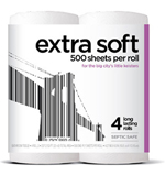
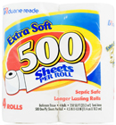
The solution: Initially, designers planned to equip each package with a custom New York-themed UPC code. But when the overwhelming number of SKUs became an issue, they decided to take another route with the concept. In order to maintain a New York-centric attitude and do something unique, designers developed large artwork for the front of the packaging using UPCs. The numbers beneath the bar code imagery are correct, but the UPC images are not scannable. Instead, they function to present a unique depiction of New York landmarks like The Statue of Liberty, the Brooklyn Bridge and the Empire State Building. And although this UPC-like packaging doesn’t have a brand name, its graphics are the reason designers refer to the line as “skyline.”
“One of the biggest things that was leveraged was the New York sense of style and New York attitude,” says Todd Maute, managing partner at CBX. “This was all about making it quick and easy for the consumer to find and identify that this is a [product] brought to you from a New York retailer.”
The packaging features a white background with the New York-themed imagery taking up most of the real estate on the front panel. Product descriptors in lowercase font are the next largest item on the packaging, making the products as easy to identify as possible. And bright colors on the right edge of the packaging aid in variety differentiation. The new design was created to convey value and quality. It appears across multiple categories including bottled water, paper plates and salty snacks.
“Duane Reade’s remarkable transformation has been guided by several clear and actionable points of strategy,” says Joe Jackman, acting chief marketing officer, Duane Reade, Inc. “Easy, rewarding, and uniquely New York.”
The results: Since the products launched in October 2009, private label penetration has almost doubled, sales are up and brand awareness has been significantly heightened, Maute reports. Plus, the “skyline” brand water is now the best selling water in the entire bottled water category in Duane Reade stores.
Looking for a reprint of this article?
From high-res PDFs to custom plaques, order your copy today!


