Caress Set to Enjoy Market Success with Brand Redesign
Courtesy of Designalytics
In recent years, bath time has become more than a simple cleansing ritual—it has transformed into a self-care routine. Efficacy remains important, but consumers have come to expect bath brands to represent a sensory experience and a small, daily indulgence.
Caress body wash has been a popular choice among consumers for years, in part because of its focus on a variety of scents and its commitment to, as its tagline states, “spark your senses.” This is a highly competitive category, however; brands like Nivea, Dove, Olay, and Aveeno feature prominently on shelves, not to mention challenger brands that are regularly reshaping the playing field. So in order to maintain share and drive growth for the brand, Caress embarked on a redesign.
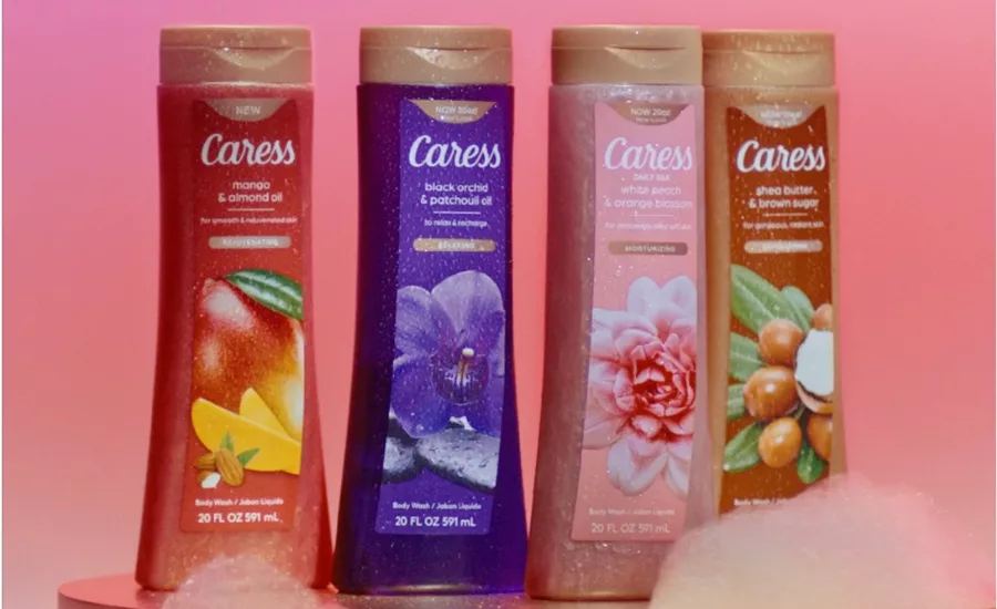
The most noticeable change, which was likely the impetus behind the redesign (considering its functional benefits), was the shape of the bottle and cap. The previous package had a more traditional shape (with a small, rounded cap) while the new version features a contoured look with a wider, flat cap.
Since Caress was already making substantive changes to the bottle itself, they decided to make strategic alterations to the design of the label. For example: the logo, along with other pertinent information about the scent and benefits (“for noticeably silky soft skin”) takes top billing on the updated package, moving above the sensory imagery. The previous design had the same information, but it was placed below this imagery.
The other prominent change here, other than placement, was to the metallic-gold call-out. The brand changed the ingredient-focused language (e.g., “Floral oil essence”) to a claim that is benefit-centric and differs by variety, such as “moisturizing,” “rejuvenating,” and “exfoliating.”
The sensory imagery was amplified as well. For example, the new design of the White Peach & Orange Blossom variety features a similar image as its predecessor, but with distinct enhancements. The bloom is centered, larger, and more photorealistic, and a deeper pink has been added to the center of the bloom, drawing the eye and complementing the lighter pink hue used on the rest of the design.
As far as consumers are concerned, this redesign is a success for Caress. The new look topped the old in consumer purchase preference 67% to 33%, a performance that bodes well for an increase in sales.
Caress has shown how impactful a few strategic choices can be when redesigning your packaging. At a glance, the old and new designs’ labels look very similar; in fact, the brand has done an excellent job of improving the design without making it look unfamiliar to loyal consumers.
The easiest change to spot was the new bottle shape, which was likely a key reason for embarking on the redesign in the first place—and consumers loved it. The curved shape made it “look easy to hold and squeeze,” said one, while another remarked “the shape of the bottle looks premium.” The updated lid caught the eye of some consumers as well, including one who liked “that you can place it upside down to get more out of it.”
In terms of communication, the new look outperformed its predecessor in conveying every one of the top 12 most important attributes to consumers. It enjoyed impressive advantages in the top two attributes, “makes me clean” (+21 points over the old) and “long lasting clean” (+27 points), in addition to wide margins of preference in “high quality” (+35), “helps me smell fresh” (+36), and “leaves skin moisturized” (+29 points).
The choice to lean into more vibrant colors seems to have struck the right tone as well. For the White Peach & Orange Blossom body wash, for example, the brand accentuated the soft pink with a sharper, darker pink in the center of the blossom image. This helped catch consumers’ attention (“the colors are vivid and varied,” said one, and another stated “I was drawn to the colors”).
Moving the branding above the sensory imagery also seemed to be a smart choice. Consumers appreciated that the logo and the name of the scent were higher up, thus making it easier to identify the brand and find the variety they were looking for.
To learn more about Caress, please visit https://www.caress.us/us/en/home.html.
Looking for a reprint of this article?
From high-res PDFs to custom plaques, order your copy today!


