Starmark Takes the Lead
The pet gear brand uses a redesign to reposition itself in
the marketplace.
 The story: For the past decade, the Starmark Academy-Animal
Behavior Center has been a leader in dog training and education. Its 360-acre
Austin, Texas campus offers an internationally accredited trainer academy,
extensive boarding facilities and a variety of obedience options. In 2004, the
company expanded and began selling its dog training products and behavioral
toys nationwide under the Starmark brand. The lineup now includes over 50
products, ranging from interactive toys and training gear to treats.
The story: For the past decade, the Starmark Academy-Animal
Behavior Center has been a leader in dog training and education. Its 360-acre
Austin, Texas campus offers an internationally accredited trainer academy,
extensive boarding facilities and a variety of obedience options. In 2004, the
company expanded and began selling its dog training products and behavioral
toys nationwide under the Starmark brand. The lineup now includes over 50
products, ranging from interactive toys and training gear to treats.
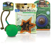
The challenge: Despite producing high quality products, Starmark was getting lost in the crowded pet gear category. “They had been bumping along for several years with really great innovative products, but it just wasn’t telling their unique story at shelf,” says Barney Hughes, president of Hughes Design Group, the agency responsible for the redesign. The reason being that the Starmark brand and positioning “failed to communicate,” according to Hughes. The product name was the lead communicator on pack, and the brand mark and company name were hidden in the corner.
The solution: Starmark turned to Hughes Design Group for a redesign that would better define the brand. The design firm began by conducting a category audit to understand the brand and its competition. The audit showed that consumers identified the products as premium and professional grade. “[But] the Starmark packaging was presented as novelty…pet toys,” says Hughes. “They are much more than that. We needed to prove that they are a brand with authority, heritage and quality.”
To do so, Hughes Design Group created a new brand mark-a star in the shape of a paw print-and tagline, “Training and behavioral solutions.”
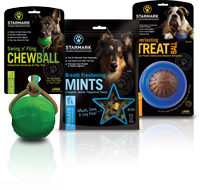
They then developed four segmentation strategies (mental stimulation, interactive play, classic training tools and treats) to enhance product meaning and use. The categories are differentiated by vertical color-coded tabs; each color carries over to the brand name and brand mark. The original grass background was also replaced with solid black to unify the brand and help the products stand out. “The black background isolates, showcases and unifies the product, while, at the same time, [elevates it] to a premium authority,” Hughes says.
In addition, each product features a unique dog on the package, which correlates to the size of the animal the product is meant for-small, medium or large. A biography of each dog can be found on the back of the package, along with the Starmark brand story and training details. “Dog people are pretty proud of their dog, so all of the dogs on the different packages are real dogs with real names and real stories,” says Hughes.
The results: Although it just launched at the Global Pet Expo in March, the packaging is reportedly receiving a great response. “It’s approachable with just a touch of authority,” Hughes says. And as a result, he says, the brand is now able to successfully distinguish itself from competitors.
CREDITS
Redesign Credits
Hughes Design Group, www.hugheslink.com
AFTER
BEFORE
The challenge: Despite producing high quality products, Starmark was getting lost in the crowded pet gear category. “They had been bumping along for several years with really great innovative products, but it just wasn’t telling their unique story at shelf,” says Barney Hughes, president of Hughes Design Group, the agency responsible for the redesign. The reason being that the Starmark brand and positioning “failed to communicate,” according to Hughes. The product name was the lead communicator on pack, and the brand mark and company name were hidden in the corner.
The solution: Starmark turned to Hughes Design Group for a redesign that would better define the brand. The design firm began by conducting a category audit to understand the brand and its competition. The audit showed that consumers identified the products as premium and professional grade. “[But] the Starmark packaging was presented as novelty…pet toys,” says Hughes. “They are much more than that. We needed to prove that they are a brand with authority, heritage and quality.”
To do so, Hughes Design Group created a new brand mark-a star in the shape of a paw print-and tagline, “Training and behavioral solutions.”
They then developed four segmentation strategies (mental stimulation, interactive play, classic training tools and treats) to enhance product meaning and use. The categories are differentiated by vertical color-coded tabs; each color carries over to the brand name and brand mark. The original grass background was also replaced with solid black to unify the brand and help the products stand out. “The black background isolates, showcases and unifies the product, while, at the same time, [elevates it] to a premium authority,” Hughes says.
In addition, each product features a unique dog on the package, which correlates to the size of the animal the product is meant for-small, medium or large. A biography of each dog can be found on the back of the package, along with the Starmark brand story and training details. “Dog people are pretty proud of their dog, so all of the dogs on the different packages are real dogs with real names and real stories,” says Hughes.
The results: Although it just launched at the Global Pet Expo in March, the packaging is reportedly receiving a great response. “It’s approachable with just a touch of authority,” Hughes says. And as a result, he says, the brand is now able to successfully distinguish itself from competitors.
CREDITS
Redesign Credits
Hughes Design Group, www.hugheslink.com
Looking for a reprint of this article?
From high-res PDFs to custom plaques, order your copy today!


