Dewars: The Newest Blend
The renowned whiskey brand unifies its portfolio with a flourish.
 The story: In 1846,
John Dewars began crafting his own blended whiskies in Aberfeldy, Scotland.
After his death in 1880, his sons John and Tommy took over, transforming the
modest family business into an internationally renowned whiskey brand-winning
more than 200 awards and receiving the Royal Warrant from Queen Victoria.
The story: In 1846,
John Dewars began crafting his own blended whiskies in Aberfeldy, Scotland.
After his death in 1880, his sons John and Tommy took over, transforming the
modest family business into an internationally renowned whiskey brand-winning
more than 200 awards and receiving the Royal Warrant from Queen Victoria.
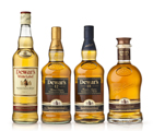
The challenge: In 2004, Dewars underwent a redesign to unify its expanding portfolio, including the additions of its 12-Years-Old, 18-Years-Old and Signature blends. But, in doing so, it ultimately stripped away some of the brand’s personality. As a result, Dewars joined forces with Spring Design Partners to create a brand and visual identity that would be more iconic, memorable and unified.
The solution: In order to create a strong visual identity, Spring Design Partners did a lot of “soul searching” about what the brand actually represents. “For Dewars, it was about understanding its history, its legacy, as well as creating a new expression of the product that could live above the package,” says Ron Wong, the firm’s president and executive creative director.
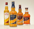
The focus of the new design is the dynamic flourish that is debossed into the glass, splitting the square of the label. “It unifies the line, not just from a graphic standpoint but from a structural standpoint,” Wong says. The flourish carries over on the Signature, 12- and 18-Years-Old blends’ label, uniting the double-aged barrels. It can also be found on the brand’s signature, with the capped “D” curling up to resemble a drop of whiskey.
From there, the original design was re-crafted, redrawn and re-orchestrated. Each blend has a distinct label color, ranging from “barley white” to brown, to differentiate the quality of the liquid. Gold icons, representing medals for the blends’ numerous awards, have also been added to the bottles, with the luxury of the liquid determining medal placement. For instance, the brand’s flagship White Label blend features the medals on the label, while the Signature blend’s medals have been embossed and embellished on the flourish, on the glass bottle itself. The redesign is completed with John Dewars’ signature on the closures and 1846 (the year the company was founded) emblazoned on the bottle shoulder.
The result: “The final effect of the label and the glass is a cohesive brand story that is contemporary and noteworthy,” says Wong. For the first time in company history, the Dewars’ portfolio and identity is consistent across all of its packaging, creating range cohesion, shelf impact and, ultimately, working to increase the quality perception of the brand.
Where to go for more information…
PACKAGE DESIGN
Spring Design Partners, 212.255.7194, www.springdesignpartners.info
AFTER
BEFORE
The challenge: In 2004, Dewars underwent a redesign to unify its expanding portfolio, including the additions of its 12-Years-Old, 18-Years-Old and Signature blends. But, in doing so, it ultimately stripped away some of the brand’s personality. As a result, Dewars joined forces with Spring Design Partners to create a brand and visual identity that would be more iconic, memorable and unified.
The solution: In order to create a strong visual identity, Spring Design Partners did a lot of “soul searching” about what the brand actually represents. “For Dewars, it was about understanding its history, its legacy, as well as creating a new expression of the product that could live above the package,” says Ron Wong, the firm’s president and executive creative director.
The focus of the new design is the dynamic flourish that is debossed into the glass, splitting the square of the label. “It unifies the line, not just from a graphic standpoint but from a structural standpoint,” Wong says. The flourish carries over on the Signature, 12- and 18-Years-Old blends’ label, uniting the double-aged barrels. It can also be found on the brand’s signature, with the capped “D” curling up to resemble a drop of whiskey.
From there, the original design was re-crafted, redrawn and re-orchestrated. Each blend has a distinct label color, ranging from “barley white” to brown, to differentiate the quality of the liquid. Gold icons, representing medals for the blends’ numerous awards, have also been added to the bottles, with the luxury of the liquid determining medal placement. For instance, the brand’s flagship White Label blend features the medals on the label, while the Signature blend’s medals have been embossed and embellished on the flourish, on the glass bottle itself. The redesign is completed with John Dewars’ signature on the closures and 1846 (the year the company was founded) emblazoned on the bottle shoulder.
The result: “The final effect of the label and the glass is a cohesive brand story that is contemporary and noteworthy,” says Wong. For the first time in company history, the Dewars’ portfolio and identity is consistent across all of its packaging, creating range cohesion, shelf impact and, ultimately, working to increase the quality perception of the brand.
Where to go for more information…
PACKAGE DESIGN
Spring Design Partners, 212.255.7194, www.springdesignpartners.info
Looking for a reprint of this article?
From high-res PDFs to custom plaques, order your copy today!


