A Brush with the Divine
Last year saw a true breakthrough in the field of dental care: A toothpaste with the cleaning powers of fluoride, but entirely free of it — a welcome innovation for consumers concerned about the risks of ingesting fluoride. The secret ingredient? A blend of minerals that includes cocoa bean extract.
This effective non-fluoride toothpaste also has an especially enticing moniker: The world’s first chocolate toothpaste. And since chocolate is known as the “food of the gods,” its cavity-fighting ancestor has been blessed with the perfect name: Theodent.
Theodent was poised to enter the market catering to an affluent, sophisticated set of consumers. But before it did, it needed to be housed in a package fit for a deity. My colleagues at N.J.-based World Wide Packaging were presented with the challenge of honoring this praise-worthy product with a true temple of a tube.
Theodent's packaging had to have a luxurious look combined with a revolutionary appeal. It also needed to stand out on a shelf full of premium products since it would be launched at Whole Foods Market — a store known for its trend-setting sophistication. Here, Theodent’s signature ingredient could be used to further differentiate it from competitors.
Of all the bright, sparkly hues consumers have seen in toothpaste aisles, Theodent had the advantage of a never-before-seen color palette. It would surely stand out on shelves.
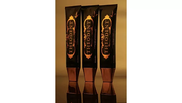
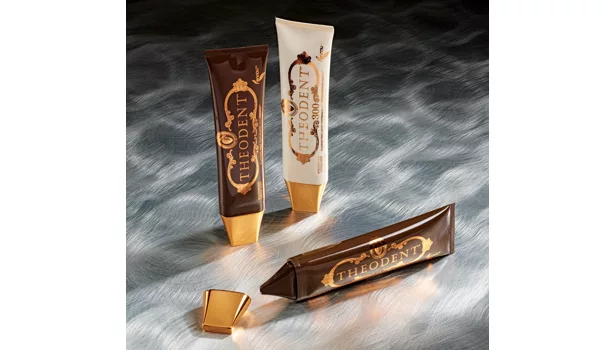
The brown communicated its cocoa bean roots, but then the bold choice needed counterbalance — a statement of elegance making it clear that Theodent was far more innovation than novelty. A stylish copper color was chosen for decorative purposes, and the Theodent name would be presented in a classically formal, all-capped font. The elegant touches showed a substance behind the style: Theodent was indeed unique — but not merely for unique’s sake.
In addition, so as not to completely surprise consumers upon first taste, Theodent decided to signify the product’s more traditional mint flavor with a mint leaf overlapping the name of its proprietary mineral blend, a mixture called Rennou. This allowed Theodent to reap the benefits of a chocolate-brown package without being misleading; it also reassured consumers that Theodent would leave them with the fresh breath traditionally promised by toothpastes. The intended result was a package that used its product’s non-traditional ingredient to the fullest marketing advantage without being so unconventional that it turned consumers off to giving Theodent a try.
At World Wide Packaging, it was now our turn. WWP was given the color schemes and direction on hot stamp colors and tube colors. The overall goal was implicit: to differentiate the aesthetics from a typical toothpaste package in order to help Theodent tell its unique story. This was no ordinary toothpaste, and it had no ordinary design. It certainly would have no ordinary tube.
WWP prides itself on elevating our customers’ brands through packaging solutions. These solutions come in many shapes and forms, as well as varying levels of complexity.
For example, one project may require the adaptation of colors and graphics on a stock package, where the design of the package is generic in form and the decoration does the heavy lifting in terms of getting the message across to consumers. Another project may require multiple custom tools, moving internal components that fulfill some function of the package, and high-end surface finish sprays and decorations along edges or curves.
Our work with Theodent was especially challenging, because we were utilizing the marketing value of a novelty ingredient while the product itself was far more than a novelty. We were using an out-of-the-ordinary color palette to earn initial attention, and at the same time communicating that this product is not only sincere, but exemplary.
In short, Theodent’s packaging needed to clearly convey two messages, in rapid succession:
> It’s different
> It’s better
We were immediately drawn to the tube that was ultimately selected for several reasons. First, the orifice was perfect for dispensing toothpaste. Second, the cap was broad and flat-headed, which provided expansive real estate — somewhere to flaunt the flashy, decorative copper color chosen by Theodent — and allowed the tube to stand on its head. Theodent deserved to be upright, atop store shelves and sink tops alike.
The third factor, though, was the most important: It looked nothing at all like a traditional toothpaste tube. It was thinner, squarer and sleeker. It was fit to house a product consumers care about, are sparing with and are proud of. This wasn’t a product that you just “use.” This was a product to be enjoyed.
Sometimes a product comes along that is so different that, as packaging professionals, we are forced to think completely outside the norm, to not only be inventive but to actually reinvent. Theodent afforded WWP this truly satisfying opportunity, and we are proud that we were able to achieve the aesthetic demands of a truly special product. Our reputation for premier tube decoration and production paved the way to this exciting, ongoing partnership.
Looking for a reprint of this article?
From high-res PDFs to custom plaques, order your copy today!


