Nostalgic Packaging: Those Were the Days
Why “something old is new again” works every time with design.
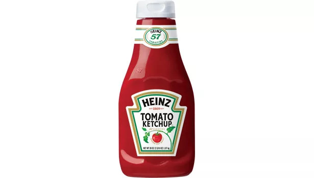
The redesigned Heinz ketchup bottle was inspired by the brand’s iconic glass bottles. Keeping the same effective design helps the brand retain its charm. Image credit: http://bit.ly/UaafzU.
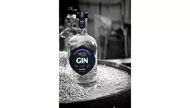
The eye-catching logo and package design project a small-batch feel, and Civilized Spirits’ classically beautiful bottles are old school and modern at the same time. Image courtesy of Civilized Spirits (www.civilizedspirits.com) and Irene Sugiura.
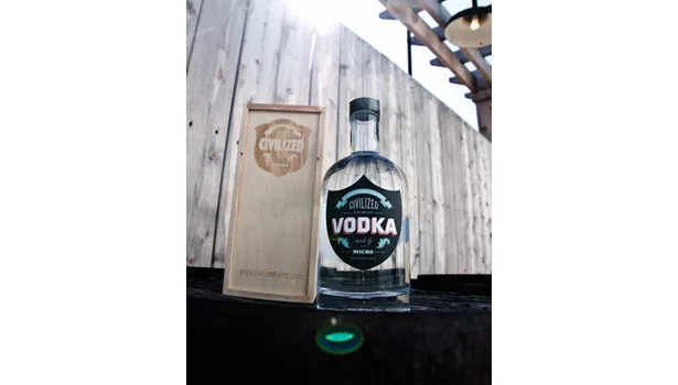
The eye-catching logo and package design project a small-batch feel, and Civilized Spirits’ classically beautiful bottles are old school and modern at the same time. Image courtesy of Civilized Spirits (www.civilizedspirits.com) and Irene Sugiura.
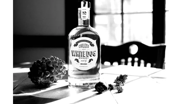
The eye-catching logo and package design project a small-batch feel, and Civilized Spirits’ classically beautiful bottles are old school and modern at the same time. Image courtesy of Civilized Spirits (www.civilizedspirits.com) and Irene Sugiura.
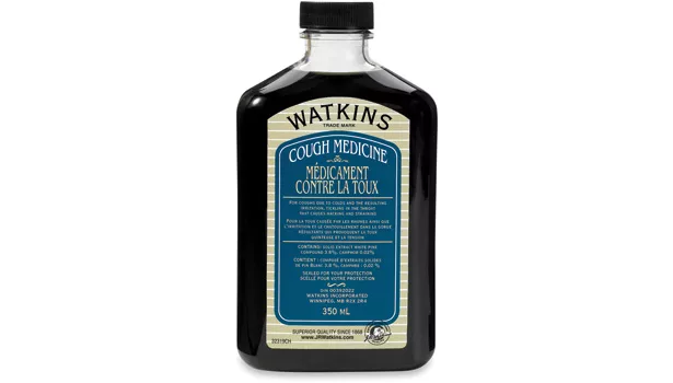
J.R. Watkins, a brand available since 1868, introduces the best of the past combined with that of the present. Each product feels as if it was specially formulated for you by a pharmacist. Image courtesy of J.R. Watkins (www.jrwatkins.com).
Whenever I hear the word “nostalgia,” an image of grumpy old Archie Bunker and his dowdy wife Edith sitting on their musty old furniture in their Queens house singing “Those Were the Days,” pops into my head. But the truth is there’s nothing old-fashioned about nostalgia, which Webster’s calls “a wistful or excessively sentimental yearning for return to or of some past period.”
Nostalgia has been a staple marketing and branding tactic for decades, but lately it seems like every product in the supermarket aisle is borrowing something from years gone by. Why does nostalgia speak so strongly to us as consumers? Because it taps into the fundamental human need to feel safe and secure, in our lives and in our choices. It’s like that old pair of blue jeans you never want to take off — it just feels cozy, familiar and right. And it speaks to me the way it speaks to all of us: I’m wild about Stewart’s soda bottles; I keep my receipts in an Altoids tin on my nightstand, and I’ve always loved the look of Jack Daniel’s bottles. But while existing brands are using the retro-ssaince to bring back old, and often beautiful, designs, new brands are taking retro elements and creating something entirely new, often combining these elements with undeniably modern touches.
To the first point, General Mills kicked off the recent reissue trend when it re-released its original designs for brands including Lucky Charms, Trix, Wheaties and Kix. Featuring bold graphics on bright backgrounds, these boxes were originally designed to pop on TV sets — TV being a relatively new technology at the time — but they made as big a splash when the boxes were reintroduced nearly 40 years later. Brillo is currently riding on nostalgia’s coattails in honor of its 100th birthday; earlier this year, the brand released an awesome-looking limited-edition box featuring Andy Warhol’s iconic interpretation of the brand. In 2011, Coca-Cola marked its 125th birthday by reissuing the Hutchinson, its first ever glass bottle, released in 1899.
So why do people love nostalgic packaging, other than it looks fantastic? In my opinion, it boils down to three significant points:
- It speaks to a simpler time, before our daily lives became saturated by an abundance of overt marketing messages and promotional speak.
- It helps us trust the products, because they feel personal, as if someone took the time to create them just for us.
- It validates a brand or product by appearing as if it’s been (or actually has been) around for years, in turn conveying that it has stood the test of time.
>REMINISCENT OF SIMPLER TIMES
It’s hard to imagine a time other than the one we’re currently living in, where young kids have iPhones and people take photos of themselves savoring their daily lives in order to post them on Instagram (not to actually savor their daily lives). I mean, I barely remember what it was like not to have email. That’s why there’s something so refreshing about packaging that is streamlined and simple. And not just packaging — food products are now marketed on the simplicity of their ingredients.
Ronnybrook Farm Dairy capitalizes on this trend perfectly. The brand sells its milk in classic glass bottles, which catapults us back to the days when a milkman dropped off your milk at your door. The logo is incredibly simple, featuring two cows and the product name, as well as the town where the farm is located. A simple line, “Bottled on the farm,” appears under the logo, which also speaks to the “personalized” aspect so prevalent in products that speak to nostalgia.
Another example of the simpler-times trend is the packaging that was introduced this past August for Kellogg’s Frosted Flakes, Froot Loops and Rice Krispies. Sold exclusively at Target to celebrate Froot Loops’ 50th anniversary, it marks the first time in Kellogg’s history that they have introduced retro-inspired packaging (I wonder if the General Mills’ boxes had anything to do with that?). The boxes were designed to allow each brand to stay true to its core equity while also reminding consumers of their beloved cereal as children (which has been with them for years), and of what life was like before they were bombarded by text messages and Facebook updates. I love how these boxes tap into their historical roots while also looking totally updated and modern, and the use of their famous taglines (“They’re Gr-r-reat!”) in a larger font than the actual logo is really novel and eye catching. They’re definitely worth a special trip to Target to collect them all. Similarly, Oscar Mayer put a fresh spin on retro-inspired packaging last year, when it released playfully illustrated boxes that contained vintage-style trinkets like a bike horn, a dart board and a yo-yo.
>FEELS PERSONAL AND HOMEMADE
There’s a built-in trust level in products inspired by nostalgia, because they seem as if they were made especially for us. J.R. Watkins, a manufacturer of health remedies, baking products and other household items, has — according to its packaging — been around since 1868, but the public has only taken notice of the brand in the past few years. Why? Because it reintroduced its body-care line in 2008 with packaging that has an apothecary feel, as if each product — from body lotion to baby oil — was specially formulated for you by a pharmacist. In fact, the word “Apothecary” appears front-and-center on the packaging. The logo incorporates an old-style illustration of founder J.R. Watkins himself, yet feels totally modern thanks to its choice of fonts and decorative background graphics. Each product has its “variety” called out in English and French on the bottom of the bottle in a typewriter-style font, as well as its own product number, which makes it feel as if it has been made in a small batch just for you.
Similarly, Civilized Spirits, a maker of whiskey, rum and gin based in Michigan, has a small-batch feel that instantly forges trust between the product and the consumer. Its eye-catching logo is reminiscent of another era yet undeniably modern, as is its classically beautiful bottle. The Civilized Spirits’ brand story is told through minimal copy that salutes the distillery, Mission Microdistillery, where the product is made. In my opinion, this brand, and many other liquor brands, takes a page out of the Jack Daniel’s school of branding, in which its old-school look and brand story makes it seem almost like moonshine — crafted not only especially for you but also illegally in someone’s basement!
>HAS STOOD THE TEST OF TIME
Products use nostalgia to show that they’re a trusted source that has stood the test of time. In a market where new products pop up every day and try to claim their share of their respective category, having a rich heritage goes a long way.
Milk-Bone has been a trusted dog food brand since 1908, and it puts that fact right on its packaging (admittedly designed by CBX). The original logo remains, but has been enhanced to reinforce its “right to own” in the pet aisle. By reminding us of Milk-Bone’s heritage of 100-plus years, it fortifies the brand in our minds as a trusted and honest source. And when juxtaposed against a fire-engine red box, that bone and the trust factor make an even bigger visual and literal statement and more indelible mark in the mind of consumers.
How many brands can say they’ve been around since the reign of King George III? (Not that I really know much about King George III … but it sounds like he’s been around for a while.) Altoids, one of my personal favorites, was introduced in 1780 — yes, 1780! It’s made very few changes to its original design over the years, namely moving from a cardboard box to a metal tin in 1920 and introducing its now-legendary tag line, “Curiously Strong Mints.” That line and the overall design — with its classically elegant logo, a simple illustration of a peppermint plant and a “Made in Great Britain” phrase — harken back to its quintessentially British lineage. By rooting its story and design in this history, Altoids has become one of the world’s most iconic brand identities.
Of course, not all retro design is good design, especially in a time when so many brands are manufacturing nostalgia as a marketing tactic. In order to incorporate nostalgia in a way that looks distinctive, not copycat, you’ll need to keep the following pointers in mind:
-
Use a little of this, a little of that.
Brands like J.R. Watkins and Civilized Spirits take the best elements of the past and combine them with modern elements of today to create something own able and distinctive. -
Practice restraint.
Whether we’re talking about design or copy, less is always more. Altoids’ classic “Simply Curious” line and Ronnybrook’s “Bottled on the farm” message are memorable by brevity, choice in their executions and focused in their deliveries. -
Don’t throw out the baby with the bathwater.
Often, a company’s original design — à la Coke’s original glass bottles or Froot Loops’ Toucan Sam illustration — can retain its charm from generation to generation. Brands like Heinz ketchup and Campbell Soup Company, for example, have kept the same design for many decades. They are effective, and they look as modern today as when they were first introduced. I would urge brands to think twice before eliminating original elements in their designs, and that when introducing a new visual asset, they carefully assess its timelessness.
Let me apologize now if I’ve gone overboard waxing poetically about all these terrific examples of nostalgic design. Given that our agency is celebrating its 10th anniversary this year, I can’t help but find myself a little bit nostalgic for my early days in the industry. Man, maybe I’m undergoing a little retro-ssaince of my own these days — though that’s certainly not a bad thing.
Looking for a reprint of this article?
From high-res PDFs to custom plaques, order your copy today!


