The Importance of Packaging's Front Panel with Kids
Use packaging's front panel to make an emotional connection with "kidsumers."
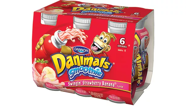
On the package designed by Zunda Group, this archetype attracts kids with Bongo: a fun, personality-filled chimp. On-pack communication is perfect for kids and moms.
The front panel, crucial in connecting brands with kidsumers, speaks volumes to moms and children with verbal and visual cues.
Recent marketing research has revealed that Millennials aren’t especially brand conscious or brand loyal. But that might be a bit misleading, since kids have always been skeptical about consumer product marketing, especially hard-sell tactics. If anything has changed, it’s the explosion of consumer brand marketing online, where kids live. Millennials simply tune it out. They choose which brands they wish to interact with, and they do it on their own terms. But make no mistake: Kids drive many families’ purchase decisions and have considerable purchasing power of their own — and they do form brand relationships — so connecting with them is a must. They are often referred to as “kidsumers,” and they truly are.
Consider: Kids have favorite entertainment brands now just as previous generations have had; treasured movie stars, singers and animated, virtual characters populate their text messages and direct peer communication. These are powerful brands, and if they stay true to their values, kids stick with them until they move on to new, age-appropriate choices. Given this allegiance to pop-cult superstars, it’s no wonder that consumer product brands seek to leverage their power with licensing agreements. But that alone doesn’t necessarily ensure success. Licensed consumer products will only do well if they capture the essence and values of these brands in an authentic manner. That’s why the front panel of packaging is more important than ever; it is crucial in connecting the brand with its fans.
THE POWER OF PERSONIFICATION AND ARCHETYPING
Simply put, consumer product brands aimed at kids (and adults) can find success if they make an all-important emotional connection with them. Personification of kids’ consumer product brands can produce the same effect as a favorite pop star. This is accomplished by creating an archetypal brand with a unique story, and it can be very compelling. Archetypal brands are personified by a central human trait or a combination of traits. Kids respond to archetypes that are summarized as Hero, Outlaw, Magician, Jester or Clown, Creator/Designer, Destroyer, Seeker and Innocent. Carl Jung, the founder of analytical psychology, conceptualized the theories of archetypes, and they have been embraced by marketers in building brands ever since. Joseph Campbell notably applied the concept at General Mills as the Wheaties marketing team successfully leveraged the Hero archetype some time ago — and the rest is history.
Hasbro’s Transformers brand blends two archetypes: Hero and Outlaw, with potent, emotive storylines of good guys versus bad guys. Transformers dazzle Millennials as much as they did their parents; storylines continually evolve to remain relevant, and new characters populate the toy world and consumer products after appearing on the big screen. Kids love every bit of this as much as they ever have. Nike and Superman are Hero brands; MTV and Lady Gaga are Outlaw brands. Magician brands are all about fantasy and include Nickelodeon’s Winx Club fairies and Harry Potter. Jester brands aren’t only comedic; they encompass individuals who live life to the fullest and like to party. These brands are personified by Bugs Bunny, Adam Sandler and The Black Eyed Peas. Creator brands include Apple, Crayola and Lego. Destroyer brands are edgy and a little dark; that’s why kids will always love dinosaurs and pirates, Star Wars’ Darth Vader and Batman’s quirky, memorable enemies such as the Penguin, Joker, Riddler and Catwoman. Seeker brands like Hobbit Frodo Baggins and Nickelodeon’s Dora the Explorer captivate kids due to their sense of adventure. Innocent brands include Disney Princess and Sesame Street; they’re sweet and nurturing, and young kids adore them. Note that all of these brands create unique, powerful universes which have a profound impact on their fans and create a cult-like following as a result. They may fall within one or more specific archetypal categories, but each of their stories is unique.
Classic product brands aimed at kids have often used archetypal branding to accomplish the same effect. Kellogg’s Tony the Tiger has been an icon of breakfast tables for decades; his distinctive image and booming voice famous for saying “They’re GRRRRREAT!” suggest that eating a good breakfast builds a strong body like a tiger’s. Ronald McDonald is ingrained in our culture and associated with Happy Meals forever. Campbell Soup Company markets optimal soup choices for kids with “The Wisest Kid in the Whole World.” The Flintstones make taking vitamins fun, and the M&M’S characters make their candy brand more engaging than competing brands — all because of personification. Note how most of these characters appear on the front panel of their respective brand packaging.
Yet it’s not necessary to create a brand character in many cases. The brand itself can be imbued with personality and an archetype without the use of a character. Brand positioning, marketing, advertising and packaging can synergistically create a unique brand personality that will resonate with kids too. Think: Pepsi, Nintendo and Wii, Doritos, Jello and Lunchables, Target, Toys“R”Us, Domino’s, Pizza Hut and Nike. All of them are favorite kids’ brands with distinct personalities, but they aren’t represented by a character.
MAKING IT COME TO LIFE
Packaging takes the conceptual idea of the brand that has been developed via marketing and delivers it in consumer-facing products. With brand loyalty at issue, packaging is more crucial than ever, making the front panel arguably the most valuable marketing real estate that the brand owns.
Here’s where the brand personality and its archetype can be fully leveraged in a meaningful (read: emotional) manner. For kids, visual brand communication outweighs the verbal, so making sure that the proper cues are in place leads to immediate recognition and an emotional response. For parents, the right combination of verbal and visual cues leads them to trust the products their children wish them to purchase. Even then, visual cues have to engage first, so that moms will pick up packaging and read the verbal brand communication as the next step to purchase.
ARCHETYPES IN PRACTICE
The Jester. Dannon’s Danimals Smoothies packaging, designed by Zunda Group, combines the zany fun represented by Bongo the chimp and kid-friendly flavors like Banana Split, Strawberry Explosion and Wild Watermelon. This truly fits the Jester archetype and attracts kids in a big way. Brand personality helps Danimals win out over colorfully packaged competing brands. On-pack verbal communication is perfect for kids because it’s to the point: “Shake! Drink!” Moms will turn the packaging around, note the healthy ingredients and no artificial colors or flavors, and endorse their kids’ choice.
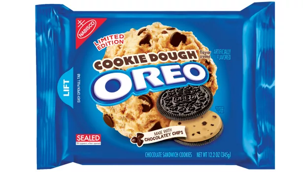
The Magician. According to youth and family marketing research experts at Smarty Pants, Oreo was kids’ and moms’ number one brand in 2012-2013. Oreo is a highly personified brand — no character needed. At age 101, Oreo still delivers magic, changing its marketing message slightly from one generation to the next but continuing to demonstrate the power of an Oreo and a glass of milk. The new “Wonderfilled” theme shows a cookie cracked open in a “smile” to show a luscious filling choice, dominating the front panel of packaging with the Oreo brand identity emblazoned across it. The famous chocolate cookie is available with its original cream filling as well as berry, mint, chocolate, peanut butter and limited-edition varieties. Then there are Golden Oreos filled with chocolate, lemon and specially offered flavors. Oreo does a great job of adding flavor cues to the packaging, placing mint leaves or chocolate shavings next to the large visual of the cookie.
Speaking of cues, the Oreo brand’s signature blue is continuously used on all of its chocolate cookie varieties, easy for consumers to focus in on when shopping. On the golden cookie varieties, the background color is a sunny shade of yellow, which makes sense. Since all other cues, including the brand identity and product imagery, are positioned in the same place as the chocolate cookie packaging, there is continuity and an Oreo-family feel to the entire product line.
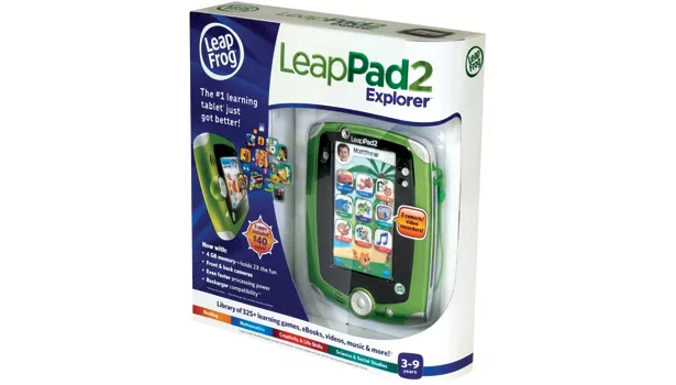
The Seeker. The front panel on the packaging of the LeapPad Explorer with built-in camera and video recorder tells the story of this Seeker brand. Limited brand communication for mom tells her what she needs to know in her quest for a child-friendly pad that will educate and stimulate her child’s mind and offer the fun of engaging games and apps. But it’s the trusted LeapFrog brand identity on the upper left-hand corner and the brand’s signature green that will speak to mom first. Kids will hone in on the visual cues depicting some of their favorite characters from Toy Story, Cars, Dora the Explorer and Scooby-Doo, among others, engaging with them, playing games, and seeking out information. But it’s the full view of the pad itself that resonates most. Having been born into a technological age, kids know that they will be able to customize their pads, downloading favorite games and sites and sharing them with their friends when they see this packaging.
Kidsumers are savvy about brands, but they’ll only gravitate to the ones that have a unique personality, with a one-of-a-kind authentic story — character-driven or not. It’s up to brand marketers to create a compelling, archetypal personality and deliver its most emotive drivers on the front panel of packaging to make enduring brand-to-kid connections. Otherwise, no matter how great the potential of the brand, it may fail at retail with kidsumers.
Looking for a reprint of this article?
From high-res PDFs to custom plaques, order your copy today!


