Good Grooming: Haircare Line Debuts Polished New Look
The story: Consumers around the globe are getting their first look at Amway’s newly redesigned Satinique haircare portfolio — with award-winning structural packaging and graphics created by leading global brand agency CBX, which specializes in corporate identity, consumer branding and retail. Amway is one of the world’s dominate direct selling businesses, founded in 1959 by entrepreneurs Rich DeVos and Jay Van Andel, and based in Ada, Michigan, U.S.
The challenge: The project — which took top design honors in the haircare category this past June at HBA Global, the Health & Beauty Aids Expo and Conference — will help Satinique remain relevant, contemporary and fresh in global brand markets for years to come, says Gregg S. Lipman, managing partner at CBX.
CBX assisted with the upfront strategy of the Satinique brand, helping the team optimize the brand’s positioning based on consumer insights learned through both global research as well as input from a team of Amway regional affiliates.
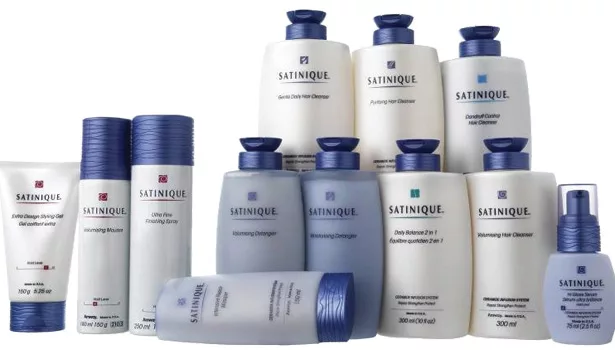
The solution: The subsequent redesign involved simplifying and contemporizing the packaging of nine cleansing items and four conditioners as well as a host of styling gels and serums, final-touch sprays, mousse and other products.
For the new logo, CBX added a touch of uniqueness to the “q” in Satinique and mirrored the letterform in a rejuvenating drop icon that sits with the brand mark. Visual elements call to mind wisps of renewed and free-flowing hair.
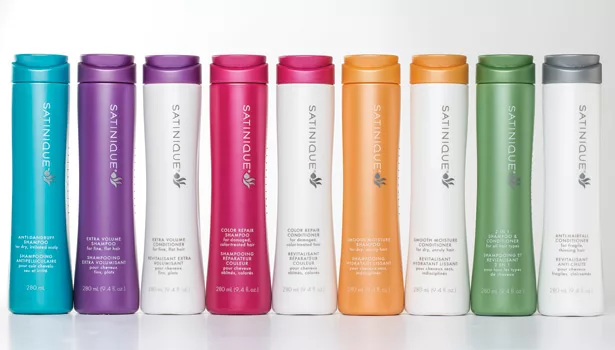
Positioned as “rejuvenating,” “revitalizing” and “vibrant,” Satinique products now feature a jewel-tone and metallic color palette with premium finishes.
“Because Amway is an $11.8 billion company with a vast network of global customers and distributors, the structural positioning and graphics also needed to be universally appealing,” Lipman explains. “And since Amway customers receive products direct from distributors rather than shopping for them at shelf as with a typical CPG, the design considerations were a bit different as well.”
Starting in 2010, CBX participated in Amway’s global research study that identified universally appealing characteristics to Amway’s diverse consumers across markets such as Russia, China and Southeast Asia. The research was followed by an audit of the premium or prestige beauty and haircare category internationally in a bid to understand how people in diverse markets think about product aesthetics and even portfolio mix in the category, Lipman notes.
This research, as well as quantitative testing, revealed that consumers universally favored a simple, sleek and streamlined design. As a direct result, feminine lines and an upward sweeping movement characterize the Satinique cleansing bottles’ silhouette.
“This energy emphasizes the cleansing product’s breakthrough ability to rejuvenate hair from the inside out while staying true to the positive transformation beautiful hair provides,” Lipman says. “The ergonomics of the feminine shape also create a comfortable feeling in hand and an easy grip in the shower or bath.”
While competing with other products at shelf was not part of the challenge for CBX on this project, Amway agreed that the structural packaging and graphics were no less important than with a typical CPG.
“Strong design helps provide reassurance that this is a good brand and that it is delivering on quality,” Lipman concludes. “It also helps convey things like usability and shower worthiness.”
“Amway’s deep commitment to scientific innovation elevates Satinique to be among the best haircare brands on the market,” explains Maud Pansing, VP Global Beauty. “We’ve raised the bar in the category with technology and performance in the formulations that truly make a difference to the health of hair, inside and out.”
- The brand moved away from its previous stouter structures in favor of slimmer, streamlined packaging. Research and testing proved consumers were partial to a simple, sleek design that feels comfortable in hand.
- The “q” in Satinique mimics the rejuvenating drop’s shape that sits with the brand mark.
- Rich jewel tones and metallic touches grace the new bottles and coordinate the cleansers and conditioners. The new color palette gives the products a fresh, revitalized look.
Looking for a reprint of this article?
From high-res PDFs to custom plaques, order your copy today!


