Ace Hardware Rolls Out a Helpful Store Brand Refresh

Ever since 1924, when Ace Hardware, “The Helpful Place,” was founded, the company has been dedicated to bringing quality products to its loyal customers. In addition to working with thousands of the world’s finest merchandise vendors, such as Craftsman and Valspar, Ace Hardware puts its own personal stamp of approval on nearly 10,000 different products through its private label merchandise program.
The history of the Ace store brand merchandise dates back to the company’s inception more than 90 years ago. Fast-forward to 2015: Today, Ace Hardware’s private label products are specifically sought out by customers for their quality, durability and value. Ace’s lineup of exclusive brands include Ace, Living Accents, Celebrations, OakBrook Collection, Home Plus, Steel Grip and Grill Mark. Together, these brands annually drive a significant portion of revenue for the $4.7 billion corporation. Ace’s private label business experienced a sales increase of 9.5 percent in 2014, including store brands.
Currently, Ace is in the midst of a multi-year project to refresh the look and shopability of its Ace brand merchandise. The overhaul includes packaging updates on a wide range of products — everything from basic hardware to birdseed. The decision to refresh the packaging presentation of the already well-established Ace brand wasn’t a decision made in haste. In fact, a cross-functional team comprised of corporate employees, retail store owners and external agencies collaborated for more than a year to formulate the vision.
Since the Ace rebranding effort began in 2012, the packaging of more than 7,500 SKUs has been updated, with the end goal of completing more than 9,000 SKUs by 2016. The refreshed packaging is intended to be as informative as possible and features consumer-friendly bullet points, bilingual text and colorful banding to make sure customers are getting the exact product they need.
In addition, Ace recently completed a redesign of four store brands: Living Accents, OakBrook Collection, Home Plus and Grill Mark. Each of these brands has a unique purpose and targets specific customers, which is evident in the packaging designs. Overall, the goal of the packaging is to catch the consumer’s attention while clearly illustrating the features and benefits of the product.
Read the following explanations for a closer look at what went into each redesigned product package.
ACE BRAND REDESIGNS
Ace Private Label Plumbing: With many small replacement parts, the plumbing aisle in a hardware store can be a confusing place for customers. The updated Ace brand packaging boasts a simple design with consumer-friendly bullet points and color-coding of the most common fittings and connectors. As with all the updated Ace brand packaging, the Ace logo is prominently featured at the top with the “Quality since 1924” statement to show the excellence, longevity and nostalgia of the brand.
Ace Private Label Paint Brushes: Paint brushes are one of the many categories that Ace developed with a clear price strategy progression in mind. The core red packaging, with its basic callout features, appeals to the consumer looking for a good product. The premium version offers a sleeker design, metallic color with imagery and an icon calling out the added benefit. Color-coding is used to differentiate the paint brush use, and the Ace logo is consistent between both options.
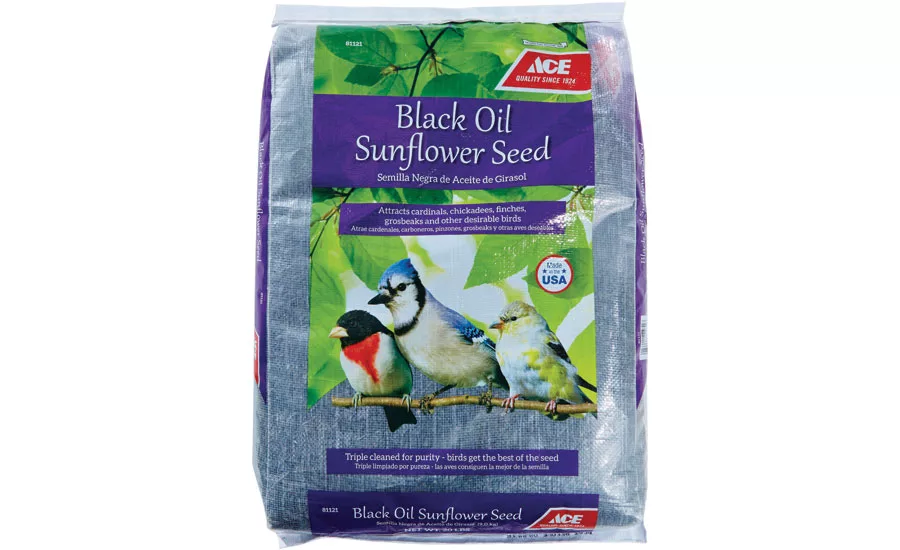
Ace Private Label Brand Bird Seed: A primary example of Ace’s redesign can be seen in Ace Private Label Brand Bird Seed. The new packaging exemplifies an attractive, easy-to-use and informative exterior. The clear bag casing shows the quality of bird seed the customer will receive, and the natural elements of bright green leaves impart an association with nature. The product design further details what customers can expect through images of birds that will be attracted by the seed. Ace took the initiative in color-coding the packaging so customers know exactly what type of seed they are getting with just a glance. When you combine these elements, you end up relaying a quality that’s sure to attract hobbyists.
STORE BRAND REDESIGNS
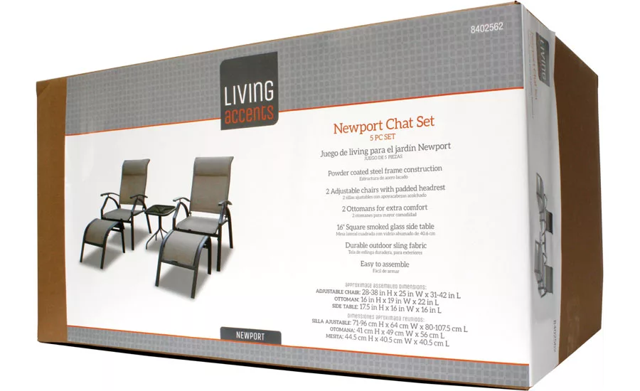
Living Accents: Living Accents, Ace’s line of interior and garden décor, features new packaging with a contemporary logo, an updated hang tag and craft box labels. The tag and label both resemble the shape of the Living Accents logo as a reminder of the brand. Customers are kept informed through the dimensions and product features on one side of the packaging, while the logo, product photo, product title and name are listed on the other side. The elements all work together to show that Living Accents is truly an attractive, upscale product.
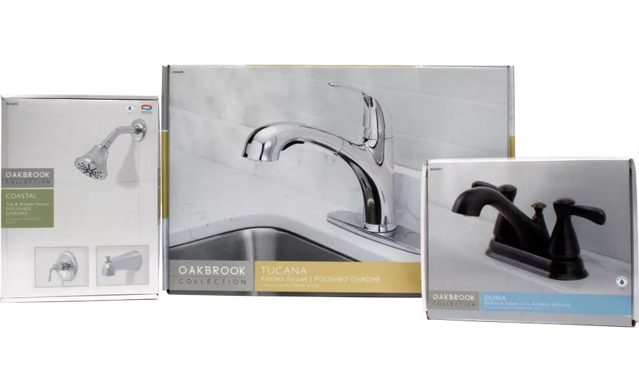
OakBrook Collection: Customers can’t look away from the OakBrook Collection, Ace’s affordable store brand of decorative kitchen and bathroom faucets, shower heads, tub spouts and plumbing accessories. OakBrook Collection’s packaging uses simplicity in both design and color to highlight contents while strongly conveying features and benefits. Product groups are divided through distinct colors separating kitchen, bath and tub/shower categories. Product photography lays against a clean white background on the top, front and side; the back of the box is home to special features and supplies needed for installation.
Home Plus: Home Plus, a line of impulse and seasonal goods, offers timely awareness on its product packaging. Home Plus impulse products are available at the front checkout and aisle. This assortment includes product appealing to all consumers. Ace recently expanded Home Plus to include seasonal product: Customers know just what time of year the product is designed for by looking at the box’s imagery — flowers for spring, a flag for summer, a pumpkin for fall, an ornament for winter. The product packaging features easy-to-read text displaying needed information on a neutral white and gray background.
Grill Mark: When customers see a Grill Mark product, Ace’s store brand of outdoor cooking tools and accessories, they know they are getting a product that can stand up to the heat. The product catches a customer’s attention through the use of live outdoor photography and clean, concise features and benefits.
The brand team has put in many hours into redesigning the Ace and store brands. The result is packaging as attractive and descriptive as the stores’ service is helpful.
Looking for a reprint of this article?
From high-res PDFs to custom plaques, order your copy today!


