Design North Earns Three American Package Design Awards
Awards for TH Foods Harvest Stone Ale House Mix, TH Foods Crunchmaster POPS, and DWT Ecotechnologii Prio RUS 000.
Packaging design is one of the key assets for brands and a major factor in the consumer’s purchasing decision. The American Package Design Awards has recognized areas of excellence and opportunity for creative professionals for over five decades. This competition honors outstanding design that advances brand promise and forges an emotional connection with the buyer at the moment of truth. This year’s entries reached 2,000 for the first time, with a highly‐selective group receiving awards. Design North is pleased to announce three packaging design awards for: TH Foods Harvest Stone Ale House Mix, TH Foods Crunchmaster POPS and an international brand, DWT Ecotechnologii Prio RUS 000.
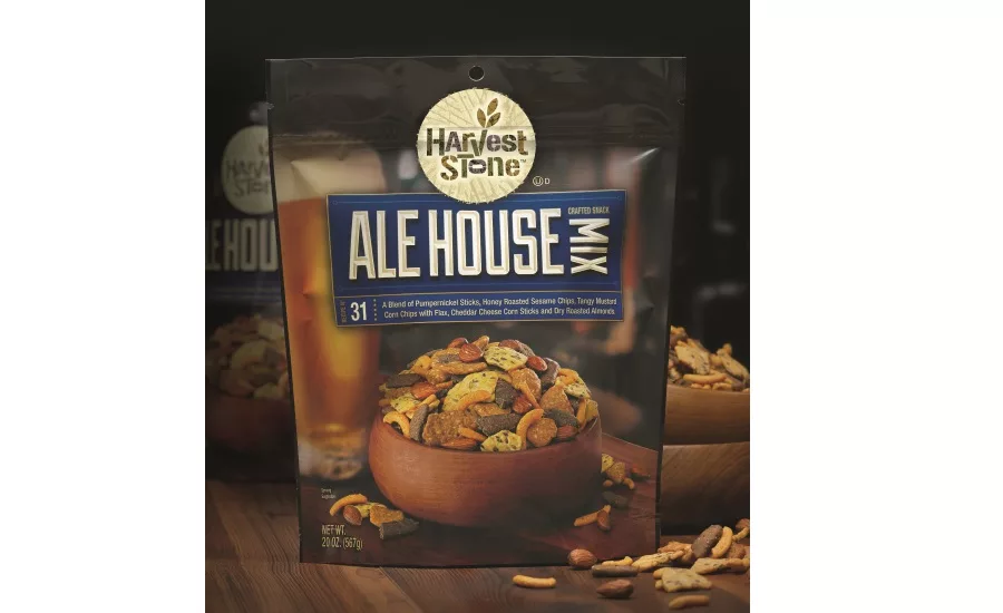
TH Foods Harvest Stone was one of the most successful new product entries of the healthy snack category in 2014. To build on that success, Design North helped TH Foods with positioning, naming and packaging design for Harvest Stone Alehouse Mix, a bold-tasting snack mix aimed primarily at a male consumer. The packaging’s rich background photography, with warm wood surfaces and an ice‐cold beer, creates a comfortable, pub‐like impression. The use of a recipe number and typography reminiscent of artisanal foods communicates that Alehouse Mix is the perfect snack to pair with a craft brew experience.
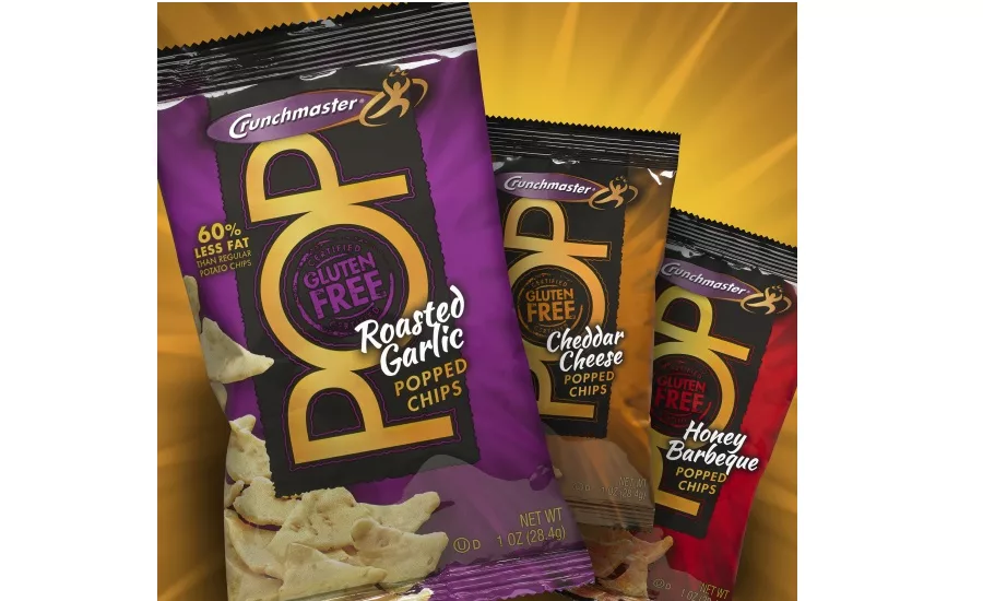
TH Foods Crunchmaster’s commitment to living healthy, happy and gluten‐free expanded into convenience stores with the introduction of gluten‐free, single‐serve snacks. Design North helped Crunchmaster POP chips stand out in this chaotic environment with a dramatic packaging design with stopping power. A bold type treatment places emphasis on “POP” and creates a bull’s‐eye effect for the product’s “gluten‐free” asset. Bursts of background color, cued for each of POP’s three flavors, whets the appetite while creating excitement and movement.
DWT Ecotechnologii RUS 000, the leading manufacturer of small‐ to mid‐size household drinking water treatment systems under Prio™ in the Russian market, approached Design North for help in launching their Prio brand in the US arena. Using a clean, modern design with black and darker blues, the new package catches the shopper’s eye and communicates the product’s German engineering and the advanced technology. The dramatic photo of ice splashing into a glass of water visually expresses how clean and refreshing Prio water is, and the blue wave – a play on the Prio logo’s swash ‐ adds motion while mimicking a wave of water moving around the box.
Looking for a reprint of this article?
From high-res PDFs to custom plaques, order your copy today!


