Rebranding Time for Tea
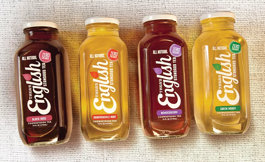
Thea’s English Standard Tea has been available exclusively through P.J. Clarke’s restaurants, including the flagship location dubbed the “Vatican of Saloons” by The New York Times. The product is described as an eight SKU range of all-natural, zero-calorie, sugar-free iced tea with flavors like Black Rose, Honeysuckle, Smokey Lemon and Dandelion Mint.
As part of an effort to expand product distribution online and into additional retail outlets, Thea’s embarked on a package design and rebranding project to best capture the company’s values and positioning. The tea provides a healthy and sophisticated alternative for savvy consumers, and the new brand design needed to reflect that sophistication while communicating superior, natural taste.
The resulting packaging is bright and beautiful: It presents the product in a modified 16-oz. French square glass bottle with a custom 48-mm lug neck finish. The faceted corners enhance the bottle, creating a jewel-like presentation, which strongly stands apart from competitors in the iced tea category.
The clear label lends a transparent, honest presentation showcasing the product and its understated elegance, while bringing to life the handcrafted, small-batch origins of the brand. The branding allows consumers to quickly identify the eight flavors visually and distinctively. Crisp graphics further enhance the healthful botanical theme. The clean and bold white typography includes a playful leaf dotting the “i” in “English.” Bright, fresh colors punctuate the flavor identifier bars, a zero-calorie stamp, and the leaf-shaped title. All of these elements play off the vibrant colors of the product itself, which are as clear and beautiful as their names imply. www.berlinpackaging.com
Looking for a reprint of this article?
From high-res PDFs to custom plaques, order your copy today!


