Packaging Imperfections Can Increase Consumer Interest
Showing the imperfect side of a product in its packaging can create an added sense of authenticity.

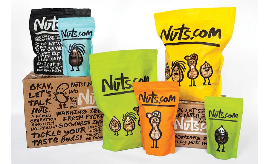
Self-deprecating humor on the packaging helps the family-owned Nuts.com establish a relationship with customers.
Dieffenbach’s unabashedly uses its packaging to help sell chips made from imperfect potatoes.
Cues on the packaging let parents envision how their children might play with the new toys.
Less is more. There’s a great deal of insight in that statement. We, as package designers, understand that clarity and simplicity help consumers to hone in on specific brands to the exclusion of everything else. But “less” can allude to something that’s not quite perfect as well. Because brands work hard to create a perfect image, they’re sometimes seen as too slick; as less than believable by consumers. That’s especially true when their brand experiences don’t match up to the image that has been created. This, unfortunately, is often the case.
Lately, a handful of brands have hit on something valuable. They’ve portrayed themselves as imperfect and vulnerable, and even a bit disheveled—like an unmade bed. They call attention to themselves and create an instant connection because everyone can identify with these traits. Marketer, author and professor, Rohit Bhargava, calls this trend Loveable Unperfection: “where brands intentionally focus on imperfections, flaws and personality to make their products and experiences more human, believable and desirable.”¹
keeping it real
To be human is to be somewhat unpredictable and a bit flawed. Nobody’s perfect, so why not celebrate it? Brand marketers recognize the importance of authenticity. It’s something for which consumers are truly hungry, so why not give it to them?
Think of the huge success of the Dove Real Beauty campaign. It was always about “real” women, not models. Consider how Matthew McConaughey delivers rambling, sometimes odd monologues in his auto ad spots for Lincoln. Let’s be honest, don’t we all do that on occasion? Quirkiness has become cool. Celebs have dared to go out in public sans makeup. Supermarkets are offering heirloom fruits and vegetables that are more nutritious and flavorful, even a bit ugly.
As a culture, we’ve turned an important page because there are brands that are willing to put authenticity ahead of slick, sophisticated marketing designed to make them look perfect. They’re winning in the marketplace because of this positioning. Keeping it real matters. However, every visual and verbal expression of the brand must deliver the message in a cohesive manner. Well-conceived advertising campaigns are great. But for consumer product brands, compelling package design should be the top priority because the consumer is persuaded or dissuaded at the shelf.
Visual and verbal brand elements should be distinctive so that they become ownable to a brand. They should fuse to create a unique language. And while it might sound counterintuitive, the smart brands going forward will be so well designed that they will appear to be un-designed and effortless. They will dare to show some kind of imperfection.
Of Superheroes and Brand Heroes
Our culture is totally into superheroes, and we all have our favorites. What appeals most to us isn’t necessarily the unique powers they possess but their backstories, limitations and challenges. That’s what makes them captivatingly human, right? In spite of Superman’s awesome power, speed and strength, a small amount of kryptonite could be his undoing. Batman’s relentless drive to find and bring criminals to justice before they wreak havoc in Gotham City emanates from his need to discover his parents’ killer. DC Super Hero Girls possess awesome talents but they’re also dealing with the insecurities of being high school kids. Teenage Mutant Ninja Turtles are, well, mutants. These traits are endearing to legions of people around the world. Is it any wonder that their visual assets depicted on licensed consumer product packaging create instant cognition and connection with their fans?
Now if we could just imbed some human imperfection to the DNA of brands in general, why wouldn’t they be more connective, believable and trusted? You might think that this approach works best for unique consumer product brands and not commodities, right? Think again.
Nuts.com is a small, family-owned business that sells—you guessed it—nuts and dried fruits online. How basic is that? Well, it isn’t at all because the package design plays on the “nuts” theme in a hilarious manner. Rudimentary artwork depicts family members as a bunch of nuts on the front panel with a short blurb about the family history of the company on the back. The typography looks as though it was handwritten—it’s irregular and imperfect. The shipping cartons aren’t Plain Janes, either. They are used as a brilliant marketing platform, filled with funny short phrases and doodles that also appear to be handwritten.
Many would allude to this kind of packaging as artisanal due to its hand-drawn look. I disagree. It’s basic and unsophisticated, and it’s injected with self-deprecating humor. It’s memorable and real, and it’s guaranteed to bring a smile to consumers’ faces. In short, it’s very human and connecting.
Lauding the Flawed
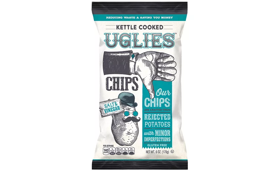
Pennsylvania-based Dieffenbach’s Potato Chips, Inc. has been making waves with its new Uglies branded chips. Capitalizing on the trend toward offering less-than-perfect Uglies Chips are made from potatoes with blemishes. Nevin Dieffenbach, owner and CEO, has this to say on the company website: “This new brand is using potatoes that farmers would likely be throwing away due to minor imperfections. Because of this, we’re able to pass on the savings to our customers, and everyone feels like they’ve done some good.” This is a brilliant product idea that’s squarely on trend. Sustainability and cutting food waste are top of mind, and who doesn’t like to save money?
Uglies packaging doesn’t merely rely on verbal brand communication to get its point across to consumers. It uses deliberate visuals in a deft manner. The top of the package informs consumers that these chips are “Kettle Cooked” over the “Uglies” brand name. “Thumbs down artwork points directly to simple, direct verbiage presented in a vertical manner in old-fashioned typography reminiscent of broadsides and posters from the past. “Our chips are made from rejected potatoes with minor imperfections, gluten free.” Additional artwork of humorous, mustachioed potatoes wearing shades and hats hold up signs to denote which variety is in the bag. No slick photography here. The visual and verbal package design elements work together in a cohesive, memorable manner.
This product concept and its refreshing packaging are designed to stand out in snack aisles loaded with branded options. The largest players in the potato chip category will no doubt be taking note of what a small company from Pennsylvania has done. Could this be a category game changer?
Kids Get It
The toy brands that speak to children encourage creativity and allow for zaniness because learning should be rooted in fun. Efforts are applauded and perfection isn’t the goal. That’s why recent brand extensions from Play-Doh and Crayola have been such a hit with kids. Crayola’s Silly Scents Marker Maker encourages kids to mix colors and fruity fragrances to their hearts’ content. Artwork on the pack depicts zany pieces of fruit as mad scientists, blending scents and colors and having madcap fun while doing it. Likewise, Doodle Scents Scented Markers feature artwork depicting humorous personifications of each scent. The subliminal message is quirky, creative art is encouraged, and so have a blast doing it. When kids see this packaging it speaks to them in an immediate and compelling manner.
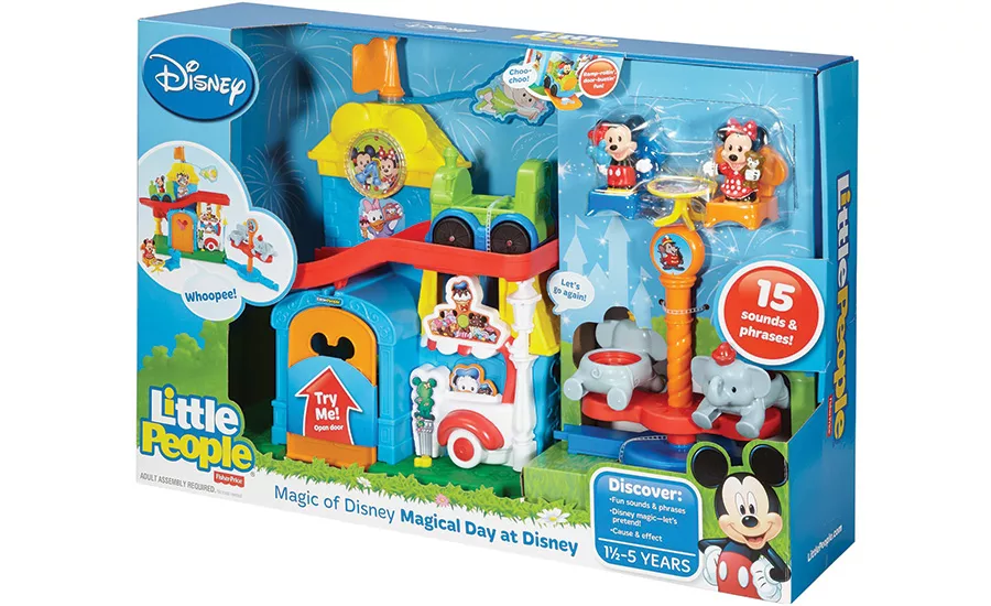
Mattel’s Fisher-Price has become one of the world’s most trusted toy brands for preschoolers for almost 80 years. Like many classic brands, Fisher-Price has evolved its toys and its packaging. The brand’s recent Little People package design has been refreshing in its approach which feels and looks spontaneous and un-designed. The toys are partially or fully visible inside the packaging, and additional artwork insets are reminiscent of frames in animated series. They suggest action and storylines, which kids themselves help to create. It’s as though the brand managers took into account how young children play—and the phrases they use as they play so that speech balloons could be added in a deliberate manner around the artwork.
Kids respond to the colorful, visual language while parents, who know their children’s play patterns, understand the verbal cues, making it easy for them to envision their kids playing with Little People toys. The “Magical Day at Disney” playset presents a great example of this. Mickey and Minnie Mouse figures take a tour of the park by embarking on a train which rolls down a ramp. There’s a cool spinning Dumbo ride, a food court where a quick snack can be had, and the figure of Donald Duck, who can be made to pop up behind the ice cream cart. Kids can also spin Tinker Bell, the diminutive fairy, so that she appears to fly overhead.
All of this is depicted on the front panel of the packaging with sound effects or short phrases contained within speech balloons. “Choo-choo!” appears on inset artwork of the train; “Wahoo!” on inset art of the amusement park; “Let’s Go Again!” at the top of the train ramp. On the back panel of the packaging: “Wahoo! This is a blast!” appears again. “Who wants to go on the spinning Dumbo (ride)?” Arrows point to major toy features with more verbal communication: “Tinker Bell. Give her a spin;” “Food Court. When it’s time for a snack;” and the like.
Another Little People playset dubbed Spinnin’ Sounds Airport is similarly packaged. There are two figures of a passenger and pilot. The airport features a ticket counter and baggage cart for luggage as well as a food court for quick snacks. When the plane is boarded, it takes off and flies by spinning from top to bottom around a pole by pressing a button. After it lands, the plane can go back up to the top of the pole and fly to a brand new destination or taxi to the hangar to refuel for its next flight. The packaging’s front panel depicts the plane in flight with the phrases “Fasten your seatbelt,” “Ready for takeoff” and “Zoooom!”
Young children love these kinds of toys. They’ll create their own adventures and stories prompted by the sounds, phrases and songs emanating from the toys and the prompts they’re given. And this process begins with specific prompts on packaging that’s unsophisticated, child-like and highly emotive.
Packaging Takeaways
Consider making your brand and your packaging more human and connecting. Let it appear to be less artful and more unstudied; dare I say un-designed? Think of an unmade brand like an unmade bed: Kind of rumpled, deeply inviting and totally comfortable. Ahhh!
¹https://www.ces.tech/CES/media/pdfs/garys-bookclub-media/author-Bhargava-PressKit.pdf
Looking for a reprint of this article?
From high-res PDFs to custom plaques, order your copy today!


