Licensed Packaging: Tap into Consumer Emotions
Accentuating the Human Aspects of the Brand
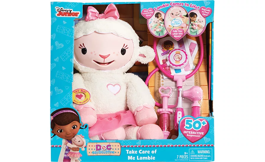
Toys R Us ranked Doc McStuffins Take Care of Me Lambie in its top 15 holiday toys for 2015. The packaging for the interactive plush toy is highly emotive for kids. The toy and Doc’s tools of her trade are fully visible inside the package, which triggers the nurturing nature of children.
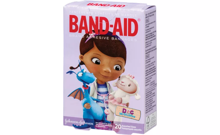
In a perfect pairing of brands, Johnson & Johnson’s Band-Aids feature Doc McStuffins holding Lambie and Stuffy. There is no verbal brand communication; none is needed other than the Doc McStuffins brand identity.
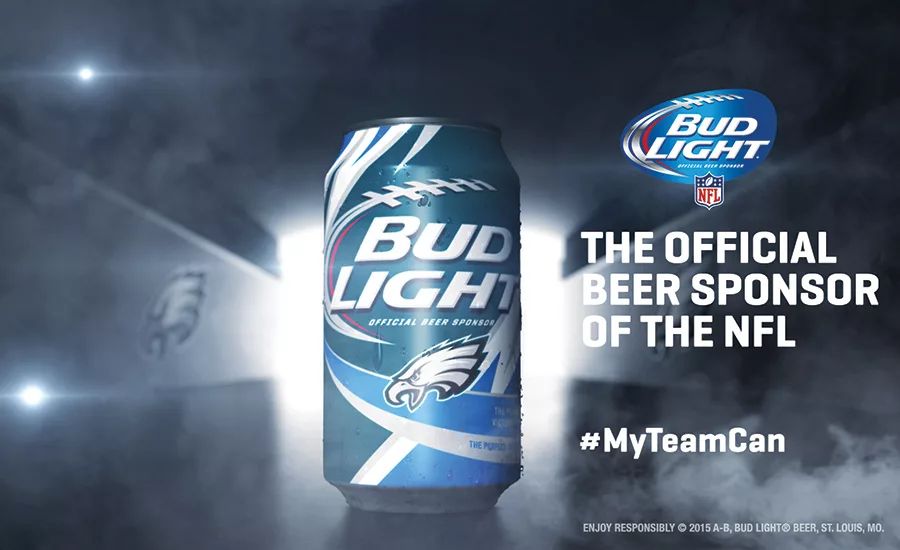
NFL and Budweiser offer a road map for other licensors who want to remain relevant and compelling to their fans. This is a terrific example of co-branding that works well.
Every character from the worlds of toy and entertainment has a story; the ones that have engaging backstories and compelling, ongoing sagas create avid fans. The best of these brands transcend cultures and generations and have legions of fans around the world. So why isn’t it easy to make licensed consumer products bearing their images a success?
Licensed properties, like countless consumer product brands in every category, have intense competition in the marketplace, and all are clamoring for the customer’s attention. Making them stand out from everything else takes vision and marketing strategy. It takes knowing the fan base intimately in order to understand what is relevant to them to keep them engaged with the property. A well-conceived, well-executed licensing program style guide and licensed product packaging program lead to compelling consumer product and package design. They ensure a property will have a strong retail presence and drive connections with consumers. That’s why we can boldly assert: “Design adds value to brands.”
Working with a licensed property necessitates the creation of a unique visual language and design aesthetic that is based on the primary visual assets associated with the property. Great design doesn’t just happen. It’s a process. But it makes all of the difference in the world. A rich visual language tells the brand story to the property’s fans in a compelling manner. It goes well beyond putting imagery of the property on consumer products and packaging. It’s the overall design aesthetic that stops fans in their tracks in retail environments burgeoning with an overwhelming amount of branded merchandise.
How licensed properties are represented matters. The proper visual aesthetic, when applied to design elements incorporated into licensed consumer products, creates a higher level of expression that minimizes the need for a great deal of verbal brand communication, important in an era where consumers are reading less and becoming increasingly visual. To be most effective, verbal communication should be both limited and selectively chosen to bring the property’s fans into the story.
The proper aesthetics elicit an emotional reaction because they’re infused with the personality or archetype of the brand. Fans are deeply impressed with the desirability of these kinds of licensed products. They promise satisfaction beyond similar products within their categories that aren’t licensed. After all, this is a meaningful brand in its fans’ lives. Strong brands promise quality, but the best brands offer something more: enjoyment. That’s what the fans of licensed properties value most.
CAPTURING THE EFFERVESCENCE: PACKAGING FANTASY
The most exciting aspect of licensing program design, in my view, is that it enables design experts to push packaging forward in a bold manner. A fast-changing culture and restless fans eager for connecting emotive experiences enable designers to push the envelope further with licensed consumer product packaging. After all, we’re packaging fantasy, and we need to find new and exciting ways to capture it.
That doesn’t imply that we should substitute style for substance. Rather, the opposite is true: The most compelling licensing program design conveys special meaning. Each visual and verbal design asset comes together to speak to the fans of the licensed property in a manner that only they can fully understand and appreciate. These design assets bring the property to life, which the image alone cannot do. They become drivers unique to the brand that make it feel human and real.
The Walt Disney Company understands and exemplifies this approach to licensed product package design. It’s no accident that Disney is the number one licensor in the world, currently boasting eleven billion dollar properties, according to the “Top 150 Global Licensors Report” released in May 2015 (http://bit.ly/1U0PeE2). The entertainment giant has continued to see significant sales growth on both legacy and newer properties, generating a record $41 billion from licensed merchandise in 2013, according to a report published in Variety in June 2014 (http://bit.ly/WLjZ7R).
Disney not only owns some of the world’s most endearing properties but also knows how to ensure success at retail by creating compelling licensing program design. Every property is unique, and the language, look and feel that is created for each is just as unique. The princesses continue to be Disney’s #1 property, followed by “Frozen,” “Cars” and “Star Wars” among its top legacy brands. But another newer property that appeals to preschoolers has quietly been making inroads in the U.S. and the U.K. Since the 2012 debut of “Doc McStuffins” on the Disney Junior channel, the young wannabee doctor has been a favorite with children and their parents.
The series features freckled six-year old Dottie “Doc” McStuffins who emulates her physician mom and diagnoses the illnesses of her toys and dolls by consulting her medical encyclopedia, “The Big Book of Boo-Boos.” She enlists the aid of her stuffed friends — Stuffy the Dragon, Hallie the Hippo, Lambie the Lamb and Chilly the Snowman — as well as her magic stethoscope to help make her ailing toys “feel better.” Doc’s clinic is set up in her backyard playhouse.
Boel Ferguson, former VP and GM, Disney Channels and Disney Online, U.K. and Ireland, observed in the release “Disney Marks Doc McStuffins’ Success” (http://bit.ly/1OTW7qC): “The success of ‘Doc McStuffins,’ both here [the U.K.] and in the U.S., is testament to the fantastic storytelling and sensitive approach taken to highlighting what can be a daunting experience for our younger viewers when they visit the doctor.” She added: “Doc is an aspirational character and a unique female role model for our younger viewers, giving an insight into what is a fascinating and fulfilling career endeavor.”
But the property’s reach goes even deeper than that as young children are shown how to be nurturing, which has a natural, emotional appeal for them. The animated series on the Disney Junior channel was an immediate winner, and by 2013, the brand had already generated $500 million in the sales of consumer products, mostly books and toys, according to the Time magazine article “Disney’s Perfect Answer to Barbie Is Doc McStuffins” that appeared in August 2014 (http://ti.me/WX2YIG). Licensed consumer product launches are currently being planned in multiple categories.
Toys R Us ranked Doc McStuffins Take Care of Me Lambie in its top 15 holiday toys for 2015. The packaging for the interactive plush toy is highly emotive for kids. The toy and Doc’s tools of her trade are fully visible inside the package. Verbal brand communication is on target, telling kids and their parents that Lambie “Sings the ‘I Feel Better’ Song,” “Tells You What She Needs” and “Responds to Your Care.” The Disney Junior logo appears on the upper left-hand side of the packaging, and Doc herself appears holding Lambie on the lower corner. Next to her is the property’s brand identity: a bandage with Doc McStuffins’ name across it. The “o” in Doc has another bandage inside with a heart in its middle: perfect for the compassionate nature in which she “practices medicine.”
In a perfect pairing of brands, Johnson & Johnson’s Band-Aids feature Doc McStuffins holding Lambie and Stuffy. Wearing her lab coat and stethoscope, Doc is the picture of a compassionate caregiver, helping youngsters to feel better about having their boo-boos treated. There is no verbal brand communication; none is needed other than the Doc McStuffins brand identity.
PLAYING TO POWERFUL EMOTIONS
Adults respond to human emotions leveraged by packaging as much as children do, but some licensed consumer products are better at targeting these emotions in adults than others.
Few things stir up stronger emotions than professional sports. The NFL is the most powerful sports brand in the country. The league’s adroit decades-long marketing has built the NFL into a force with a massive audience, 44 percent of which is female. Budweiser, a leading NFL sponsor, has tapped into NFL fervor with its limited-edition Bud Light beer. By packaging its beer cans with 28 of the league’s 32 teams’ colors and insignias, Budweiser has created an instant collectible for fans. (Four teams — the Chicago Bears, Green Bay Packers, Dallas Cowboys and Minnesota Vikings — were omitted because they are sponsored by MillerCoors.)
These cans feature stand-out artwork: The oval football shape and iconic NFL football laces define the architecture. Team-specific striping, graphics and color palettes make up the background. Without the use of product-specific verbal brand communication or even a human face, this is compelling packaging that speaks to fans of each NFL market in a deep manner. Instead, authentic team-related messaging is printed on each can. For example, the Cleveland Browns can reads, “The perfect beer for being Dawg Pound proud.” New England Patriots’ can has the sentence, “The perfect beer for dropping R’s but never passes.” Philadelphia Eagles’ can features the line, “The perfect beer for proving VICTORY is spelled E-A-G-L-E-S.” You get the idea.
What’s important to realize is that while the NFL and Budweiser are mature brands, they both offer a road map for other licensors who want to remain relevant and compelling to their fans. This is a terrific example of co-branding that works well. It keeps both brands in front of football fans in a meaningful way by going to the core of what matters most: not the sport of football alone, not the NFL and not even a cold brew, but the favorite team of each fan. Favorite teams recall heritage and evolving storylines that matter deeply. And those stories revolve around players, coaches and fans who are all bound together by their love of a sport.
GIVING FULL EXPRESSION TO THE LICENSED PROPERTY
Licensed consumer product and packaging design, and their interpretation by the brand’s fans, confirm the goal of design experts — to achieve a true emotional connection by leveraging the most human aspects of the property: those that specifically trigger the deepest of human response and emotions. And that can’t be delivered without developing a unique visual language and design aesthetic.
Looking for a reprint of this article?
From high-res PDFs to custom plaques, order your copy today!


