When to Ditch an Old Design
Should you merge that classic package design with the modern? Or should you break new ground?

Crayola’s deliberate use of visual design assets such as one crayon holding three other colored crayons adds personality to the brand.
Crayola’s refreshed logo with a rainbow-colored smile elicits an emotional response from people of all ages.
Campbell’s has gone beyond its iconic red and white cans to introduce products with new colors and visual images.
Marketers are fond of saying “What’s old is new again.” These marketers are referring to wistful consumers who associate retro brand packaging with a sense of nostalgia—a recalling of simpler, less complicated times. With all due respect, there’s more at play here. Of course, consumers who see classic product packaging generally make positive associations with the brand. There’s an element of authenticity and trust because of the long life of a brand that’s still going strong. But recognition doesn’t necessarily create an impulse to buy. Strong emotions do.
The opportunity exists when repackaging a classic brand, or licensing one, to leverage those unique and desirable elements about it to a brand-saturated culture. When contemporizing packaging, it’s important to maintain relevance with a modern audience while preserving the key visual equities that make consumers recall not only the heritage associated with the brand, but the emotive aspects of it that have moved them to purchase in the past. That leaves designers with a choice: put a modern twist on classic packaging or jettison it altogether. However, there are two other factors to consider.
First, younger consumers might not have any history with the brand, making it even more important for the brand to present its equities in a manner relevant to them. Second, there are new consumer products being positioned by classic brands that break out of the mold completely. These products call for new packaging that is a departure from the core look and feel of existing packaging. So, if we’re going to create a package design that stands out and stands apart, we need to look at those classic properties and brands through a new lens. The focus of that lens is customer experience.
Keeping it Engaging
In an era when high-tech toys seem to be dominant, surprisingly few tech brands are showing strength. Instead, many classic brands are leading the way. That’s likely because they encourage intergenerational interest and play. Whether legacy toy brands are being reinvented or reintroduced for today’s kids, the winners have packaging that speaks to this generation in a compelling manner while simultaneously touching the hearts of parents and grandparents who have fond memories of them.
The addition of interactive apps to some classic toys has upped the ante on their appeal as they bridge real and virtual worlds, effectively reinventing them. Hello Barbie and LEGO Dimensions offer great examples of these kinds of toys. Consumer product packaging for these brands expertly leverages their important visual assets while simultaneously showing the interactive nature of these new toys in a highly relevant manner.
Hello Barbie, for example, is positioned in clean, contemporary packaging designed with a white background. A round window allows the face of toydom’s most famous fashionista to be displayed. A round speech bubble is superimposed over the window with the words “Hello Barbie” emanating from a young girl who is photographed “speaking” with the doll by pressing on her belt. The speech bubble is in Barbie’s signature pink, and the word “Barbie” appears as her logo in classic script—these visual brand elements are recognized around the globe.
The verbal brand communication is short and on point: “Press Belt & Talk” with a pink arrow that points to Barbie’s belt. The signature pink bar across the bottom of the package shares information on the necessary app that must be downloaded to make Barbie interactive. The words “Let’s Chat” and “Doll Answers” appear with appropriate iconography. The left-side panel of the package shows the full-length image of the doll clad in a white t-shirt, black belted jeans and silver leather jacket. Barbie is also wearing fashionable jewelry, as we’d expect. While this package design stands out from basic doll packaging, it carries enough of the visual equities of the brand forward to tell consumers unmistakably that this is a unique Barbie doll.
Media Stars
Many entertainment properties with legacies continue to create rich content and use multiple media platforms to allow their fans to experience them in a highly personal manner. Doing this enables character back stories to be explored in depth, as well as advance new storylines that are relevant to modern audiences.
Hasbro’s Transformers, DC Comics’ Batman and Marvel’s Spider-Man are great examples of these brands. With the
release of each new film or animated series on television or online, these properties continue to extend the brand with new consumer products and packaging in an effective manner. They deploy new licensed package design not only for toys but in all consumer product categories by deftly using visual cues that are relevant to the brand, while merging each property with backgrounds and other visual assets that are appropriate to the latest storylines.
No Tech and Sticking To It
Many classic toy brands haven’t gone high tech, nor are they media stars. Instead, they’ve repositioned their offerings, repackaged them and then relied on compelling line extensions to remain relevant to kids’ current interests and play patterns.
Crayola has relied on no-tech line extensions for its legacy brand throughout the years, retaining its relevance even though it’s more than 100 years old. In 2002, Crayola refreshed its logo creating a rainbow-colored smile within a signature cartouche of yellow outlined in green. The logo elicits an emotional response from people of all ages, and it reflects the brand perfectly. The Crayola brand name appears in a rounded custom font rather than the older block-lettered versions of the past. The new brand identity is brilliant because it infuses personality.
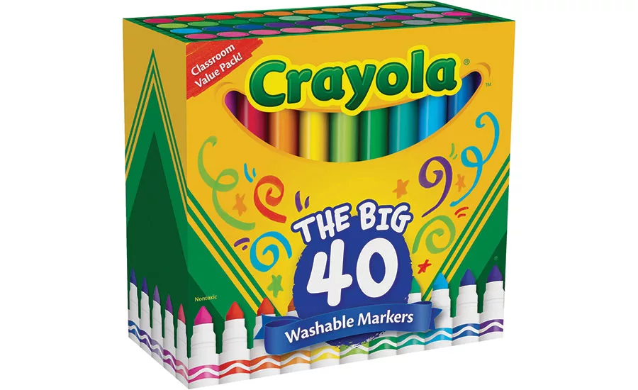
Smart line extensions include washable crayons (bringing a sigh of relief to parents everywhere), washable markers, construction paper crayons, colored pencils, colored chalk and washable kids’ paints. There are also packaged sets containing a mix of these products that engender creative play and artistic work for kids and adults alike. Crayola brand marketers have wisely positioned their products for consumers and teachers by leveraging smart, direct verbal brand communication on the package in an effective manner.
Colors Say ‘Crayola’
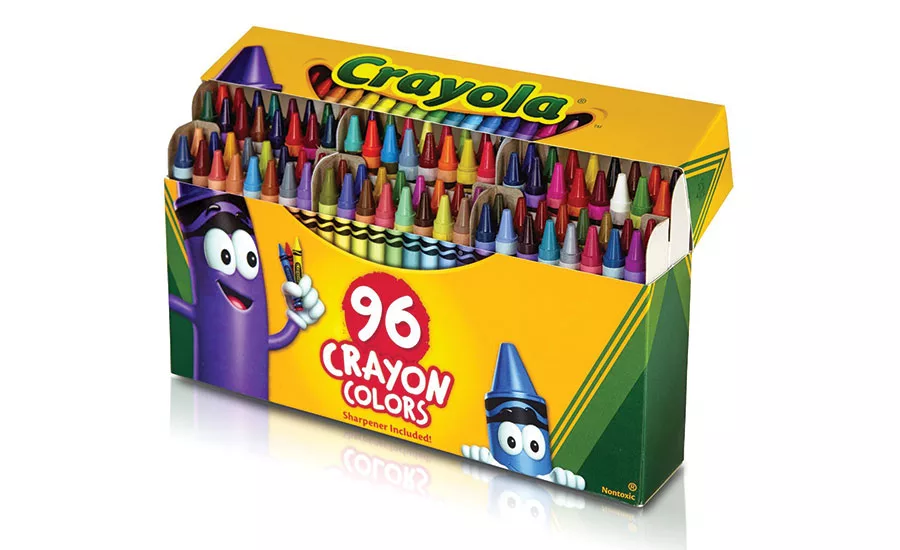
The ever-growing product line is unified by Crayola signature brand colors of yellow and green, with key visual assets on packaging. Classic package design architecture featuring dark green, angled stripes in the bottom corners of the front panel and the brand identity clearly say “Crayola.” But personality has been added to what might otherwise be viewed as basic commodity products. Clever packaging on boxes of crayons merely utilizes the Crayola brand name instead of the full logo, but it appears above a broad smile depicting a range of crayons as teeth at the top of the center panel. This is ingenious and effective.
Boxes of washable crayons depict a brightly-hued Crayola with arms and large eyes peering over sunglasses on the right-hand side of the packaging. Bubbles indicating water-solubility appear on the center front panel. The 96-crayon box similarly employs a smile of crayon teeth beneath the brand name. And then there’s a smiling crayon with bulbous eyes holding three crayons himself on the left-hand side of the packaging while another crayon peers up from the lower right-hand side. This is packaging that is amusing and appealing to consumers of all ages.
Crayola’s deliberate use of visual design assets like these adds personality to the brand. Not to mention pops of color. And isn’t that what the brand is all about? This is packaging that delivers a great deal of information in an emotive manner—at a glance. It’s fresh and delivers enjoyment in a compelling manner while retaining the relationship-building, classic assets of the brand. There’s nothing stodgy about this packaging.
Doing Something New
Few American consumer product brands are as iconic as Campbell’s Soup. Yet, this is a company that honors its legacy while resisting the temptation to rest on its laurels. Campbell’s is feeling its way into the future and making some meaningful inroads with consumers because the company is taking its time to develop, position and package new products.
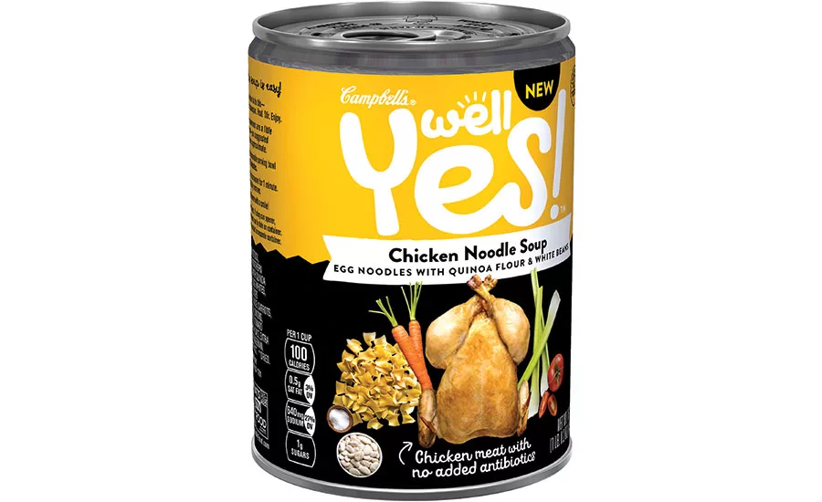
The “Well Yes!” line that debuted at the end of 2016 took eight months to develop. Packaging wise, the sub-brand is a departure for Campbell’s and for the ready-to-eat soup category. The decision not to package these soups under the red and white label makes perfect sense. Taking a page from the natural product industry, Campbell’s Well Yes! soups pack a nutritional punch: whole grains, legumes, vegetables and antibiotic-free chicken were carefully paired in interesting combinations. Additionally, these soups don’t contain modified starches, artificial colors, flavors or ingredients of any kind.
A new package design system had to be developed for Well Yes! to reflect its wholesomeness. It also needed to stand out from every other soup brand in retail food channels. The new labels accomplish this goal. They are black across the bottom so that visuals encompassing the ingredients stand out in stark contrast for each variety.
Where appropriate, “chicken meat with no added antibiotics” appears in a script font with an arrow that points to the image of the bird. Very effective. The top part of each label features the Well Yes! brand logo in unique typography with what appears to be the sun’s rays above the “e” in the word “Well.” Bright backdrop colors on the top of each label clearly act as segmentation for each variety. The Campbell’s logo appears in a much smaller size at the upper left of the Well Yes! logo. This is clearly done by design because the sub-brand is quite different than Campbell’s core soup line.
Parting Thought
Legacy brands might be making a mistake if they choose to go too retro with their packaging. It’s important to recognize that today’s sophisticated, empowered consumers respond to classic brands if marketers up the ante with contemporized package design that speaks to them in a relevant manner, so we can’t get stuck in the past.
Today’s packaging should imbue life and personality into the brand. Just make sure to retain and leverage the core visual assets that define the brand in the minds—and hearts—of consumers. Then, add new design cues to keep the brand fresh and evergreen. You know, something old with something new. Culturally, we’ve always known that works.
Looking for a reprint of this article?
From high-res PDFs to custom plaques, order your copy today!


