Artisanal Jerky Ditches Cowboy Cliché
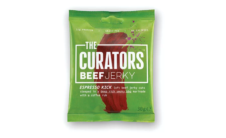
THE CURATORS BEEF JERKY
To date, mass-produced jerky brands referencing strong American traditions of cowboys and cattle have dominated the category, and even new challenger entrants have aligned with clichés of masculinity. B&B studio’s concept for U.K. brand THE CURATORS focuses instead on inspired flavor combinations and the artistry of the product, with a design that feels more modern, tastier, healthier and gender neutral.
Stepping away from the tough, chewy products that are synonymous with the category, THE CURATORS has devised a method that retains a more tender meat texture and adds depth of flavor, delivering a new dimension to the jerky sector. This is reflected in the brand language with a challenging color palette and playful slogans.
Founders of THE CURATORS, Max Rees and Ed Hauck, are passionate foodies at heart, and they sought to collect flavor inspiration from around the world. B&B studio introduced a vibrant brand identity which brings together the concept of curating flavors, as you would art, with the process of curing meat. A single brushstroke of paint that resembles the jerky is featured on each pack, representing the creativity at the heart of the brand. A simple graphic border around the brand name adds weight to the on-shelf packaging and provides flexibility for off-pack branding with punchy straplines and imagery of the high-quality ingredients.
Shaun Bowen, creative partner at B&B studio, says, “Jerky has been rising in popularity in line with trends for higher protein diets, however both established and challenger brands have stuck to relatively narrow type codes, creating an opportunity for a healthy, flavor-rich product like THE CURATORS to disrupt the sector.”
Looking for a reprint of this article?
From high-res PDFs to custom plaques, order your copy today!


