Package Design's Rising Stars: Class of 2018
Overachieving and under 30 - Meet the talented, young artists who are leading the future of design.
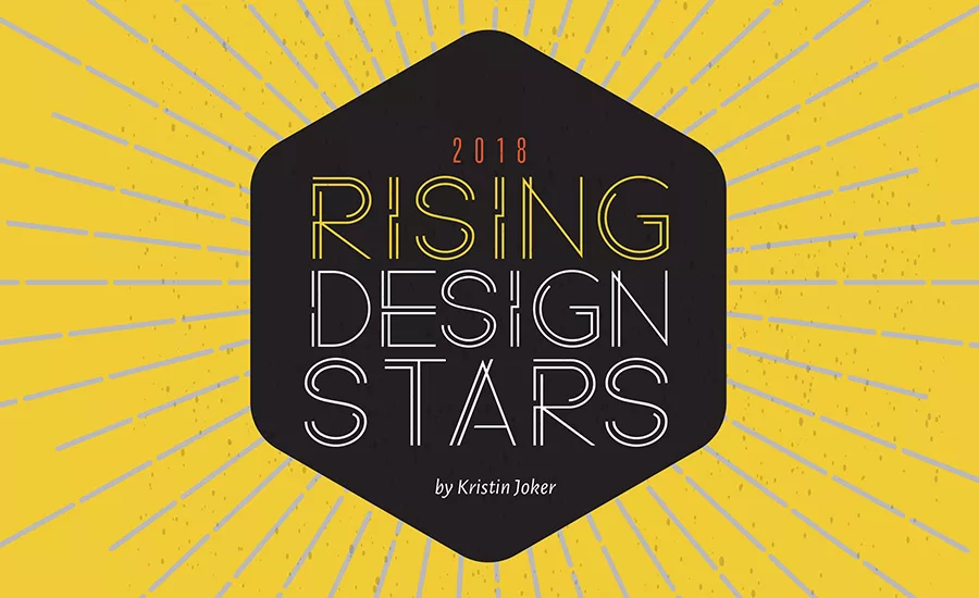
BrandPackaging honors the top—and, coincidentally, nearly all female— package designers of the year who are making an impact on clients and consumers consumers while making a name for themselves.
!!!!! MOST NOMINATED !!!!!
KELSEY DIEHL, 27
graphic designer, The New Primal
North Charleston, South Carolina
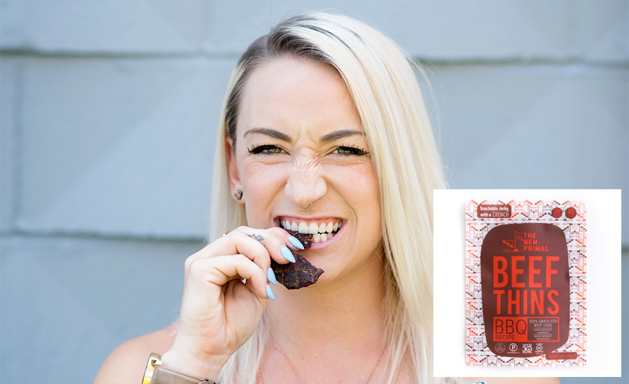
Winning Project: Beef Thins
With seven nominations, Kelsey Diehl is Brand Packaging’s rising design star of 2018. Diehl’s talent was evident early on in the hiring process at the grass-fed jerky snack company The New Primal, “During our hiring process we put all potential candidates through a design challenge. Our entire team chose Kelsey's design despite being one of the younger designers,” says Melissa Miller, just one of the many who nominated Diehl. The Savannah College of Art and Design graduate previously worked for Amazon designing book covers before beating out other candidates for the designer position at The New Primal. Her latest package design for Beef Thins offers a fresh take on the somewhat stale jerky category. Diehl was tasked with designing packaging that was equally as disruptive and unique as the product inside. “Her revolutionary designs accurately represent the vibe of our company, as well as the audiences we hope to reach,” confirms office logistics manager, Meredith Kidd.
Kelsey’s POV
When the concept of The New Primal Beef Thins was first created, we went in with the understanding that there was nothing like it in the marketplace. As such, I knew it was imperative that the packaging be like nothing else in the competitive landscape. I mixed our traditional, clean and simple style with a bit of flair to ensure we stood out. The decision to remain consistent in regard to color schemes across our existing meat snacks ensured that, even with a more whimsical style to the packaging, the brand was still recognizable and familiar to our consumers. The repetition of the logo in the background of the packaging is a tribute to our original logo, making this product truly “The New Primal."
KATE PEREZ, 29
associate creative director, Interbrand
New York City
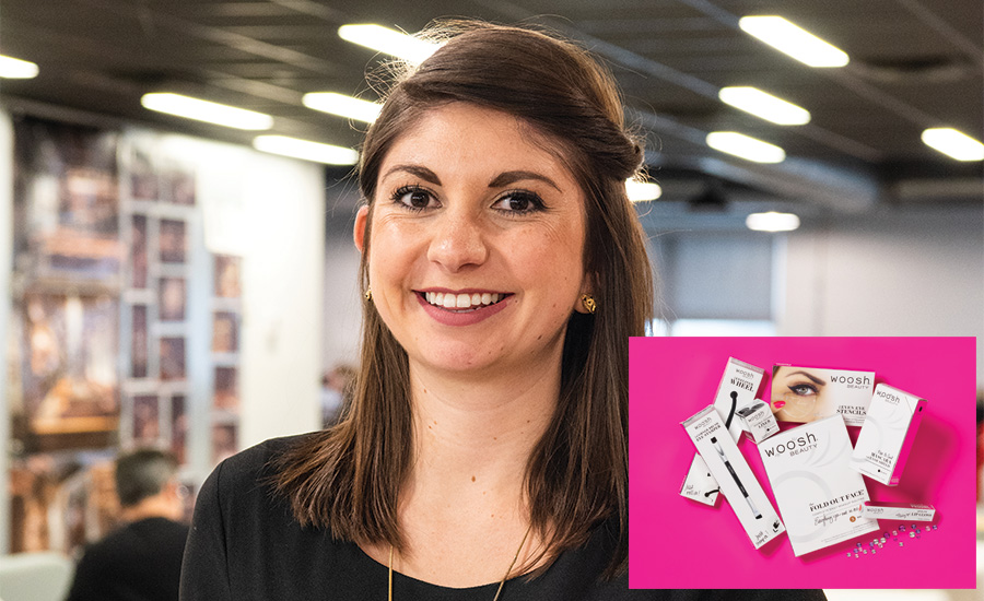
Winning Project: Woosh Beauty
Over the years, Kate Perez has dedicated herself to becoming a skilled expert in packaging. She is constantly evolving, and is looking to improve within her craft and as an artist. She was nominated because of her infectious personality, creative mind, communication, design and branding skills that keep her top of mind with every client she reaches. If that weren’t enough, Perez truly cares about every brand she works on. In addition to working on the Whoosh Beauty cosmetics line, Perez designs packaging for P&G and Kroger brands. Her co-worker Liz Sheeks confirms, “Kate is always able to deliver on the brand promise, and enriches the overall experience for everyone with every project.”
Kate’s POV
For me, designing is so fun because I get to watch my work turn from concept to reality. My favorite design element would have to be color. I love picking colors out of the pantone book to get ready for print. There is something so innately emotional and personal about color—for me, it’s the best part of every project.
TIERNEY LATELLA, 27
senior designer, Little Big Brands
White Plains, New York
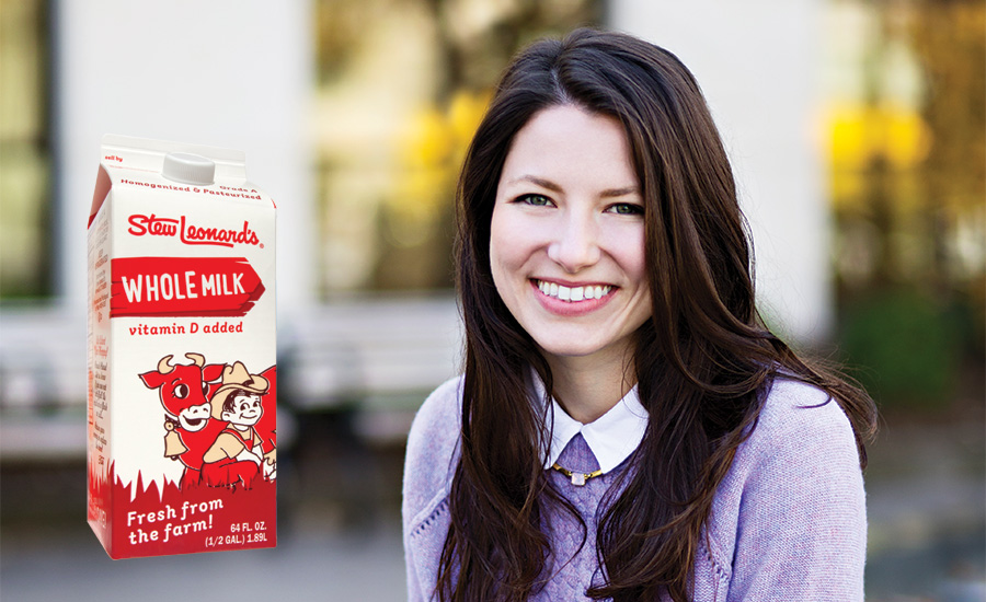
Winning Project: Stew Leonard’s private label rebrand
Tierney Latella is the ideal designer: A strategic thinker, a talented artist, an ace with clients and a leader in the studio as well as a delightful person to be around. Latella has quickly risen through the ranks at Little Big Brands from her beginnings as an intern while finishing her degree at Syracuse to now, a couple of years later, where she is leading projects as a senior designer.
Tierney’s POV
When the chance to redesign the dairy section of the beloved brand from my childhood came to Little Big Brands, I jumped at the opportunity! I knew we needed to maintain the quirkiness of the brand while also cleaning up the architecture on pack. The iconic boy and cow illustration anchors the design, and a simple wood signage graphic was introduced to aid consistent communication. This element served as a source of wayfinding throughout the store and was a natural fit for the pack. Now I love shopping at Stew’s even more and am thrilled to see the design we developed for diary quickly permeating their entire store brand.
MIRANDA WILLIAMS, 27
graphic artist, St. Clair Winery
Deming, New Mexico
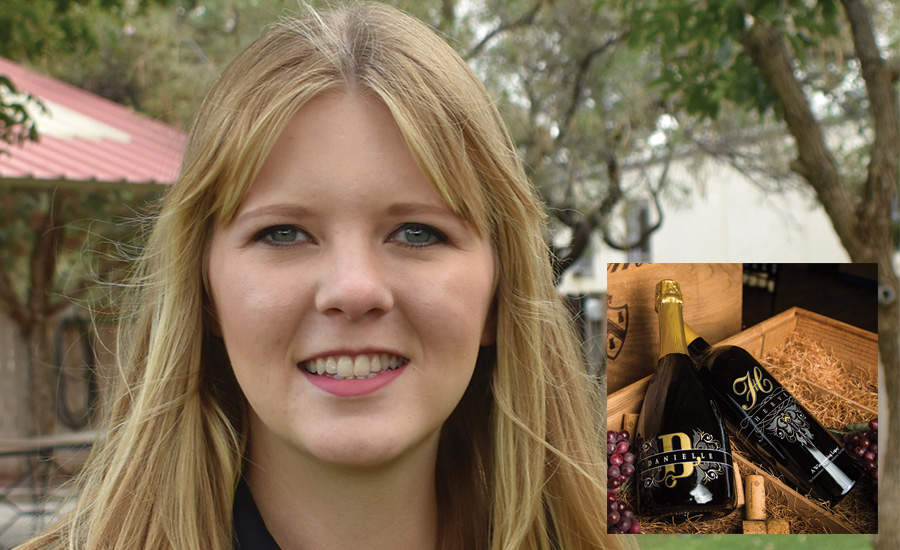
Winning Project: Danielle, a D.H. Lescombes limited-release wine
Miranda Williams is known for the unique and interesting special touches she adds to every project. Her outstanding design and fresh take on the St. Clair Winery branding showcases her talent. From initial concept to final design, her design processes are always well thought out, and her choice of color and typography combined with the different substrates and effects result in a stunning final product.
Miranda’s POV
The Danielle bottle is part of a pair of commemorative wines created to honor the winery founders Hervé and his wife, Danielle, on the 25th anniversary of the launch of the D.H. Lescombes line of wines. In order to reflect the unique personalities of each of the founders, each of the bottles was designed by a different designer. At the heart of the Danielle design is a custom monogram flanked by scrollwork that could be found on the Hervé bottle as well (this was one of the elements that “married” the two bottles together visually). Since the bottle is screen printed, I got to design in the round which allowed for more unique opportunities for organizing the various information that needs to be communicated about the wine and the person it commemorates. The overall design successfully conveys Danielle’s classy, lively and genuine personality. I really enjoyed the conceptual and collaborative nature of this project. Making sure there is a strong concept behind my work is very important to me as a designer and communicator. Connecting with the audience for the work I am producing is paramount. Projects with a rich story built into it are such a joy to work on.
JOSH JEVONS, 29
senior designer, Cactus
Denver, Colorado
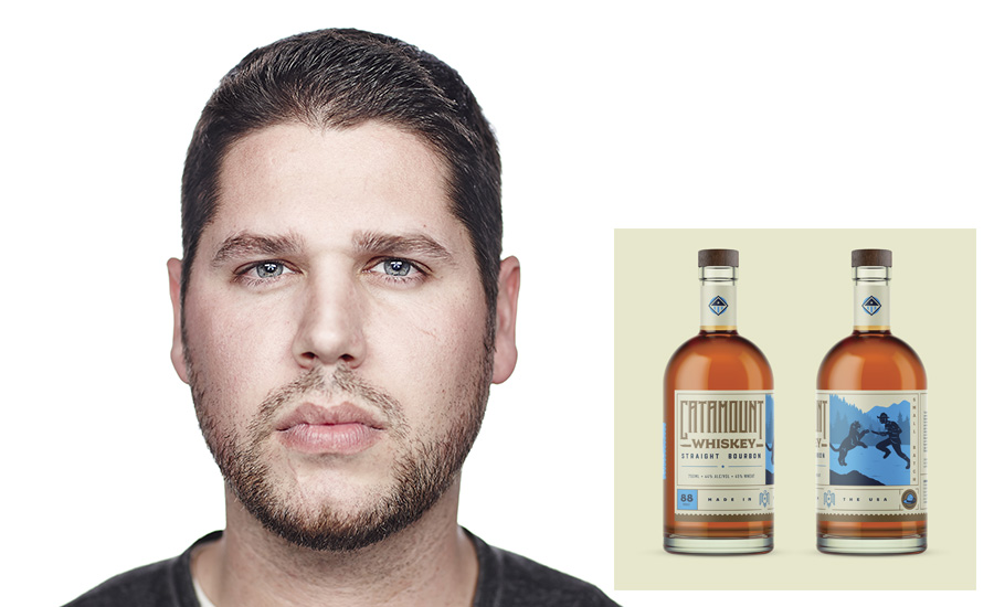
Winning Project: Grand Teton Distillery, Catamount Whiskey
Josh Jevons started his career in upstate New York before making the journey west to Colorado. Jevons’ talent spans mediums, but his specialty is creating eye-catching brand and package design in the spirits category. His award-winning work for Buzz & Bloom Honey, Hook or Crook Tequila, Grand Teton Distillery, Westfax Brewery and Odell Brewery has cemented his reputation as a go-to designer for brands looking to connect with consumers with discerning taste.
Josh’s POV
The Grand Teton Distillery whiskey packaging tells stories of legendary pioneers, frontiersmen and adventurers of the wild American west. From Teddy Roosevelt’s dagger-clad bout with a puma to a bloodthirsty manhunt by Blackfoot tribesmen, these labels celebrate the western spirit of adventure, tenacity and grit. The aesthetic is intended to communicate the rugged nature of the stories as well as the place in which the whiskeys are made, the Teton Mountains while maintaining a modern feel.
CARRIE WARREN, 29
graphic designer, Humanaut
Chattanooga, Tennessee
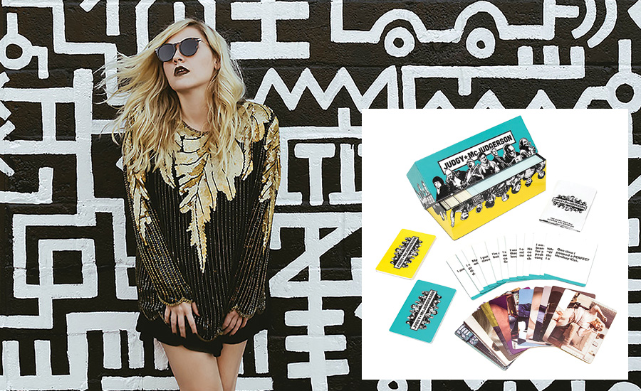
Winning Project:Judgy McJudgerson party game
Chattanooga native Carrie Warren has an extensive background in art direction and design. While at Humanaut, she has created the packaging and branding—including the actual product—for Judgy McJudgerson, a party game the agency recently brought to market. Other projects include branding and package design for local brewery Hutton and Smith where Warren carefully crafted everything, from refreshing the brand’s logo to the design for each individual SKU and all packaging.
Carrie’s POV
In the beginning stages of the Judgy McJudgerson project, I thought to myself, "The possibilities are endless," and I wasn't wrong. This certainly was one of the most provocative and impelling projects I’ve ever had the opportunity to work on. Diving into the mindset of society can be a very strange yet exciting place. Therefore, I wanted the visual experience to represent the bold yet fearless side of judgement and convey that players can be unabashedly abrasive with their judgements through visual cues.
EMMA WILLIAMS, 25
designer, Sloat Design Group
Petaluma, California
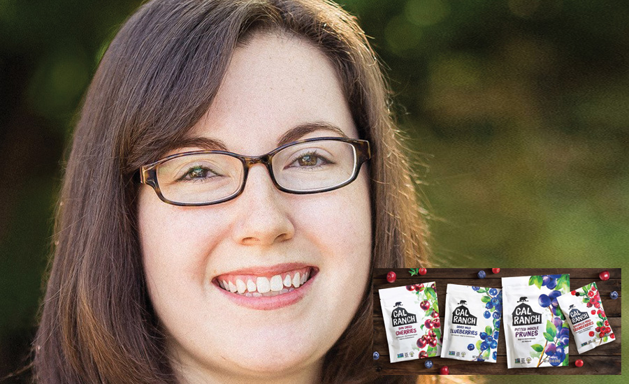
Winning design:Cal Ranch Foods
Emma Williams interned at Sloat Design Group while earning her BFA in Graphic Design at California Polytechnic State University, and she officially joined the team after graduating with honors in 2013. Williams’ talents span a broad range of disciplines from traditional print design to photography and web design. In just a few short years she transitioned from intern to seasoned designer who manages accounts of all sizes. With equal enthusiasm and dedication, Williams also leads various non-profit and community engagement initiatives, including the agency’s Farm-to-Shelf service grant where she spends more than 200 hours a year on pro-bono work helping local family farms.
Emma’s POV
My approach to design always starts with an in-depth look at the client’s brand equities and distinct positioning. Then I'll survey the product category looking for areas of opportunity that could be further explored. I also love browsing through images on Pinterest and wandering supermarket shelves for design inspiration before I start sketching. The final designs presented take advantage of the unique opportunities while embodying the essence of the brand with graphics that really stand out on shelf and resonate with consumers.
MELANIE LEWIS, 25
graphic designer, BexBrands
San Diego, California
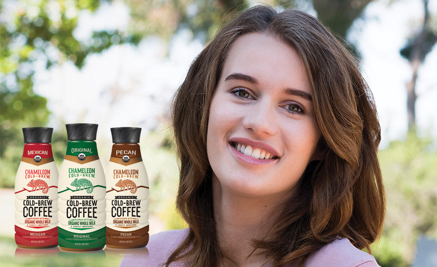
Winning Project: Chameleon COLD-BREW COFFEE
Melanie Lewis has a rare combination of innovative design talent, dedicated drive, creative problem solver and an innate understanding of how to communicate with clients so they understand project objectives. Those who work with Lewis applaud her tenacity to push the limits of design to create brand identity that stands out on shelf.
Melanie’s POV
As a craft coffee lover myself, I strived to enhance the consumer’s experience through design by maintaining a strong brand presence and highlighting the quality of the product with premium, yet still approachable, packaging.
LUCIE MOUCHET, 27
designer, Vault49
New York City
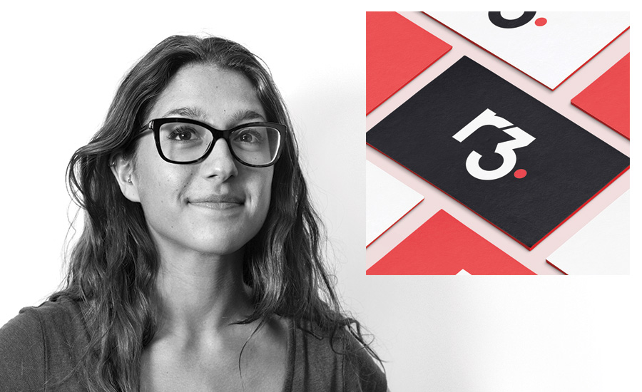
Winning Project: R3 brand identity and logo
Lucie Mouchet joined Vault49 in 2015 and has quickly proven herself to be an indispensable part of the team. Naturally curious and inherently tenacious, she’s quickly able to find the right solution to bring ideas to life in ways you can’t help but be wowed by. Humble yet confident, Mouchet presents her ideas with an excitement and charm that is contagious. Multi-disciplined in her ability, Mouchet's talent spans corporate identity, website design, advertising, packaging and illustration. In her relatively short time at Vault49, Mouchet has already created standout pieces for clients such as Baileys, Lays, Raid and Pepsi as well as creating the identity for Vault49’s 15-year anniversary.
Lucie’s POV
The goal was to position the R3 brand and product offering as the de facto industry leader in the blockchain sector. The visual language of financial services technology is predictable, defined by a sea of blue with generic infographics and circuits. To me, that type of tech-looking communications are cold and without heart. The team at R3 are so passionate, and their humanity is clearly critical to their success. I wanted to capture that in friendly letterforms that complemented their confidence and leadership. A color palette was created that breaks from the industry blue with a pop of red, underpinned by a geometry that gave the logo a timeless, confident look. Interlocking shapes and numbers cue collaboration and expertise, hence the connector between the R and 3, punctuated with a full-stop.
RYAN WILSON, 27
packaging engineer, Hasbro, Inc.
Providence, Rhode Island
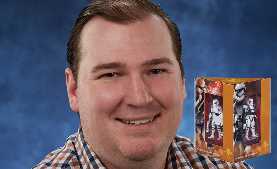
Winning design: Star Wars Stormtroopers
As a package engineer at Hasbro, Ryan Wilson gets to design the structural packaging for Star Wars toys. From kid-focused toys to highly collectible items, Wilson imparts an elevated, clean aesthetic to the brand's thoughtful packaging. Wilson is also a creative thought-leader for the package engineering team as a whole while inspiring other team members' design work.
Ryan’s POV
On a brand such as Star Wars, there are unique circumstances to navigate in the creative process. We are creating packaging for toys, however in the Star Wars galaxy they could either be “traditional” kid-focused toys, collector-focused toys or sometimes a combination of both. Understanding the target consumer and their needs is where I start. If it is a collector-focused item I am working on, I try to give the consumer options for how they could display a pack at home. I try to keep the structure clean and sleek, with an opening experience that builds a little suspense. For collectors, these packs are their trophies, so I try to design them with that in mind. The development of the packaging occurs in close collaboration with the team at Lucasfilm.
JORDAN WRIGHT, 25
senior designer, LPK
Cincinnati, Ohio
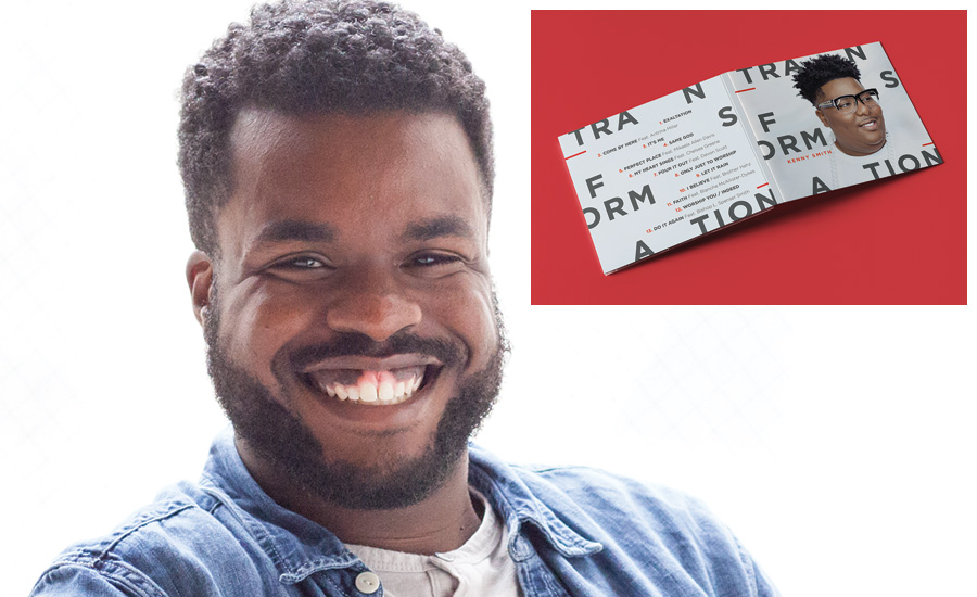
Winning design: Transform CD cover
For Jordan Wright, the word “designer” goes far beyond a job title. He is the epitome of design as a lifestyle. From graphic design to high fashion, there isn’t a challenge that Jordan isn’t game to tackle. Versatile by nature, he’s a rare talent who can synthesize quickly to visually problem-solve with style and grace. Since graduating from the Savannah College of Art and Design, he’s been a creative force on brands global and local, corporate and startup.
Jordan’s POV
I pursued a career in design because it is a bridge. It connects the things I love: art, helping others and leaving a mark on the world. Design shapes our lives. I'm grateful to be part of an industry that never stops evolving. We are always working to best serve humanity.
!!!!! Overachieving and Under 20 !!!!!
MARELLA ALBANESE, 19
Student, Fashion Institute of Technology
New York City
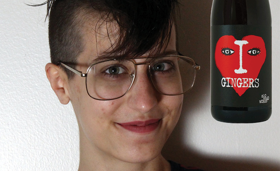
Marella Albanese, the youngest designer nominated, has already been commissioned to create labels for numerous winemakers, including 810 Meadworks—all while still in school. Her vision and creativity has many layers, which showcases her eclectic and imaginative design style. At 19, Albanese has already established herself as a skilled, original designer with an extraordinary work ethic. It’s clear this young designer is one to watch.
Marella’s POV
Each of these labels is an homage to a different artist. Art director Mike Gaughn and I work together to come up with a concise look, and then I carry it out. The I Love Gingers label is probably the closest to my usual illustration style. It mimics the simple, almost paper-cut aesthetic of Saul Bass' work. It's supposed to be a play on the “I (heart) New York” logo by Milton Glaser from the ‘70s, but with a semi-contemporary look. The Cheeky Keen label is a lot less subtle than I Love Gingers. We went for a Ralph Steadman, Bill the Cat-type exaggeration of the animals, and played against the conventional "peach" aesthetic (soft, pastel colors, fragile, etc.). We wanted the background to mimic the curve of the foreground while making the cat and dog look like something is almost spewing from their mouths.
Looking for a reprint of this article?
From high-res PDFs to custom plaques, order your copy today!


