French Brand Lefranc Bourgeois Enfants Encourages Young artists to Follow in Picasso’s Footsteps
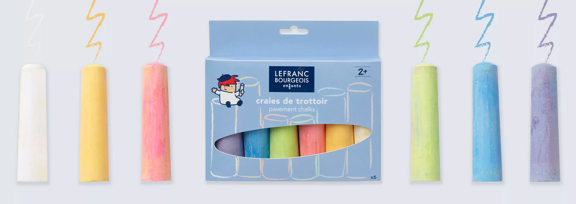
The project involved conceiving a new name and architecture for the children’s sub-brand – Lefranc Bourgeois Enfants – bringing it in line with the parent brand and translating seamlessly across the packaging and portfolio. Bespoke lettering for “enfants” was inspired by typical handwriting practice sheets familiar to all French children. Simple text is then set against “enfants blue.” The result is an authentic, charming brand identity with a contemporary and distinctive look and feel, delivering strong and united shelf presence across a broad product range. Building on the brand’s rich heritage as a tool for experimentation, creative collaboration and artistic education, Lewis Moberly injected an element of fun with the creation of a new brand character, Elbé and his family.
Looking for a reprint of this article?
From high-res PDFs to custom plaques, order your copy today!


