B&B Studio Harnesses the Power of Peanuts for Snack Bar POP
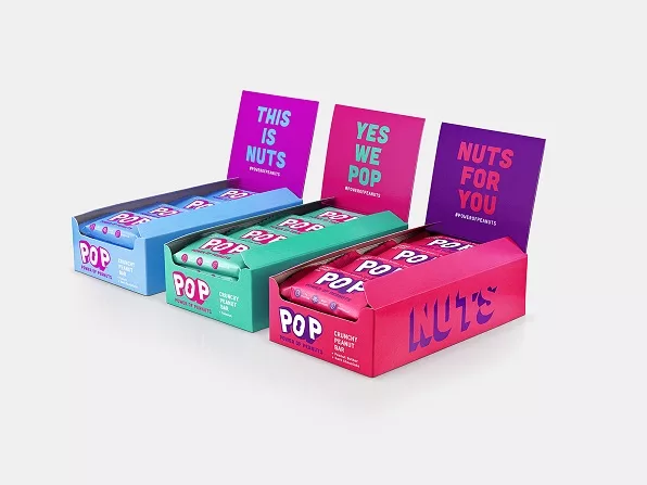
B&B has interwoven this mission into every touchpoint of the brand’s visual and verbal identity, with brightly-hued packaging that is bursting with dynamic optimism and purpose to highlight the nutritional benefits of the core ingredients within each bar.
Shaun Bowen, creative partner at B&B studio, says: “We spotted an opportunity for POP to focus on a single concept—peanut-based products—that would carve out a unique platform in a very competitive category. This enables POP to really celebrate and elevate the modest peanut, championing its superpowers.”
“Every element of the visual and verbal identity embodies this message, showcasing the core product attributes and brand values in a way that feels celebratory, not worthy. The vibrant visual identity has been designed with a full, three-dimensional impact, representative of the abundance of the peanut and the small but mighty POP bars."
POP co-founder Katja Thrane says, “B&B captured the product attributes brilliantly in our new brand identity, with an eye-catching design that feels authentic. From the peanut incorporated into the ‘O’ of our brand name to a natural tone of voice, B&B kept our values at the heart of the brand and delivered a striking identity that expresses who we are and what we stand for.”
“We support this movement by donating 1 percent of our annual turnover to support Project Peanut Butter, a global charity that tackles child malnutrition with RUTF (ready-to-use therapeutic food), an amazing invention with peanuts at its heart.”
Looking for a reprint of this article?
From high-res PDFs to custom plaques, order your copy today!


