Body Wash Bursts with Scent Cues on Package Redesign
Foamburst arrived on the market with its unique gel-to-foam formula over 20 years ago, with the most recent redesign in 2013. Its innovative product and packaging made a big impact on shelf. The brand felt the time was right to push forward with a new identity to rejuvenate the range, reinvigorate that initial sense of excitement and set it apart from regular body-wash brands.
Imperial Leather approached brand and packaging specialist PB Creative with the challenge of embodying Foamburst’s upbeat, experiential USP as part of the new identity, using the existing 3D structure. The new look needed to celebrate Foamburst’s formula, give it a contemporary look and feel, and cement its position as the premier foaming body-wash product on the market.
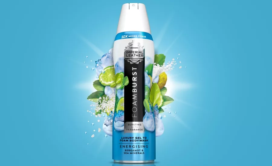
Central to PB Creative’s strategic approach was to communicate Foamburst’s fragrance and transformative nature on pack. Unlike many of its foaming competitors, only a small amount of gel is decanted from canister to hand, before it develops into a luxurious, abundant lather like no other.
The background color of each canister graduates from rich at the base, representing the gel, to shimmering white at the top, depicting the foam. The Foamburst brandmark progresses from light to bold, amplifying the messaging.
Fragrance is central to the foaming gel line, and PB Creative team offered bold colors to represent the intense scent in each variant; and images of the various fruits, flowers and herbs used can be seen bursting out on pack in an explosion of ingredients that brings everything to life.
A new brand ‘lock-up’ made up of a vertical black panel housing the brandmark and ‘Bursting with Fragrance’ brand message has been devised to ensure that the range can flex, grow and tier-up without losing cohesion. Using metallics and changing Imperial Leather’s iconic red flag to silver for the first time gives Foamburst primary-brand status and the everyday luxury look that it deserves.
Looking for a reprint of this article?
From high-res PDFs to custom plaques, order your copy today!


