Spotlight Feature
The Art & Science of Packaging Design
How to use packaging design to address the evolving needs of today’s consumers.
The definition of redesign, per the Merriam-Webster dictionary, is to revise in appearance, function or content. In packaging, that happens more frequently than one might imagine.
When brands are considering a new design, one question to answer is: Why? Is it for a more modern look, such as digital printing or other special graphics effects? Is it to revise the text placement? Change colors for an entire product line? Change to sustainable materials or another pack container?
While the answers may be apparent, make sure to do your due diligence — and check out “5-Step Guide to Rebuilding Your Brand” on page 13. Do your loyal followers recognize your brand’s colors, logo? For example, the yellow in McDonald’s arches, the M&M’s brown logo, Coca-Cola’s red and white, PepsiCo’s red, white and blue, and Hormel’s green and red.
Do consumers rely on your brand’s packaging structure for their needs, and if so what will consumers think if it changes? Have you conducted focus groups? Are you seeking a new design just because the company thinks it’s time?
Below are some prime examples of “before and after” designs that prevailed in recent design challenges. Perhaps it will help in your decision to do — or not to do — a redesign.
Before & After Packaging Designs
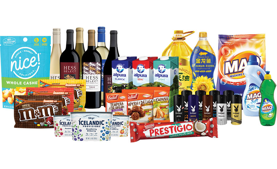
Nielsen recently honored the top packaging design innovations around the world. The 2019 Nielsen Design Impact Awards recognizes successful package redesigns for consumer packaged goods (CPG). Over the past three years, the award has gained distinction and prestige within the design community for underscoring the real and measurable business value of outstanding package design. For the first time, Nielsen included global submissions, netting 10 winning brands from around the world.
“Brands around the world are designing with change in mind. Across all 10 honorees, we saw common themes that bridged their redesign success. Brands who are winning with design are designing with a hyper-focus on the ebbs and flows occurring within the business and consumer landscape. They are leaning into design to stretch beyond a category norm, using design to address white space or leveraging design to respond to shifts in consumer preferences and behavior whether that’s the growth of health and wellness, increasing screen time or changing retail platforms. Ultimately, this year’s winners were best in class at creatively using their pack redesign as the vehicle to effectively address the evolving needs of today’s consumer,” said Kyle McKinley, VP of Nielsen BASES Design Solutions.
This year’s winners represent a wide range of business situations across food, beverage, personal and household care. Some transformed brands; others tacked challenges with competing in saturated categories; and some adapted heritage brands to stay relevant amid an evolving FMCG landscape.
Nielsen identified four lessons that this year’s winners learned, which each brand leveraged as they redesigned their product packaging. The need to:
- Design beyond category norms
- Design to promote health & wellness
- Design for white space
- Design for screen time and new purchase platforms
One award winner that recently went through a redesign is Mars Wrigley Confectionery’s M&M’s. The brand used the same iconic colors and redesigned the packaging in a “sharing size” stand up pouch, complete with a resealable closure. Mars, who was responsible for the design, also revamped the graphics. The new look and pack format is used for its milk chocolate, peanut and peanut butter products.
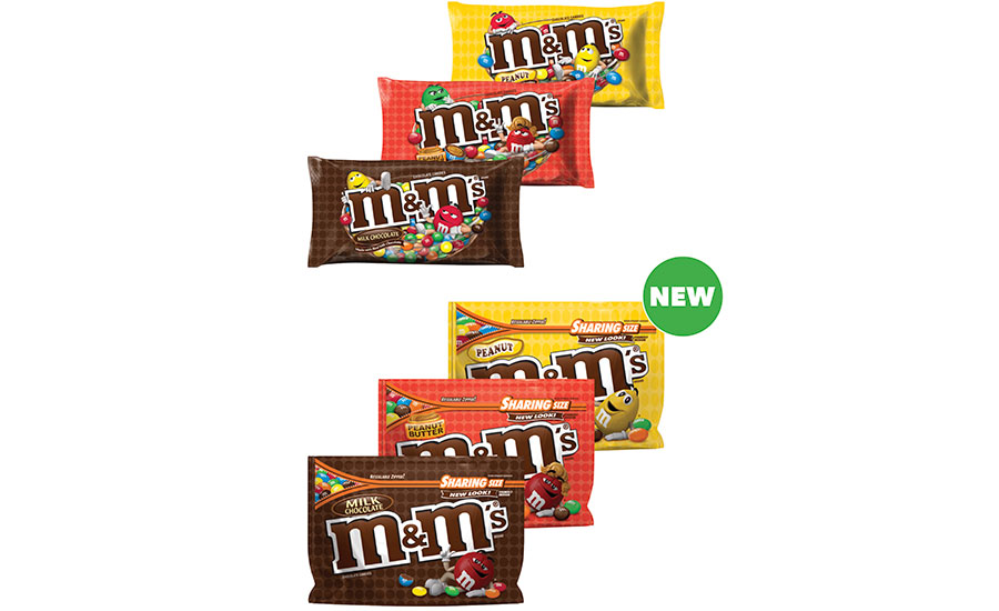
“We wanted to improve the shopper experience and enable consumers to identify our products faster and easier, and so began the M&M’s stand-up pouch aisle transformation,” said Allison Miazga-Bedrick, M&Ms brand director.
Skyr is becoming more popular for its high protein and unique taste. Icelandic Provisions moved from a tan-colored pack to a bright white, moving graphics around for more white space on its 5.3 oz. Skyr tubs. While the graphics are still there, they are used in a more eye-pleasing way. The design was created by Colorado-based creative agency Moxie Sozo.
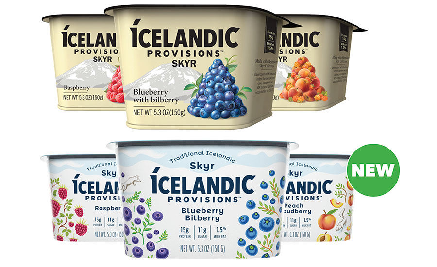
The company and design agency knew the importance of conveying a premium product through refined fruit imagery. The matte label was created so the product could be photographed well by amateurs on social media. (That’s thinking ahead!)
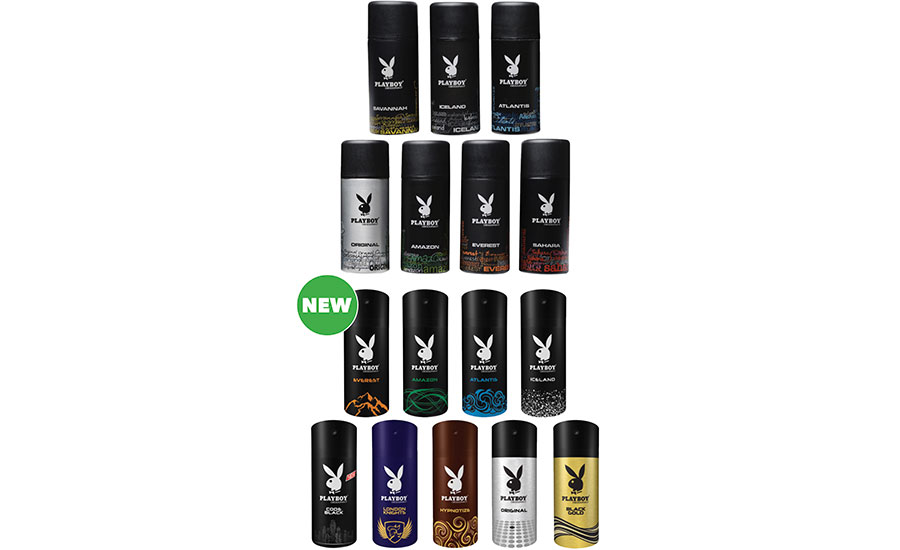
Another Nielsen winner, South Africa’s Amka Products produces Playboy deodorant for men. The redesign captures the essence of each variant with a better use of colors to determine the different scents. The deodorant comes in 150 ml aluminum aerosol cans with creative design by Sainsbury Design.
The big challenge here was to balance creativity within a single brand identity. Also, instead of a cap that consumers frequently throw away or lose, the brand went with an actuator that could be twisted and locked into position.
Other winners include:
- Nice! (U.S.; Parent Company: Walgreens; Design Agency: Soulsight)
- Hess Select (U.S.; Parent Company: The Hess Collection Winery; Designer: Michael McDermott)
- Alpura (Mexico; Parent Company: Alpura; Design Agency: Foic Lecanda)
- Arawana Oil (China; Parent Company: Yihai Kerry; Design Agency: Dongdao Creative Branding Group and Posher Design)
- MAQ (South Africa; Parent Company: Bliss Brands; Design Agency: Fountainhead)
- Prestígio (Brazil; Parent Company: Nestlé; Design Agency: DBA B+G)
- Satis! (Brazil; Parent Company: Ajinomoto do Brazil; Design Agency: Arcwwbrasil)
Paperboard Design Trends Delivered
The Paperboard Packaging Council (PPC) also just held its folding carton design competition, and shares trends seen from new designs.
PPC launched a digital printing and converting category in the 2018 competition, and this year’s event saw more digital entries than ever, showcasing the expanded use of digital technologies.
“Digital print and cutting is being used much more widely, and not just for personalization, but also to add speed and flexibility to the supply chain,” said Judge Tony Hitchin, general manager of Pro Carton.
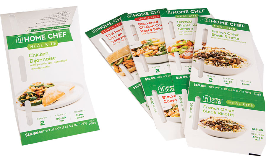
Digital Print: Zumbiel Packaging submitted a digital print entry — folding carton sleeves for Home Chef’s fresh, refrigerated, ready-to-cook meal kits. Home Chef offers seasonal menu offerings, which means that exact ingredients and nutritional facts are not available well in advance.
Home Chef’s need for flexibility lent itself perfectly to Zumbiel’s digital printing and workflows. Zumbiel receives 24 new graphic files for various meal kits each week. They then print, cut, and glue those 24 unique SKUs in 24-48 hours. The filled cartons hit store shelves nationwide no later than two weeks after Zumbiel receives the art.
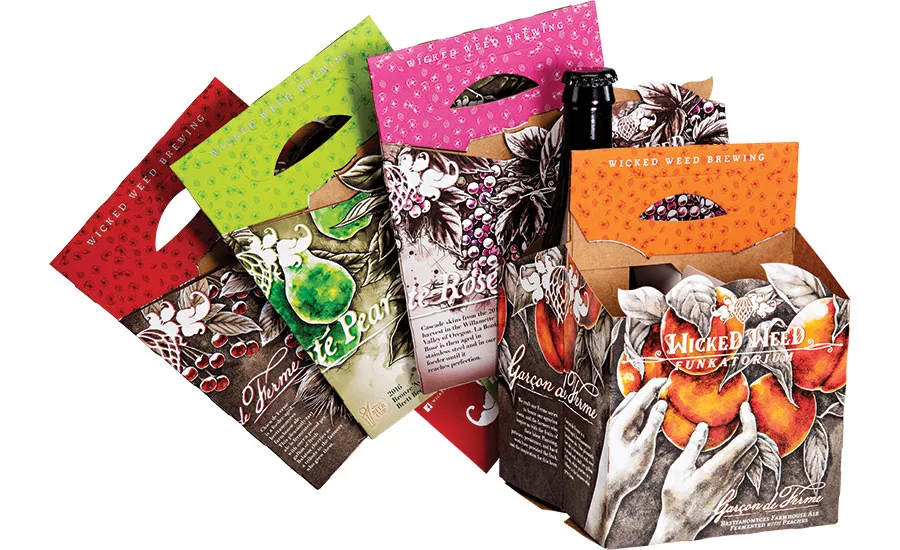
Beverage Packaging Sustainability: Another reveal was the great strides in sustainability from the beverage space, specifically in replacing plastic with renewable paperboard. There was a significant move away from plastic hi-cones and shrink-wrap to highly decorated carton-based multipack solutions for both bottles and canned drinks. Not only is it a more environmentally friendly substrate, it also allows for the use of high-end finishings and design techniques unique to paperboard.
For example, Wicked Weed Brewing’s new carton-based multipacks in the main photo. They come in Garcon de Ferme (farmhouse ale fermented with peaches), La Bonté Pear (farmhouse ale with pear), La Bonté Rosé (farmhouse ale fermented with grapes) and Chien de Ferme (farmhouse ale fermented with cherries).
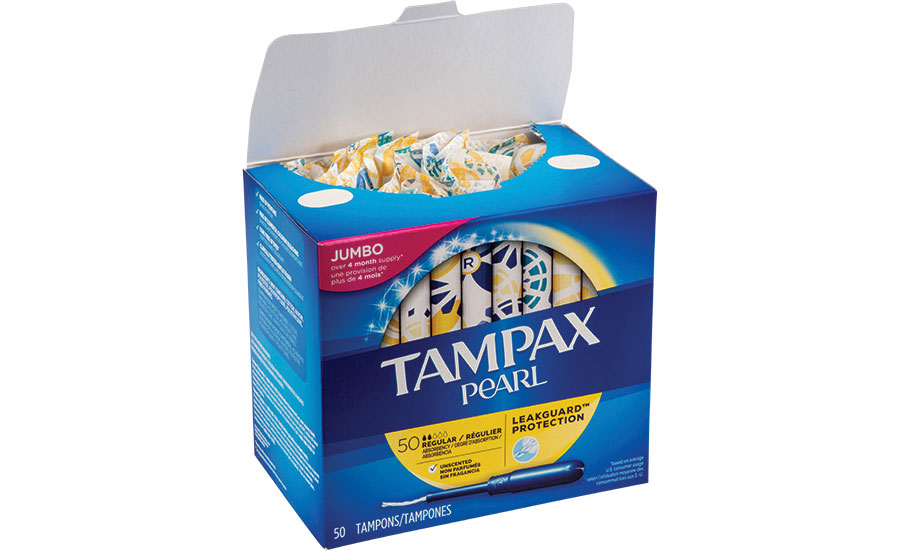
Virtual Window: One new design concept for 2019 was the ‘virtual window.’ PaperWorks Industries Inc. added this feature to a Tampax Pearl carton, substituting a plastic window for a descriptive graphic of the product inside. Designed to appear as a window on the pack, the graphics include appropriate shadowing and depth-of-field. As well, it is a more sustainable solution, cutting out the plastic.
Other interesting techniques included intricate laser die-cutting that eliminates the need for printing; gradient glitter that either changed in color or intensity from top to bottom of the carton; and innovative new tamper-resistant designs.
The PPC will announce the winning designs in October at its Fall Meeting, Oct. 23-25 in Minneapolis.
|
From Paper to Packaging By Mike Foster | creative director and co-founder, Straight Forward Design Interest in veganism, ‘free-from’ and plant-based eating is at an all-time high. Retailers are responding with ever-expanding ranges that speak to the growing number of consumers looking for products that are kinder to animals and the planet. As free-from alternatives move into frozen treats, navigating the space has become even more complicated, making packaging and branding essential to get right. Regular ice creams tend to rely on indulgent design cues to communicate a treat. The free-from alternatives are playing the same game with the addition of a badge highlighting what they don’t include or a perceived product benefit. Challenger brand Gigi was looking to carve a new space in the overcrowded ice cream category. The brand created an Italian-style plant-based gelato made with cold-pressed fruit and vegetables, using cutting-edge production processes to lock in all the goodness. The result is a new super creamy plant-based product never seen in the category before, with a rich and satisfying taste appeal.
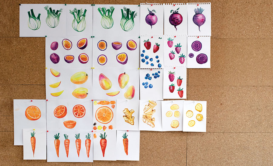
To get the branding right, Gigi partnered with London-based brand and packaging design agency Straight Forward Design. The agency was tasked with developing a unique visual identity that positioned Gigi as a genuine category-changing product, using their Connect in FULL methodology to ensure Gigi would be “Found, Understood and Loved while being Lived from the inside-out.” From the briefing to conceptual sketches right through to the final designs, the creatives were focused on positioning Gigi as a credible ice cream rather than a substitute or dairy-free alternative. The result is a brand that conveys “healthy” and “indulgent” through smart design choices. The concept originated from the wonderful mind of designer Lenka Vomelová, who took inspiration from heritage Italian design cues, experimenting with hand-painted watercolor illustrations of the ingredients. The illustrations evolved throughout the design process to celebrate the deliciously healthy free-from gelato, with a hint of Italian style.
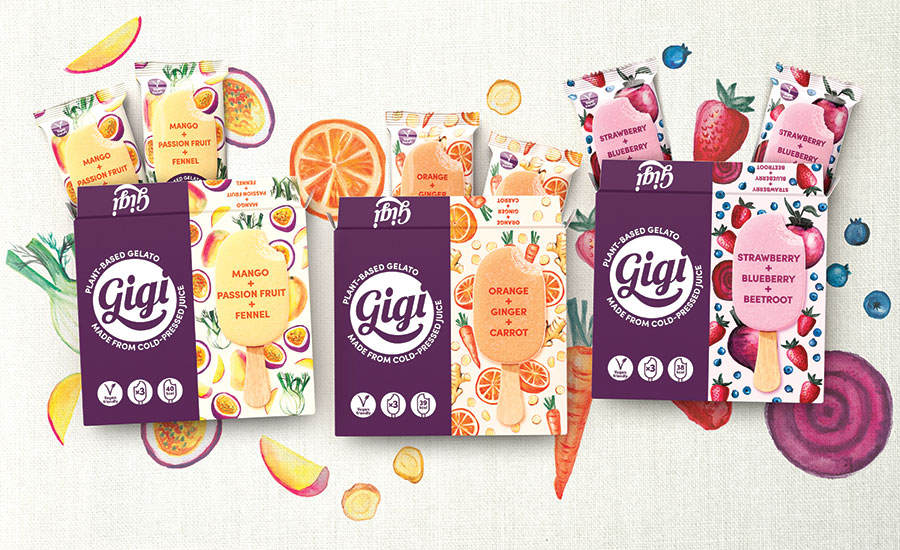
The final designs are disruptive, with the strong brand color positioned next to the softer flavor colors creating a clever brand block. Beautiful illustrations of the ingredients (carrots, beetroot, orange, mango, passionfruit, cucumber, etc.) give a truly artisan feel — in stark contrast to a crowded market of heavy indulgent cues. When you get closer the whole story starts to unfold, from the natural and free-from messaging that is clear but not dominating, to the product imagery and illustrations making a virtue of the interesting and surprising flavor combinations. The resulting Gigi designs hit the sweet spot between healthy and indulgent, promising a clean and rewarding treat. Importantly, the brand can be found and understood. Straight Forward Design believes that by putting people first, at the heart of its culture, it can unlock growth in both the brands it works on and the individuals it works with. From its studio in London’s Fitzrovia, the Straight Forward Design team has spent 10 years creating compelling brand strategies, impactful design and effective communications with a diverse group of clients, including Tusting, betty, Mars and PepsiCo. Visit straightforward.design. |
Looking for a reprint of this article?
From high-res PDFs to custom plaques, order your copy today!


