Editor’s Note
The Story Behind the Symbol
Two of the most recognized symbols in the world – the recycling symbol and Nike swoosh – were created by college students.
Gary Anderson's original sketch idea for the recycling logo.
Courtesy of CAA
Back when magazines existed in print form, the month of April often had a renewal theme with the topic of sustainability showcased. Today most content is digital, and sustainability gets addressed regularly. Recently, I was flipping through past April issues of Packaging Strategies and Flexible Packaging and noticed the pages in those old issues used the classic recycling symbol to signal sustainability. It occurred to me that I can't recall a time when those three green, omnipresent M.C. Escher-like arrows in that familiar triangle shape didn’t exist. So, I did some research on its origin.
In April 1970, an environmental activist named Gaylord Nelson founded Earth Day, the now annual event, as a response to an oil spill, which had seen an estimated 100,000 barrels of crude oil soak the shores of Santa Barbara, Calif., the previous year.
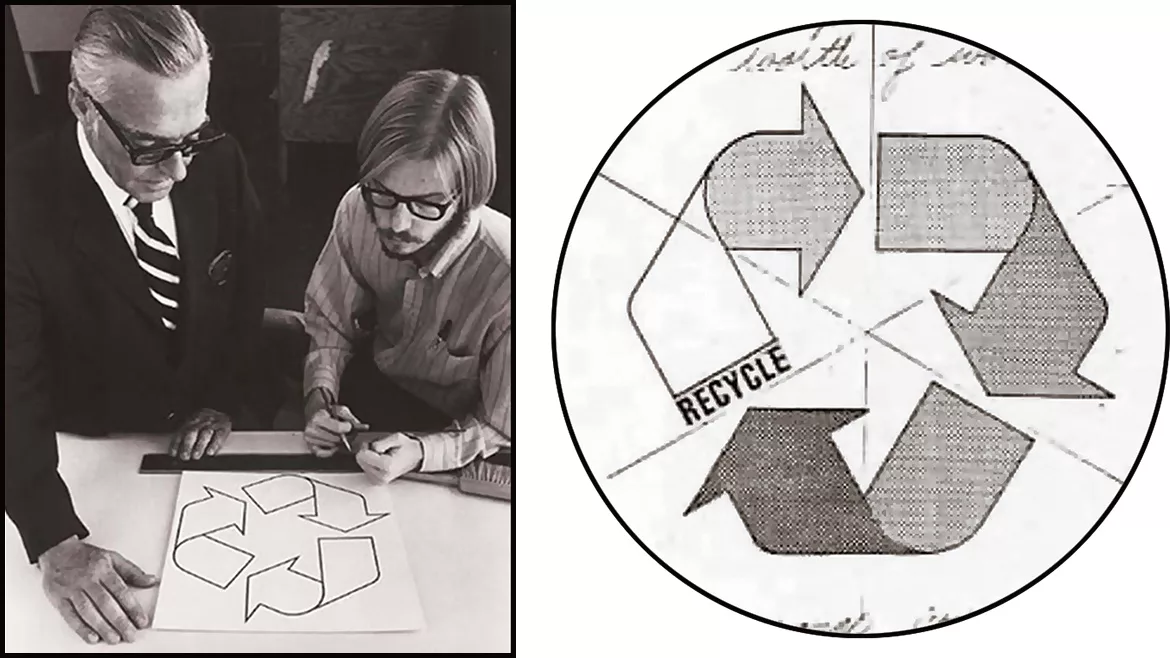
Just months after that first Earth Day, the Container Corporation of America (CCA), then the biggest manufacturer of corrugated boxes in the U.S. with a reputation for being at the forefront of corporate graphic design, plastered college campuses with posters encouraging aspiring designers to produce a symbol for future use on products made from recycled paper. Said symbol would be a public domain design with a prize of $2,500 and a fellowship to attend the 1970 International Design Conference at Aspen.
The 500 entries were judged by a team of design experts, including graphic arts legion Saul Bass and the influential IBM designer Eliot Noyes. The winner was a recent graduate of the USC School of Architecture by the name of Gary Anderson.
In an interview with the Financial Times, Anderson admitted, “It didn’t take me long to come up with my design: a day or two.” He added, “When I sat down to enter the competition, I thought back to a field trip in elementary school to a newspaper office where we’d seen how paper was fed over rollers as it was printed. I drew on that image — the three arrows in my final sketch look like strips of folded-over paper.” Later, in 2012, Anderson recalled, “It was on a big, igloo-shaped recycling bin and it was bigger than a beach ball! I was really struck. I hadn’t thought about that symbol for years and here it was hitting me in the face.”
In 1971, one year after the creation of the recycling symbol, Carolyn Davidson, then a graphic design student at Portland State University, came up with the iconic Nike Swoosh. The fluid checkmark shape indicates movement and speed. The image also resembles a wing and hinted at the Greek goddess of victory, Nike. Davidson charged Nike founder Knight a mere $35 for arguably the most famous athletic shoe and gear brands of all time.
While she didn’t profit immediately from her work on the Swoosh, the designer was given a generous amount of stock in the company (estimated to be worth upwards of $1,000,000), as well as a diamond and gold ring featuring the Swoosh design.
Both symbols are affirmative and conger an inspiring new beginning for both ourselves, and the planet we inhabit. Makes me want to go outside for a run.
I’m curious to know what logos or symbols you think are interesting or impactful. Let me know at jokerk@bnpmedia.com.
Kristin Joker
Editor in Chief
(248) 227-4727
jokerk@bnpmedia.com
Looking for a reprint of this article?
From high-res PDFs to custom plaques, order your copy today!


