Makers of “The Game Changers” Launch FȲTA, a Plant-Based Performance Line
Courtesy of FȲTA
The Game Changers documentary followed the story of James Wilks – elite special forces trainer and winner of The Ultimate Fighter – as he traveled the world on a quest for the truth about protein and the optimal human diet. Viewed by an estimated 200 million people since its release in 2019, it frames plant-based eating for better health and athletic performance.
After the film’s release, global demand for high-protein plant-based food skyrocketed. Coinciding with this, The Game Changers’ team was inundated with requests for tasty, convenient products that met their criteria for optimal athletic performance and health. Unsatisfied with the existing options, they assembled a team of world-class team sports dietitians and food scientists with one simple mission: develop a line of products worthy of The Game Changers’ legacy. As a result, FȲTA - derived from the Greek word for “plants” – was born.
With a strategic foundation and brand framework created by Saatchi, UK, they turned to creative agency, Chase Design Group to develop a packaging system for FȲTA, one that is distinctive in the health and performance space while leveraging the equity and trust built with the Game Changers movie/brand.
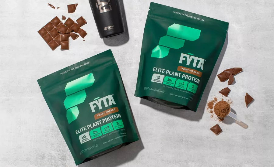
One of the challenges was to cut through the sea of clutter. The Game Changers was bold, performance driven and evidence based.
“We knew we wanted to lean into that as much as possible while forging a new path for FȲTA that would stand out online and on shelf,” said Jennessa Davis, Design Director, Chase Design Group. “The key was to simplify and take a bold visual approach.”
“We helped simplify the complex without losing the heart and soul of The Game Changers by not playing into stereotypical plant-based cues – instead focusing on the game-changing nutrition that the product provides,” added Mike Mandarino, Account Manager, Chase Design Group. “It was important to simplify both visually and verbally, making the benefits easy to digest.”
The FȲTA ‘F’ is crafted around the strategic concept of ‘building blocks’ – with FȲTA being the key to building optimal health. The three sections of the ‘F’ symbolize steps of growth and forward momentum, while the symbol serves as a strong device that can be dramatically used across all brand touchpoints.
“We established a strong color palette paired with bold branding to create a brand block on shelf. The tones of green were carefully considered, with dark green grounding FȲTA in the plant-based category, while the bright metallic green is contemporary, generating a sense of innovation. The brand colors are ownable and stand out against the blacks and silvers that are typically used in the performance category,” continued Davis.
The new line includes 3 flavors of plant-based protein powder, a meal replacement powder and 3 flavors of meal replacement bars.
“With the help of Saatchi and Chase Design Group, FȲTA is a credible challenger brand and a source of truth in the category,” said James Wilks, founder, FȲTA. “It will first be available direct-to-consumer through fyta.com and on Amazon, before expanding to traditional mass market retailers in the future.”
Looking for a reprint of this article?
From high-res PDFs to custom plaques, order your copy today!


