USA > True Lemon
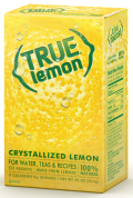
Because True Lemon was introducing a new product format, it knew its packaging would have to be pretty powerful. “The first challenge we faced was to explain what the heck it is,” says Jean Koeppel, managing director for Blue Marlin New York. “True Lemon is truly unique and, as a result, some stores were unsure of where to put it – some stocked it alongside powdered beverages, others with sweeteners and some with product. We needed to create a clear proposition without weighing down the identity with too much information.” As a result, the brand leveraged its design around an illustration of the fruit’s skin. Typography at the bottom of the package clearly explains what the product is, and parentheses in the logos of each package further reflect the fruit.
LAUNCH DATE
February 2010
PACKAGE DESIGN
Blue Marlin, www.bluemarlinbd.com
Looking for a reprint of this article?
From high-res PDFs to custom plaques, order your copy today!


