The Bottom Line
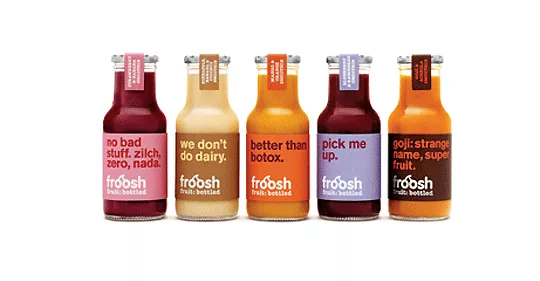
Despite the popularity of fruit smoothies, Froosh, a Nordic pure fruit smoothie brand, was fading fast. Its unappealing brand identity translated into declining sales and slow growth across its core markets of Denmark, Finland and Sweden.
Brand design firm Pearlfisher was called in to boost shelf standout and communicate the brand’s powerful “fruit only” message. The firm created a new identity anchored by a new logo designed to be timeless and confident, with a bright, appetizing and natural color palette. A new tagline-“fruit: bottled”-is simple and no-nonsense.
The Bottom Line: The new Froosh packaging hit the shelves in Sweden, Denmark and Finland in May 2010. From a third place market position, it’s now the number one smoothie brand in the region with a 107% increase in total volume sales between January and May 2011 (compared to the same period pre-launch).
Following the re-launch, the brand also enjoyed a number of new listings and consumers frequently cited the new identity as a significant factor in their purchasing decision.
CREDITS
Package design and brand identity: Pearlfisher, www.pearlfisher.com
Looking for a reprint of this article?
From high-res PDFs to custom plaques, order your copy today!


