Fan Club
The markets the Big Ass Fan Company serves are diverse, but the brand's clean look stays consistent.
Attention-grabbing headlines, large images and strong colors instantly tell the viewer that this is a Big Ass Fan Company piece.
You know the saying, “Bold as a donkey, brave as a bear?” Wait, no, that’s not right. Lions are bold. Donkeys are … somewhat humble creatures. So how does the Big Ass Fan Company have such an adventurous brand, when its mascot is the unassuming Fanny?
For starters, the unconventional brand name matters. Big Ass Fan Company manufactures, you guessed it, big fans. Six to 24 feet in diameter high volume/ low speed (HLVS) ceiling and vertical fans, to be exact. These HLVS fans are fantastic for saving energy and increasing comfort in buildings all year long.
The brand originally set out as the HLVS Fan Company, but “we finally had to bow to the sentiments of our customers and concede that we do, in fact, design and manufacture some Big Ass Fans,” says Sherrell Watson, public relations manager.
“It was therefore a natural step to change our name to Big Ass Fan Company, and to ‘adopt’ our mascot, Fanny the Donkey, shortly thereafter,” continues Watson.
The forthright name sets the brand's tone. The striking colors also contribute to the strong identity.
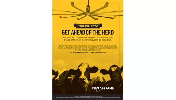
“The Big Ass Fan Company has a bold name and a bold logo to match. The brand’s strong core colors include dark gray, black and safety yellow to reflect its industrial heritage,” says Chris Barnes, graphic designer at Big Ass Fans. "Advertisements embody this strong industrial personality through attention-getting headlines and impactful typography partnered with large product images appropriate to the scale of Big Ass Fans.”
You wouldn’t expect a forward-thinking company to stay static with its brand’s design. And Big Ass Fans hasn’t.
“As the Big Ass Fan Company has expanded into commercial and residential markets, the look and logo have evolved as well. Fanny consistently takes center stage,” says Barnes.
“We tell our brand story to many diverse markets. In order to reach people across these spectrums, we need to modify the way in which it is presented without losing our core message,” Barnes continues. “We do this through carefully considered use of color palettes and typefaces that appeal to our different audiences, while accurately and consistently retaining our disruptive brand identity and corporate culture, pushing the envelope without alienating our more sensitive groups.”
The whole inspiration for the brand’s evolution comes from a key place — the customers.
“Our style reflects our customers. As mentioned, industrial communications use the colors representative of those environments — the dark gray, black and safety yellow,” states Barnes. “The residential and commercial markets, however, feature a softer palette of gray, white and black, partnered with images of the sleek line of products designed specifically for these environments. Because these materials do not utilize a strong color, such as the industrial yellow, the viewers can more easily picture their fans in their own settings, without a predetermined feel or usage.”
Because of the fans' widespread adoption, the company has the unique challenge of maintaining a consistent identity over the very different markets.
"The brand’s look has evolved to serve the different needs and appeals of these audiences, excelling at producing targeted communications while also remaining true to the company’s industrial roots,” says Barnes.
To do just that, the Big Ass Fan Company keeps certain elements unchanged on all communications.
"These elements include the recognizable Fanny logo and the same support typeface complementing the very different headline styles used in different markets," Barnes explains.
In addition to keeping the marketing consistent, the Big Ass Fan Company further solidifies branding by pulling that same look into product design.
“As awareness of our brand identity and colors has grown, we have carried these colors over to the product line itself — namely, safety yellow details on the industrial line of fans,” states Barnes.
“Conversely, several of our residential and commercial fans are known for their brushed aluminum finish, a look which carries over to the minimalist palette of those communications. The typography featured in residential/commercial ads — a thin, contemporary sans serif — reflects the clean, sophisticated design of our fans.”
“Through judicious design, the Big Ass Fan Company’s visual brand has expanded to serve several diverse markets, while still retaining its strong core identity,” says Barnes.
For more information on the Big Ass Fan Company, visit www.bigassfans.com.
Looking for a reprint of this article?
From high-res PDFs to custom plaques, order your copy today!


