No Ad Budget? No Problem
The design of Method's packaging calls out to the consumer, making products for mundane tasks desirable.
Frontera's packaging uses the branding of Bayless' restaurant to demonstrate the chips have the same gourmet qualities his food is known for.
"Advertising is dead. Long live packaging.” That was the title of an article of mine that elicited lively discussion a few years ago. The premise is simple. Most advertising — traditional media or social media-based — is increasingly tuned out by consumers. Add to that the accelerated fragmentation of the marketplace, and it leads to the question: How effective is advertising? Even decades ago, legendary retailer John Wanamaker remarked: “Half the money I spend on advertising is wasted; the trouble is I don’t know which half.”
This is a big problem for all consumer product companies, especially for budding brands with shoestring marketing budgets. That’s why packaging can and should be a solution. Advertising brings consumers into retail environments, real and virtual. But it’s packaging that ultimately seals the deal. Research shows that many consumers make spontaneous purchase decisions when shopping. In that regard, every brand, large and small, is on a level playing field, even if the big guys do spend a considerable amount of money on advertising.
Former Procter & Gamble CEO, A.G. Lafley, famously referred to the “moment of truth” in the purchasing process. This is a direct reference to the seconds in which the consumer scans the retail shelf, sees packaging, makes the determination that the brand meets his or her expectations and decides to buy or pass over it in favor of a competitor’s product. Lafley rightly stated that his brands were up for election every day. Lafley also reflected that the design of products and packaging has a lot to do with consumers’ decision making. Package design communicates in a verbal and visual brand language and can sway the consumer to make the purchase — or not.
This begs the question: How many times are consumers looking for a specific brand in a retail store, due to advertising or word of mouth, then changing their minds for another at the point of purchase because of stronger packaging that encourages interaction and ensures a more satisfying brand experience?
Packaging as Advertising
It’s one thing to make these statements and another matter to prove it. So let’s look at brands that use packaging to do their advertising in a successful manner. Annie’s Homegrown is a great example. Annie’s founders had a simple mission: to bring a more wholesome mac and cheese product into the marketplace for kids and families. The problem: Big national brands with large promotional budgets owned the category. Who would want to pay more for a commodity product from a company with a shoestring marketing budget and no traditional advertising?
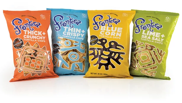
Frontera is another such brand. Renowned chef of Mexican cuisine, Rick Bayless, wisely leveraged the name of his famous Chicago restaurant, Frontera Grill, for his regional Mexican food specialties. Frontera tortilla chips feature robust, regional flavors based on authentic recipes. Frontera products are handmade in small batches from fresh, classic ingredients. But how to communicate that on packaging, sans advertising? Especially when competing against formidable snack brands?
Frontera’s packaging is as unique as the brand itself. The brand identity brings Bayless’s signature to mind: high-quality, handcrafted gourmet. It’s full of movement in distinctive typography and purple color. The words “100% natural” support the brand. Ancient Mexican motifs allow consumers to see the tortilla chips in color-coded packaging that effectively segments the brand by variety, which is clearly verbalized as well. A simple slug states that the product is “Authentically Mexican, handmade, taqueria style.” A concise verbal and visual language communicates and advertises effectively for brand and product.
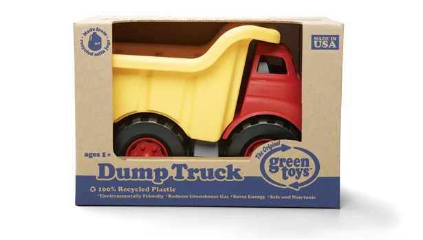
Green Toys Inc. is breaking new ground and using packaging to advertise its unique brand. The 100-percent-recyclable corrugated packaging printed with soy inks is minimalist, communicating green at a glance. Toy cars and trucks in primary colors are made from 100-percent-recyclable milk containers; they’re safe, nontoxic and made in the USA. There aren’t any twist ties; plastic or cellophane films aren’t included in this packaging, unlike in some large toy companies’ products. Every aspect of the packaging is deliberate and tells the brand story visually and verbally. No advertising necessary.
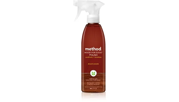
Method Home is known and lauded for its unorthodox approach to packaging. Method has built a customer base without conventional advertising. The company shows how to make the most mundane products sing on the retail shelf. Wood for Good polish appears in a brown-toned spray bottle with a wood grain panel that immediately informs the consumer about the product’s use. The same goes for Method’s Steel for Real stainless steel polish; silver-gray packaging with a brushed steel panel communicates visually very well. The Daily Granite Surface Cleaner communicates its use in the same manner with black packaging and a “textured” panel that looks like natural stone.
The packaging for the products verbally communicates that these are “nontoxic” and “plant-based.” This is visually reinforced with a green leaf icon in a white slug between the top and lower textured panels of the packaging. It pops, so it can’t be missed. Product messaging is simple and concise: “Cleans and revitalizes” or “Cleans and polishes.” Benefits appear under that in straight-forward language.
Everything about the packaging of these brands speaks with simple honesty and authenticity. There isn’t any clutter. The brand identity stands out. A unique visual and verbal language reinforces the brands and what they stand for. They communicate as effectively as any media-based advertising could ever do. More importantly, they communicate it right at the shelf where consumers are actually making up their minds about which brand to purchase. How perfect is that?
Looking for a reprint of this article?
From high-res PDFs to custom plaques, order your copy today!


