Leveraging Today's Purchase Drivers on Product Packaging
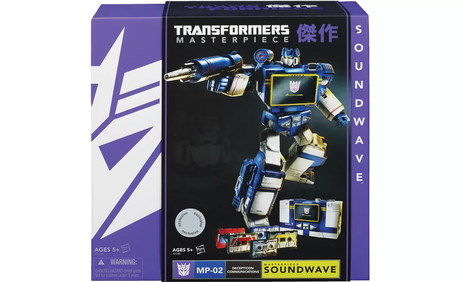
Transformers’ Masterpiece Soundwave comes packaged in a premium design, intended to appeal to both those who grew up with the brand as well as a new, younger set of consumers.
Kraft Foods called for an update to Tang’s packaging, which now includes compelling graphics and a hint toward the brand’s heritage.
RxBar understood what its customers wanted in a protein bar; the refreshed packaging communicates the prompts to purchase simply and with appealing imagery.
Consumers have changed completely in the past couple of decades. They’re more informed than ever; they research consumer product reviews online. They’re not easily swayed by the advertising that leads to brand recognition but doesn’t necessarily breed trust. They’re more influenced by word of mouth. Due to this, some marketing reports suggest that consumers have largely made up their minds about which products to purchase before shopping.
I disagree: Ultimately, purchase decisions are overwhelmingly being made at the retail shelf where consumers can analyze category products side by side. In “The Consumer Decision Journey,” McKinsey & Company marketing research bears this out: “Consumers want to look at a product in action and are highly influenced by the visual dimension: Up to 40 percent of them change their minds because of something they see, learn or do at this point — say, packaging, placement or interactions with salespeople.”
Because consumers are more likely to make purchases for emotional rather than rational reasons, they can be swayed. The implication is that the onus rests significantly on packaging and its unique ability to capture emotions and drive sales in the scant few seconds when consumers are scanning products in retail stores. A big part of being able to leverage the power of packaging lies in understanding consumers’ new purchasing drivers.
WHAT ARE THE NEW DRIVERS?
Brand marketers and package designers point to the need for innovation when packaging new products or refreshing existing packaging to gain competitive advantage. New packaging substrates attract attention, but something else is necessary to make consumers want to purchase the product — the specific cues that satisfy their current purchasing drivers. The key to securing a purchase decision is integrating entertainment, product and packaging in an emotive manner to appeal to consumers and turn them into fans, making the brand memorable and shareable with friends.
There are great examples in the toy industry. About five years ago, LEGO built augmented reality (AR) into its packaging to show a 3D view of the model inside, a major innovation in the industry. When focusing a camera on the AR code, an interactive store screen brought the model to life, delivering great satisfaction to fans of LEGO and its licensed, co-branded products. LEGO has completely evolved from a toy company to an entertainment brand. With its 3D blockbuster “THE LEGO MOVIE,” the brand’s future solidly lies in the seamless integration of entertainment, product and packaging, extending the customer experience in 360 degrees. This is an increasingly important consumer driver, but one that few CPG companies have been able to master in the creation and marketing of products, Apple being a notable exception.
LEGO’s major competitors, Mattel and Hasbro, are working in the same direction. Warner Bros. Consumer Products, Warner Bros. Animation and DC Entertainment recently announced the creation of original new content, based on the success of Mattel’s and Fisher-Price’s Imaginext toy lines. Well-conceived products that are emotively packaged (read: deliver an engaging storyline) can achieve great things. Made-for-video animated movies and shorts are planned to “extend the play experience for kids” according to a joint press release that was recently issued; “bringing dimension to the action figures and playsets available in toy aisles globally, each program will engage millions of young fans around the world like never before.”1 Companion apps will allow kids to bring their play patterns to life in an interactive and individualized manner.
In another interesting move, DC Entertainment and Warner Bros. rolled out the first animated film in a planned series. “Justice League: Throne of Atlantis” debuted early 2015. In the movie, the newly-formed Justice League, including Superman, Batman and Wonder Woman (DC Entertainment’s answer to Marvel’s Avengers), combats evil forces that threaten Atlantis in an epic adventure. The primary focus and hero? None other than Arthur Curry, aka Aquaman. Fisher-Price Imaginext toys had been created and packaged ahead of the movie’s release. A great example of packaging that optimizes storytelling in a visual manner shows seven action figures in one playset: a panoply of Justice League heroes lined up with the menacing Gorilla Grodd in the background, threatening to pounce on them. The visuals, Fisher-Price and Imaginext brand identities, and the logo of the Justice League in its red shield dominate the packaging. No verbal brand communication is needed. The story is told uniquely through the visual representation of the characters; it’s instantly recognizable and emotive to a legion of fans.
Even as Hasbro’s classic Transformers property continues to enthrall with new characters and storylines, its heritage characters are also repackaged to appeal to multi-generational fans. In conjunction with San Diego’s Comic-Con 2013, Transformers’ Masterpiece Soundwave, a beloved character from the original animated series, was made available in an exclusive offering to the delight of fans. The quality, larger-scale model features fine detailing, a great deal of articulation and is immediately recognizable with his signature helmet and faceplate. Soundwave comes with an Energon fuel cube, the favorite, intoxicating drink of Decepticons everywhere. The figure converts back and forth from robot mode to microcassette mode; it also includes five converting micro-cassettes for Laserbeak, Buzzsaw, Decepticon Rumble, Decepticon Frenzy and Ravage.
Masterpiece Soundwave might be a classic character, but the packaging is anything but old. It’s bold and modern, showing imagery of the distinctive blue and silver figure as well as the classic cassette to which Masterpiece Soundwave converts. The black center panel is a dramatic backdrop for the model; it also serves as a sleeve over a purple wraparound that features the iconic Transformers mask embossed in white. The Transformers Masterpiece brand appears horizontally over the figure; the character name appears vertically on the right-hand side of the packaging, again in white on purple. The Japanese iconography reminds fans of the origins of both the Transformers brand and the Masterpiece line. This is premium packaging, as collectible as the exclusive, higher-priced figure inside, appealing to kids and adults alike.
REFRESHING PACKAGING WITH NEW DRIVERS IN MIND
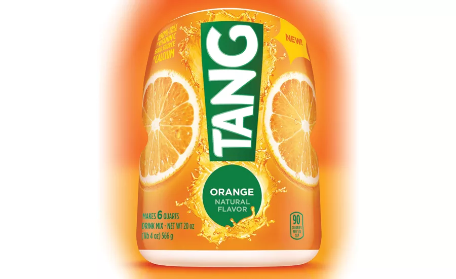
What about long-established products with considerable heritage that might need a package refresh? When classic drink mix Tang was losing relevance with consumers, Kraft Foods refreshed the packaging. The new packaging is still in canister format, but the graphics on the full body shrink-sleeved label are more compelling. The old label depicted a splash of the drink with a slice of orange and Tang’s logo prominently placed above it. The brand communication “Delicious with breakfast” appeared above the logo. While colorful, it did nothing to advance the brand to a new generation of consumers, nor did it convey its heritage.
The new label features an exclamation point with the Tang logo appearing vertically within the upper part of the exclamation mark and the brand communication “Orange natural flavor” inside of the period. The font is contemporized as well. Large splashes and orange slices appear on both sides of the exclamation point. Forget talking about breakfast: Consumers are eating light meals and snacks all day long, and they’re looking for healthy choices. A “90 calories per cup” statement was added to the new packaging, important for today’s consumers.
Since Tang was made popular in the 1960s by the space program, it makes perfect sense to leverage the heritage of the brand’s origins in a manner that suggests energy and vibrancy. Doesn’t the exclamation point remind you of a rocket lifting off? Contemporizing classic product packaging has to be done periodically, but care must be taken to ensure that key brand assets are retained while leveraging those aspects of the brand that matter more to consumers now. This is a balancing act, and Tang has refreshed its packaging in the right manner.
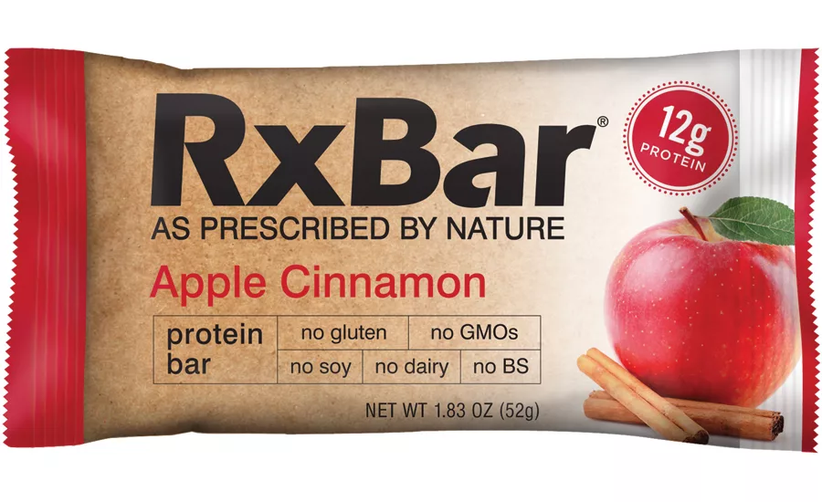
There are an amazing number of sports and energy bars in the marketplace, and what’s top-most in consumers’ minds now? They want fewer, simpler, more natural ingredients and lots of protein. Enter RxBar. Real food bars (whole and unprocessed) pair fruits and nuts with lots of protein from egg whites to pack significant nutritional punch, and the brand uses no artificial ingredients or preservatives. While the original packaging declared the cleanness of the product and used the brand communication “High protein energy bar,” it didn’t convey the information in a manner that currently drives consumers. The remedy: packaging that was slightly tweaked to deliver the message in a subtle but important manner.
The RxBar logo is larger and more prominent; the ingredient visuals are now on the right-hand side of the package. The tagline “As prescribed by nature” appears below the logo. The all-important “12 grams of protein” is highlighted inside of a colorful burst. The brand communication of “no gluten, no GMOs, no soy, no dairy and no BS” appears more prominently below the bar flavor designation. It’s simple and effective.
These examples of new and refreshed packaging give us a few insights of how to leverage consumers’ new drivers into effective package design. It doesn’t matter how unique and high quality consumer products are if the packaging doesn’t seal the deal with consumers in an attention-grabbing, emotive manner. To do that, effective visual and verbal communication has to be leveraged to speak to what’s driving consumers today.
1. www.prnewswire.com/news-releases/warner-bros-and-dc-entertainment-develop-all-new-slate-of-content-inspired-by-successful-toy-lines-300028872.html
Looking for a reprint of this article?
From high-res PDFs to custom plaques, order your copy today!


