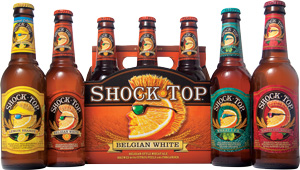
 Shock Top, a traditional Belgian-style wheat ale, originated in 2006 under the name Spring Heat Spiced Wheat. The North American Beer Awards-winning brew changed its name and moved from a seasonal offering to a year-round product in 2007.
The brand has a young, daring feel perfect for its foodie millennial consumer base, but Anheuser-Busch sought more innovation. Adventurous new flavors that appeal to the craft beer enthusiast’s daredevil lifestyle were being added, so strategic branding and packaging design agency Deutsch Design Works was brought in to create the packaging.
Shock Top needed a design that would easily stand out in the crowded beer category and interest the target consumer. DDW chose bright colors and bold graphics to complement the wedgehead character on pack. Each flavor uses a wedgehead with a unique personality demonstrated through varying hairstyles and accessories such as sunglasses or visors. Custom background and foreground illustrations communicate flavor cues for quick differentiation on shelf, resulting in a readily recognizable product in the beer section.
The line includes varieties such as Belgian White, Raspberry Wheat, Wheat IPA, Lemon Shandy and Pumpkin Wheat. With the Mayan calendar drawing to a close, the newest member in the brand’s family, End of the World Midnight Wheat, launched mid-October, leverages Shock Top’s bold and adventurous spirit as it stakes its claim of being the official beer of the end of the world. Visit www.shocktopbeer.com for a countdown to doomsday.
THE BOTTOM LINE: Since the packaging’s new look launched in January 2012, the craft-like Shock Top line has been a source of growth for Anheuser-Busch, with sales of its brews up 81 percent in the first quarter of the year — and even more since then, according to data from Beer Marketer’s Insights.

