A Package Redesign Makes GoodBelly's Gut Feeling Correct
AFTER
AFTER
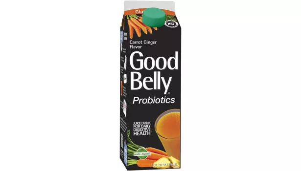
BEFORE
The story: In 2008, organic food company NextFoods’ founders Steve Demos and Todd Beckman, believers that healthy food makes great medicine, created the GoodBelly brand, which brought non-GMO, dairy- and soy-free, vegan and kosher probiotic drinks to the marketplace.
With its sleek black carton and emphasis on a unique probiotics feature, GoodBelly distinguished itself from other fruit juices in the natural channel.
The challenge: Because of the brand’s success in the natural channel, GoodBelly’s marketing team had a gut feeling it was ready for wider distribution beyond specialty food stores. In order to communicate to this broader audience, the company hired Denver-based health-marketing specialist LRXD to design new cartons for its quart- and single shot-sized juice products to speak and appeal to these new customers.
Shoppers who peruse natural-foods stores had always responded positively to GoodBelly’s packaging, which conveyed it as a functional product that aids the digestive tract. However, company research found a hitch as it was about to pitch the product to the masses: Since probiotics were the packaging’s priority, most consumers couldn’t identify GoodBelly as a juice despite complementary images of produce and a glass of the colorful drink. It needed to boost its flavor appeal.
The solution: The brand decided to play down the biology lesson and focus more on taste to achieve the perfect balance of form and function. The carefully planned rollout took more than a year from focus group to grocery store shelf.
GoodBelly swears by consumer research and data-driven analysis, so it conducted focus groups to craft fresh art and copy so new customers could instantly understand what the cartons contain and how it could positively impact their everyday health.
With those findings, LRXD designed the visuals to give the proper weight to each of the product’s benefits: its probiotic function, great taste and dairy-free benefits. One finding that affected this balance: the fact that 60 percent of customers eat yogurt regularly. This meant the non-dairy message did not need to be emphasized as much as previously thought.
Also, different sizes of GoodBelly can be found in different store sections — quarts generally sell in dairy next to yogurt and other dairy-based probiotics; shots are available in the supplements section. Packaging for all products needed to be consistent in appearance.
LRXD maintained the package’s eye-catching black background and chose to replace small pictures of produce and juice glasses with cornucopias of fruits and vegetables that appear to burst off the boxes. With the redesign, LRXD simplified the message and made it consistent across all SKUs. A new tagline now runs in small type above the Helvetica GoodBelly label: “Drink daily for healthy digestion.”
Kelly Reedy, LRXD’s CEO and chief creative officer, says the updated look conveys the idea that wellness begins with a healthy belly. While GoodBelly cartons still inform shoppers that the drink has probiotic benefits, the functional message is de-emphasized with smaller, less-prominent text in color-coded boxes to let the flavor appeal shine through.
Designer: Brian Son
Copywriter: Jamie Reedy
Creative Directors: Kelly Reedy, Jamie Reedy
Client: NextFoods
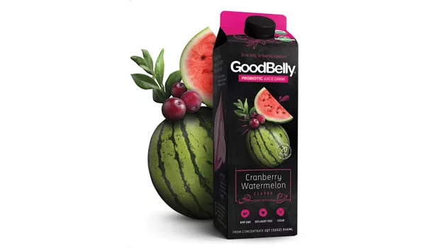
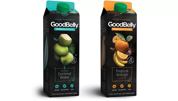
1. For the newly designed packages of its fruit-based probiotic beverages, GoodBelly balances form and function. LRXD prioritized three key benefits of the product through the pack’s art: its probiotic function, great taste and dairy-free benefits.
2. The refreshed packaging increases the emphasis on the juice aspect of the product from the previous package design by showcasing the enticing fruit ingredients.
3. Research showed that the dairy-free messaging did not have to be featured as prominently as originally thought. The statement joins other health benefits in a tidy and informative grouping near the bottom of the pack.
Looking for a reprint of this article?
From high-res PDFs to custom plaques, order your copy today!


