New Packaging Creates Unity Across Beer Line

BRANDPACKAGING says: If customers can't easily shop your product packaging, they will move on to what they can purchase at a glance. Dogfish Head decided to update its primary packaging and carriers to make a brand block at shelf as well as get its potential buyers the information they need to complete a purchase.
When Dogfish Head first opened in 1995, the brand had the unique distinction of being the smallest brewery in the country. For founder and president Sam Calagione, innovation wasn’t an option—it was the foundation for building an off-centered brand. Sam’s aspiration to make truly unique beers centered around his belief that culinary ingredients from around the world could be as integral for brewing distinct beers as the finest barley and hops. This summer Dogfish's new packaging sets out to honor this foundational spirit of off-centered innovation through highlighting its legacy of exploring goodness through ingredients and process.
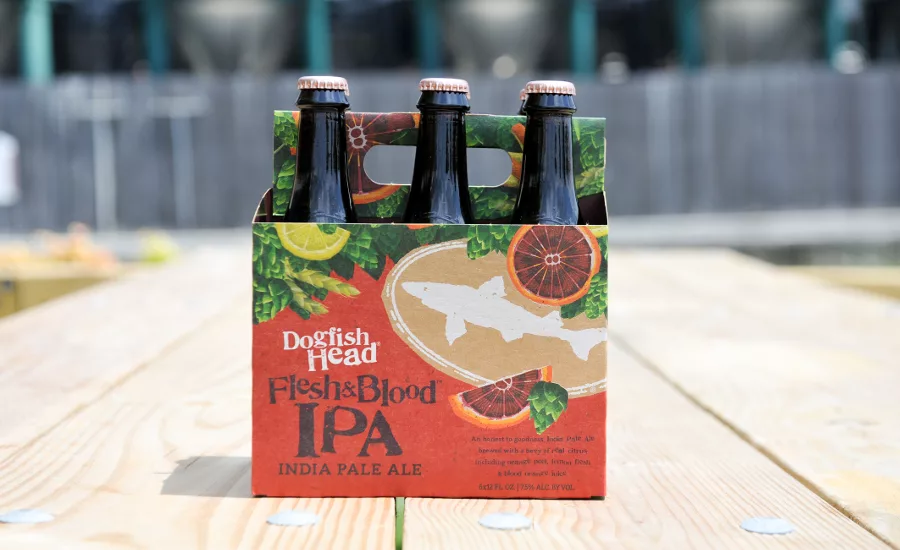
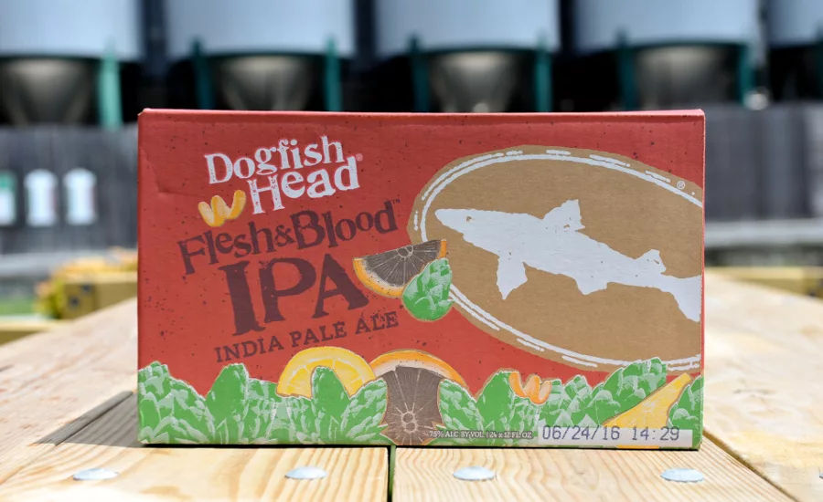
Dogfish's aim was to create conformity across its beers without falling into the trap of being predictable and sterile. The familiar Dogfish “shark and shield” logo and proprietary “Doggie” font carry through from the old packaging into the new, while new illustrations, equally playful and whimsical, create realistic and authentic flavor expectations. These elements run consistently across the cartons, the six- and four-pack carriers, and the labels. Additional storytelling and experiential elements in the carrier help to better inform the consumer at the shelf. The handle of the carrier is filled with imagery of the ingredients you’ll find in the beer, giving consumers a literal handful of ingredients when they pick up their beer. The side panels feature a bottle silhouette that shows beer lovers exactly what they are getting, in terms of unique ingredients and creative processes along with storytelling elements to help them understand how each beer is made. Through the new packaging, Dogfish Head is bringing the battle back inside the bottle.
From a consumer perspective, craft beer offers more choices than ever before. Dogfish's aim was for its loyal fans as well as new Dogfish drinkers to be able to easily identify and explore the beers on shelf. A consistency of design elements across the line delivers a Dogfish “brand block” that serves as a beacon of off-centered goodness. The brand also wants beer lovers to quickly locate key information, such as beer style, a short description of the beer, ABV, etc. The new packaging puts that information in the same on-package locations across its whole portfolio to allow for more effective and distinct storytelling at all of its retail outlets.
Looking for a reprint of this article?
From high-res PDFs to custom plaques, order your copy today!


