7 Strategies for Powerful Packaging Design - part 1
What goes through a consumer’s mind at the shelf and why playing it safe isn’t always the best strategy.


Less is more
Touching encouraged

Opposites Attract

Dress to Impress
Part 1 of this two-part article explores what goes through a consumer’s mind at the shelf and why playing it safe isn’t always the best strategy.
The retail environment is like a battleground where brands compete for a shopper’s attention. Your product packaging has two seconds to stake a claim, connect with the customer and earn closer examination. Packaging that fails the two-second test gets passed over in favor of a competitor who knew the seven strategies and how to use them. So what are the seven strategies?
1. less is more
In a culture where the dominant message of consumerism is “more-is-more,” the concept of “less-is-more” is challenged to gain adoption. However, savvy packaging designers employ the Bauhaus movement’s philosophy of less-is-more when designing retail packaging. The concept of less-is-more addresses the lack of time and attention a shopper will give to a product as he or she tries to evaluate its unique features and benefits relative to its price. The onslaught of packages screaming for attention and the visual bombardment by point-of-purchase displays means the average shopper will only give your product two seconds of attention before their gaze is seduced by a neighboring product on the shelf.
In that short amount of time, it’s critical to deliver your product’s unique benefits and “why-to-buy” statement. To achieve this near-impossible task, the packaging designer often has to battle the marketing team’s novella of words and catalog of images that seemed to make so much sense when crafted in the vacuum of their office during the last month. And then, of course, all this content was passed around to a half-dozen other stakeholders who each wanted to add their own provision into this declaration of product independence. By the time the packaging designer gets the content, he or she has to immediately default to font sizes in the single digits to fit everyone’s contributions into the available space. An experienced packaging designer should advise the prolific writers on the team to adopt the “less-is-more” approach to retail product packaging.
The essence of this approach is the two-second rule. If a shopper can fully absorb all the important visual images and text content of the front panel within two seconds, a subconscious sense of accomplishment and completion is felt. It’s as if the shopper fully understands the product, what it has to offer and appreciates its simplicity. If more time than two seconds is required, the endeavor is immediately judged to be time consuming—and your product might be cast aside for one that knew what to say and how to say it in a fraction of the time. The key to closing the sale at the point-of-purchase is to be first into the hands of the shopper. The first product to be picked up is usually the product that makes it to checkout. The less-is-more philosophy will increase your chances of being selected first and converting the shopper to a customer.
2. touching encouraged
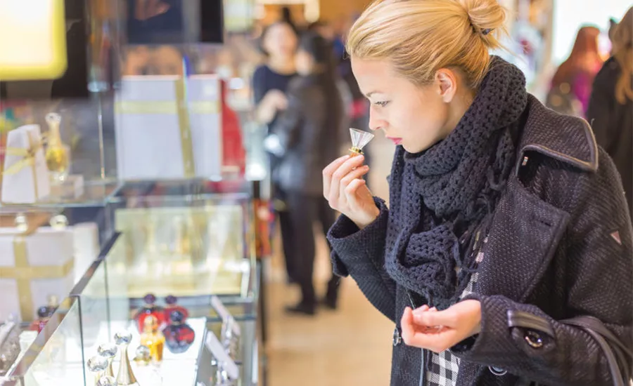
Product packaging is a nuisance to consumer because it’s standing between them and the product. If they had their way, there would be no packaging, and shoppers would be fully able to touch, smell, taste and test a product before the purchase. Of course, there are plenty of safety, security and logistical problems preventing this kind of shopping nirvana. However, the smart packaging designer seeks to minimize the packaging’s interference with the shopping experience.
Giving shoppers direct access to the product through cut-out zones and clear windows where they can see and touch a product increases sell-through. It removes the fear of the unknown: What does the product really look like? What does it feel like? Is the color really the color I see on the packaging? All these fears are removed if the customer can fully experience the product at the point-of-purchase.
If direct access to the product just isn’t possible, as is the case with some food and beverages, large, beautiful product photography with multiple views that highlight all the product’s features and tactile qualities helps give shoppers a sense for the products—and compels them to buy. Imagery that conveys a visual sense of the taste, touch, texture, materials and functional experience of the product is the next-best thing to direct customer interaction. In short, challenge yourself to make the packaging as minimal and invisible as possible.
3. opposites attract
When shoppers consider a product category on the retail shelf, their eyes quickly scan what’s available. A mind storm of visual sensory data is then received and evaluated in milliseconds. The shopper’s mind is subconsciously asking two questions:
1. What is familiar?
2. What stands out as different?
For repeat purchases, shoppers are focusing on what they recognize—products they’ve already bought, liked and want to buy again. However, there is always that subconscious desire to find what’s new. This is where the packaging designer’s opportunity lies—in being that new thing that stands out from the crowd and captures attention.
Strategic packaging designers know they need to develop a packaging design that sets the product apart from the competition, not one that blends in. However, all too often the designer is working for less-experienced business owners or junior shopper marketing professionals who are trapped in the me-too mentality of wanting to be a category follower instead of boldly stepping out as the leader.
Being a follower has the innate allure of being safe. “If the other three competitors are using blue as their primary packaging color, then we should too.” Category leaders instead say, “Everyone else is blue, we are going to be red.” Of course this is oversimplified, but you get the idea. Leaders aren’t worried about who follows in the direction they head; they head there because they know the direction is right. Followers look for who seems to know where they are headed, and follow. Which one will your product packaging be?
4. dress to impress
We can all relate to having been in a nightclub or bar and participated in the dating scene. This is like the personal relationship version of the retail shelf. Men and women gather in a location with the intent to evaluate each other based on visual appearance, body language and subtle cues that tell us who may be a good match. Of course, this is all superficial and no one can truly know another person until a relationship is developed, but the practice of surface evaluations directly relates to shopping in retail.
Just as a 21-year-old woman is usually looking for a person of similar age and personality traits with whom she can relate, so are shoppers looking for products that appeal to their sensibilities and personality. If you are looking for a one-night stand, the less clothing the better, right? But if you are looking for a long-term relationship, attire that’s a bit more modest might be more desirable. The first says “sex now,” whereas the second says, “I’m looking for a relationship that lasts longer than 24 hours.”
No product can be all things to all people. This is another common trap less experienced manufacturers and marketers believe about their products. I can’t tell you how often we have been presented with a product that, according to the marketing team, is purchased by women 70 percent of the time, but the manufacturer doesn’t want to alienate male purchasers. So, they direct us to make the packaging design appeal to both. Products that try to be all things to all people end up meaning nothing to anyone. If your customer is an 18- to 30-year-old female, consider language and visual styles millennials can relate to. Use recyclable packaging with more natural tactile qualities since younger millennials value a lower carbon footprint and favor more natural packaging materials. If your target customers are men age 40-65, be sure to use larger fonts, short, clear benefit statements and more rigid packaging that makes men feel the product is stronger and will last. Whoever your target customers are, dress your packaging to impress them and attract their attention. If your packaging design ends up looking like a bedazzled man’s suit, be sure that’s the message you really want to send.
Be sure to check back next month for Part 2!
Looking for a reprint of this article?
From high-res PDFs to custom plaques, order your copy today!


