7 Strategies for Powerful Packaging Design - part 2
What goes through a consumer’s mind at the shelf and why playing it safe isn’t always the best strategy.


5. the element of surprise

6. customers know best
7. spot color rules, process is for fools
The retail environment is like a battleground where brands compete for shopper’s attention. Your product packaging has two seconds stake a claim, connect with the customer and earn closer examination. Packaging that fails the two-second test gets passed over in favor of a competitor who knows the seven strategies and how to use them. This article is the second of a two-part series that describes the top design strategies developed by packaging experts, David and Nancy Deal of Deal Design in San Diego.
5. THE ELEMENT OF SURPRISE
Many people don’t realize that, in the past eight years, one marketing segment has risen to be the second largest spend by today’s brands: Experiential marketing. Of course, digital is still No. 1 and growing by 16 percent annually. But, experiential marketing is now No. 2, with 6 percent growth from 2014 to 2015 (Study by EventMarketer).
The reason for this is simple: People crave memorable experiences more than they crave things. It’s now a well-known fact that millennials value experience more than they value owning houses, fancy cars or expensive items. This shift in consumer behavior from desiring things to desiring experiences has a direct effect on packaging design.
How, you may ask, can a package design be like a live event? The thing that makes live events so memorable is that moment where something unexpected happens and it blows your mind. Packaging designers can take a lesson from live events by delivering a similar element of surprise to the shopping experience. For example, plan that moment when a package lid is lifted, and the inside of the carton is flooded with a bright color that says, “This secret experience was designed just for you.” Or when the customer realizes a package was designed to have a second life after it’s opened. It can double as a gift box or storage box for other things.
The packaging design’s face panels may create a larger image when viewed next to each other on the shelf. Or, when the packaging unveils a bonus gift item that wasn’t even advertised on the carton, such as a coupon code, window sticker or keychain that declares “I’m a real brand loyalist, and only loyalists get these.” The possibilities for elements of surprise are vast. Be sure to challenge your packaging designer, or your client, to develop an element of surprise into your next packaging design.
6. CUSTOMERS KNOW BEST
Anyone with experience in the creative process can relate with the primal experience of the packaging design’s concept review. Here’s the scene: Multiple packaging concepts are set on the conference room table, or shared among stakeholders during a Skype call. The designer has spent more than a hundred hours laboring over these concepts. And any one of them could be a retail winner.
But then opinions start flying. Everyone reaches into their bag of well-rehearsed designer lingo, beats their chest louder than the last type-A personality did, and eventually, the opinion of the highest-ranking person in the room dictates the design selection (or his wife does).
The reality is no one in the review process, not even the packaging designer, is in a position to make the best decision for the product packaging. Everyone is too close to the product to see it as the customer would see it.
So what’s a smart packaging designer to do? The answer is: Ask the customers. After all, who better to say “that one” than the person who is actually going to buy it. But how do I do that? Focus groups? Well sure, if you have a huge marketing budget. But many brands can’t afford that, and group dynamics can sway the results.
Today, the best tool a smart marketer and his or her packaging designer can use is crowdsourcing. There are many survey websites and online communities full of people who match your target customer demographic. For a fraction of what old-school focus groups used to cost, you can put your packaging designs in front of 1,000 individuals who perfectly match the desired demographic profile and have them vote on the best packaging design.
With survey results from 1,000 target customers in your hands two days later, you are armed with real data—and the data makes the decision. If 78 percent of customers surveyed say “the third option is best,” the chest-beating ritual should never even begin. No one can argue with hard data like that. Put simply, numbers don’t lie. And after all, everyone wants the packaging to sell the most product possible. And, the customer-knows-best approach puts everyone into alignment — even the CEO’s wife.
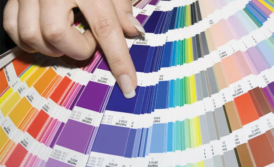
7. SPOT COLOR RULES, PROCESS IS FOR FOOLS
Well-trained packaging designers know the visual power that spot color wields when compared to its lesser-endowed challenger: process color. However, it never ceases to amaze us how often we’ll interact with a new marketing director who isn’t aware of the chromatic effect spot color has on a packaging design when compared to process color’s attempt to render the Pantone equivalent.
First, we have to establish what the difference is. In simple terms, spot color is like buying a gallon of eye-popping paint for your home media room. It’s that perfect peacock blue that just spoke to you, felt soothing, calming and inviting.
Process color is like hiring pointillist artist George Seurat to use a tiny little brush and make millions of little dots of blue, red, yellow and black in just such a density and configuration that, when you stand back far enough, your eye blends the tiny dots together to attempt the same effect as the that peacock blue. But it just falls short and looks, well, kind of grainy and dull. Spot color is a pure ink or paint hue made from actual pigments. Process color uses certain cyan, magenta, yellow and black dot patterns to simulate as best it can all the colors of the rainbow.
The problem is, process color never matches the visual intensity of spot colors. So why even use process color? The answer is twofold: It’s the only way to reproduce continuous-tone photographs and illustrations and it costs less than adding spot colors to a packaging print run that already has photographs or illustrations present. So why add more cost? Fifteen years ago, the case for avoiding the added cost of spot color on top of process color was compelling. For a 20,000-unit run, adding spot color could have increased the unit cost by $.05. There would also be additional artwork negatives that had be be generated, metal plates burned by hand and the need for printing presses that could support six or more colors in-line.
However, the same technology revolution that catapulted semiconductors into the processing speeds of supercomputers in everyone’s pocket has had a similar effect on the printing industry. Now, most every printing press is computer-assisted, plates are burned faster with digital-driven lasers, and setup times are much quicker. This means that the cost of adding two spot colors for key brand punch to your four-color process packaging design may only be $.02 per unit, an insignificant decrease when factored into a full production run. While this raises the cost of the package by a couple pennies, the resulting design may be so visually stunning that it drives just 1 percent more sell-through. That usually makes the investment in spot color worthwhile.
Looking for a reprint of this article?
From high-res PDFs to custom plaques, order your copy today!


