Brand Packaging: Beverage Branding
Less Is More in Beverage Branding
RTD brands use minimal design for maximum impact.
According to ForMarkets, the global RTD (ready to drink) market is predicted to reach $17.67 billion by 2025, with a growth rate of 7.2% between 2018-2025. As the RTD category continues to grow, consumers are reaching for convenient, better-for-you sources of energy — via protein or caffeine — in sophisticated packaging.
Energy drink brand packaging has traditionally been designed to attract a specific consumer, namely male gym-enthusiasts. The use of black or primarily colors coupled with large fonts and photography of flexed biceps are often used to convey strength. But today’s emerging brands are taking the opposite approach, using muted colors and monochromatic design to create packaging design that appeals to an entirely different consumer.
KITU and WellWell are just two of the many new brands taking this subtle approach with their wellness-first RTD products created to appeal to both men and women.
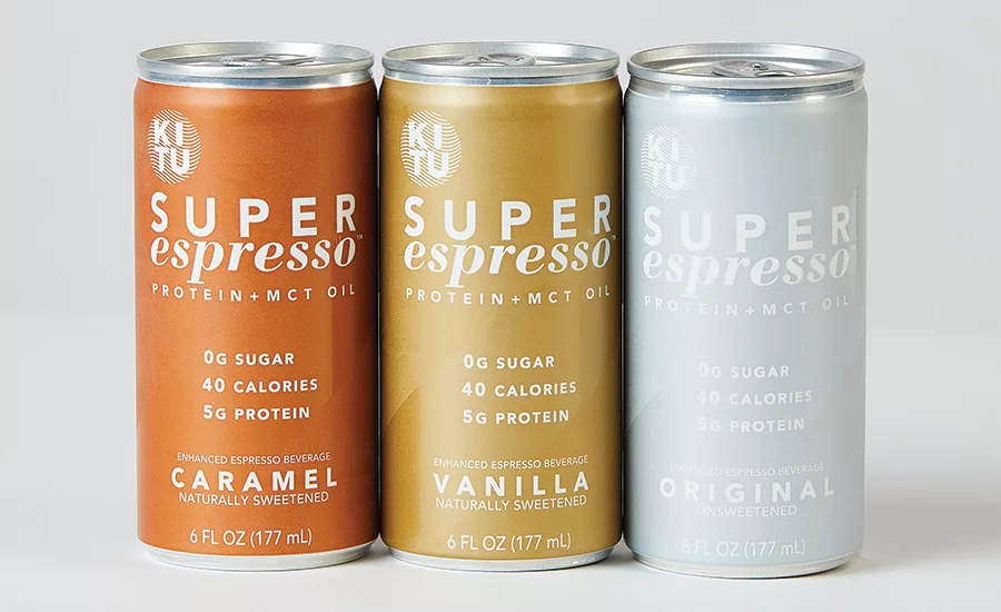
KITU SUPER ESPRESSO
Kitu Life Inc., the creators of Super Coffee, recently launched Super Espresso — a 6 oz. can with three shots of organic espresso, 5 g of protein, MCT oil and zero sugar. Jim DeCicco and his brothers Jake and Jordan founded the brand in 2015. The trio pitched the brand’s original product, Super Coffee, on ABC’s Shark Tank. Although they didn’t get a deal, the publicity from appearing on the show and sharing the enhanced RTD coffee to viewers drove online sales and catapulted them to the next level of growth. The brothers believe that the most compelling brands come from a very true, authentic mission and can communicate that mission very clearly like a great storyteller.
“Big brands sometimes fall into the trap of solely marketing their products. They forget about the mission or meaning behind them. I’ve also learned to look at the company and brand as an evolving enterprise where logos and packaging need to keep being refreshed while staying true to your style,” says Jim.
The company recently brought all of its packaging design in-house. “This allows us to be more agile, with a dedicated team that is tethered to all touchpoints of our brand communications.” When asked what inspired the gold, silver and bronze metallic colors used for the Super Espresso packaging, Jim explained the color cues are used primarily to signify the coffee flavor varieties. “The rich, earthy hues of our brand palette are meant to reinforce the sweet, bold taste as well as our use of natural ingredients.”
The new Super Espresso packaging design was a natural evolution from the original products while remaining strategically consistent across all of Kitu’s products. “The packaging draws upon the design language of our core Super Coffee product to leverage existing brand equity and to build behind a more uniform aesthetic. The subtle victory stripe is a tribute to our sports heritage. It’s reminiscent of a team jersey and anchored to our philosophy of camaraderie and culture of positive energy. More importantly, the upward angle signifies forward change, positivity and human improvement. It’s a visual co-pilot of sorts. A reminder to our customers to be constantly growing and becoming, better, healthier version of themselves.”
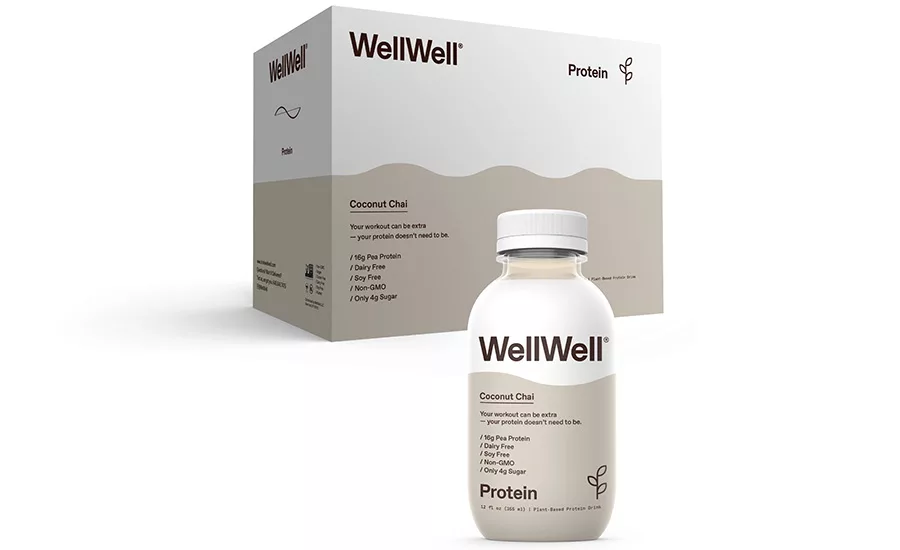
WELLWELL
WellWell launched its line of protein drinks in March 2019. M.D., CEO and Co-Founder Sagan Schultz wanted to create a functional beverage brand that would “function without sacrificing health in the long run.” As a brand, he says WellWell offers, “truth to an industry rife with false claims and pseudoscience.”
When asked about his branding, Schultz said he wanted to convey the same honesty, optimism, energy and playfulness that went into creating the product. He explained that WellWell products weren’t designed to be exclusive to the gym. “We wanted to stand out on the shelf, yet be at home on the court, in the streets, in the yoga studio and on the kitchen counter.” To do that, Schultz says the team honed in on a color, a wave motif, progressive type choices and clear, prominent copy. “It all works together to signify the function of the beverage. With customer-centric value propositions as titles, like dream, wake, hydrate, and protein, we balanced our brand voice with utilitarianism. A rising wave would denote wakefulness, while a descending one would mark our dream bottle. We were highly intentional with the shape — making it as functional as the ingredients inside.”
The design and copy work together to communicate the value, whether you’re catching it at a glance or engaging more tactilely. “With transparency as a key value, we’ve kept our messaging honest, in the foreground and in the language of the consumer, from the front of the bottle (we call that the handshake) to our email communications and social media (we call that the relationship),” Schultz explains. It’s this simple yet effective approach of using distinct, immediately recognizable design motifs and straight forward copy that that is helping the brand stand out on shelf.
PRIMARY COLORS SHOUT; PASTELS WHISPER
Innovation in the RTD coffee segment has contributed to its strong growth. According to Mintel, RTD coffee continues to drive the category as the fastest growing segment, growing 31% in the last two years. Overall, total coffee retail sales in the U.S. are estimated to reach $14.4 billion, with steady growth expected to continue through 2023. Aside from functional benefits, there is also potential for wellness-first brands that encourage consumption beyond the usual morning or afternoon pick-me-up. More than two in five (42%) RTD coffee consumers say their ideal bottled/canned cold coffee drink would help them relax, while over one-third (35%) are interested in products with added protein.
“This broader trend of beverage blurring is also opening up opportunity for innovation and brand extension, especially in the RTD segment,” said Caleb Bryant, senior beverage analyst at Mintel. And it’s the brands that are venturing away from traditional design in favor of a more subtle and sophisticated approach that are connecting to this growing consumer base.
Looking for a reprint of this article?
From high-res PDFs to custom plaques, order your copy today!


