Sol Attains Premium Design and Focuses on Positivity of the Sun
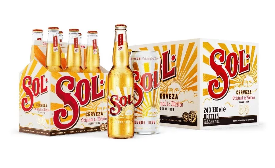
Sol cerveza unveils a new design for packaging in global markets. Inspired by Sol’s Mexican heritage, Vault49 used handcrafted artisanal elements to tell the brand’s rich and colorful history while elevating Sol’s iconic sun symbol as a vibrant beacon for positivity.
The global beer brand approached Vault49 after a separate redesign in the United States to help create a powerful, authentic packaging design for global markets. A new design in these markets would more deeply engage drinkers with Sol’s brand story and proposition: “Sol connects you to the positive energy of the sun.”
Sol wanted to establish itself as an aspirational, premium option, moving away from a gritty, rebellious identity and into a vibrant, colorful and positive space to summon sunny urban adventures that more authentically reflect the brand and its drinkers.
To help Sol tell its story, Vault49 dove into the history of the brand to reconnect it with its positive, sunny, authentically Mexican heritage, which led to the use of classic visual cues around ‘craft’ identities and to look to the work of Mexican artisans. The agency drew inspiration from the work handcrafted by these artisans.
To create the new design for Sol, Vault49 brought the techniques behind Mexican artisan designs into the studio, allowing the learnings from Mexican art to determine the brand assets designers would create and the tools they would use to create it.
Looking for a reprint of this article?
From high-res PDFs to custom plaques, order your copy today!


