New Beach St. Vodka Cocktail Evokes the Sand, Sea and Sky
New Beach St. vodka is positioned as a better-for-you alternative. Image courtesy of Chase Design Group
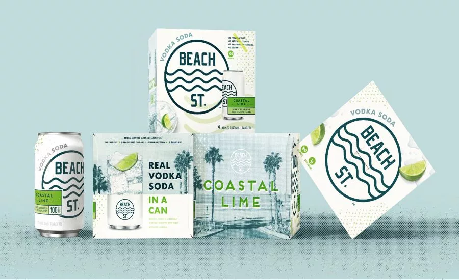
It’s always summer on Beach St. Which is why beach vibes and sun-drenched coastal signage inspire the look and feel of packaging for the new Beach St. Vodka Soda beverage from Christopher Michael Brands. Beach St. is sold in cans with an outer cardboard box.
Created by Chase Design Group, Los Angeles, the logo consists of simple, linear waves and modern sans serif font, reminiscent of familiar beach signage, but also serving as a mnemonic device. The blue logo represents the ocean while the pure white background communicates the purity of the product. Central to the focus of the design, it creates a memorable image in a sea of hard seltzers. With 1g of cane sugar, no preservatives, no artificial colors or sweeteners, no gluten and 100 calories per can, Beach St. is positioned as a better-for-you alternative.
As a new entry in the market, Beach St. needed to communicate its major point-of-difference, that it’s vodka-based, not beer,” says Dave Carlino, Senior Design Director, Chase Design Group. “The name, the logo, and the supporting graphics and language all work together to communicate a refreshing drink fit for a sun-soaked afternoon. The large logo pops off the white package while “Vodka Soda” is clearly called out on both the can and the outer box.”
Refreshing, appetizing visuals on the outer pack include a half can/half cocktail glass graphic while the front of the pack features an overhead image of an icy cocktail glass garnished with flavor cues indicating the four choices: coastal lime, cranberry splash, ruby red orange and Glacier Berry. Vintage California lifestyle photography completes the simple, refreshing vibes.
According to Stephen Goodridge, Co-Founder, Christopher Michael Brands, “Our collaboration with Chase Design Group resulted in a fun and memorable design that pays tribute to the classic California style while also communicating the superior quality of Beach St. over other hard seltzers.”
Looking for a reprint of this article?
From high-res PDFs to custom plaques, order your copy today!


