Cereal gets refreshed with new playful graphics
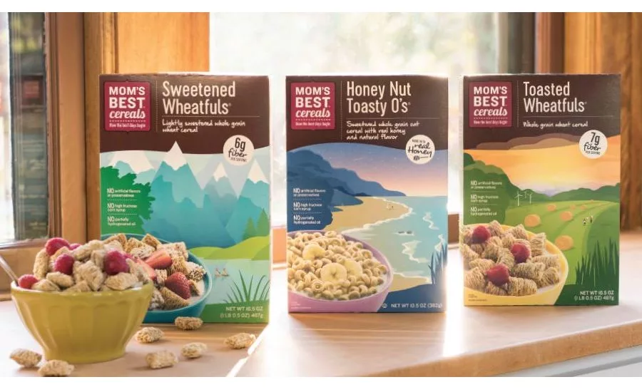
With new, contemporary graphics that amplify the playfulness and simple goodness of its brand, POST Foods / MOM’s Best Cereals recently launched a packaging refresh spearheaded by Ideas that Kick, a Minneapolis-based branding and design agency. Each of the new boxes showcases a beautifully colored landscape that instantly communicates the cereal’s wholesome focus.
“Two years ago, our launch of the brand’s kids’ cereals brought more color and a fun storytelling vibe to the MOM’s Best Cereals product line,” explains Kick co-founder and executive creative director Stefan Hartung. “Our goal with the adult refresh was to bring continuity across the brand’s entire offering while making the box and its elements more relevant to the moms of today.”
New typefaces, updated color palettes and an updated landscape design incorporating active lifestyle imagery reflects the evolution of MOM’s Best Cereals overall look and feel, while reflecting the familiar elements customers recognize. Building on the success of the kids’ line redesign, the packages also feature modern storytelling elements, such as life hacks focused on moms’ health, home and happiness, and a more realistic photo representation of the cereal product.
“The new, fresh take on this iconic design really helps to modernize the brand, without sacrificing any of the personality,” says Jennifer Sail, Creative Director at Post Consumer Brands. “Ideas that Kick did a great job helping us to give this beautiful brand a facelift that makes it feel more relevant and contemporary. It will help to build on the success we have already had with this brand on shelf.”
The design refresh touches all MOM’s Best Cereal products – six different flavors of breakfast cereals targeted to adults. The new designs are hitting shelves now.
Looking for a reprint of this article?
From high-res PDFs to custom plaques, order your copy today!


