New Mike’s Hot Honey brings heat to condiment category
Born from a quest to recreate a recipe discovered while traveling in Brazil, Mike’s Hot Honey has quickly amassed a loyal fan base. The chili pepper-infused honey was originally introduced as a key ingredient on one of the pies at the Brooklyn-based pizzeria, Paulie Gee’s, where founder Michael Kurtz was working as an apprentice. Overwhelming customer demand for take-home containers to use in a multitude of recipes led him to believe that he was on to something potentially game-changing.
When the opportunity to scale for mass distribution became a reality, Mike turned to Chase Design Group (chasedesigngroup.com), the brand design agency, to elevate the packaging and carve out an identity for a new player in the condiment category. According to Clark Goolsby, VP, creative director, Chase Design Group, “We drew inspiration from Mike’s roots and ‘old-soul’ character to develop the vintage-inspired, typographically-driven design that champions the quality and craft poured into every bottle.”
The bold typography emphasizes the word “HOT,” in thick, red letters, so that consumers instantly recognize that this is not your average sweet honey. “A streamlined, cleaner label includes a lighter background to help it stand out on the shelf and a honey bee illustration encircled in a gold badge evokes the high quality of the product,” says Michelle Hoffmann, account director, Chase Design Group.
According to Michael Kurtz, founder, Mike’s Hot Honey, “This redesign perfectly reflects the pioneering role that I am trying to carve out and I’m confident that it will help us gain space in the condiment aisle, where it belongs.”
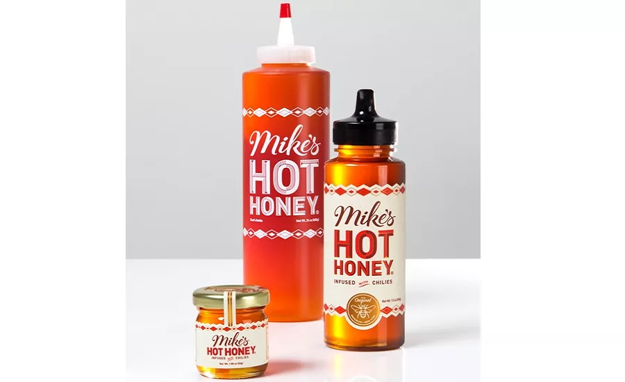
The product currently comes in four sizes: a 1.88-ounce glass mini jar and 12-ounce plastic bottle for retail, and a 24-ounce plastic chef’s bottle and one gallon / 12 lb. jug for commercial food service.
Looking for a reprint of this article?
From high-res PDFs to custom plaques, order your copy today!


