Food-to-go line uses small words in new design
Monoprix, a major city center retailer in France and pioneer in upscale to-go food, has teamed up with Brandimage (brand-image.com) to launch its new Food To Go line for busy consumers on the go.
The challenge: offering fresh, high-quality, healthy, affordable and practical products that are as appealing as they are tasty, all day long.
Staying ahead of the trends to meet the everyday needs of urbanites and travelers.
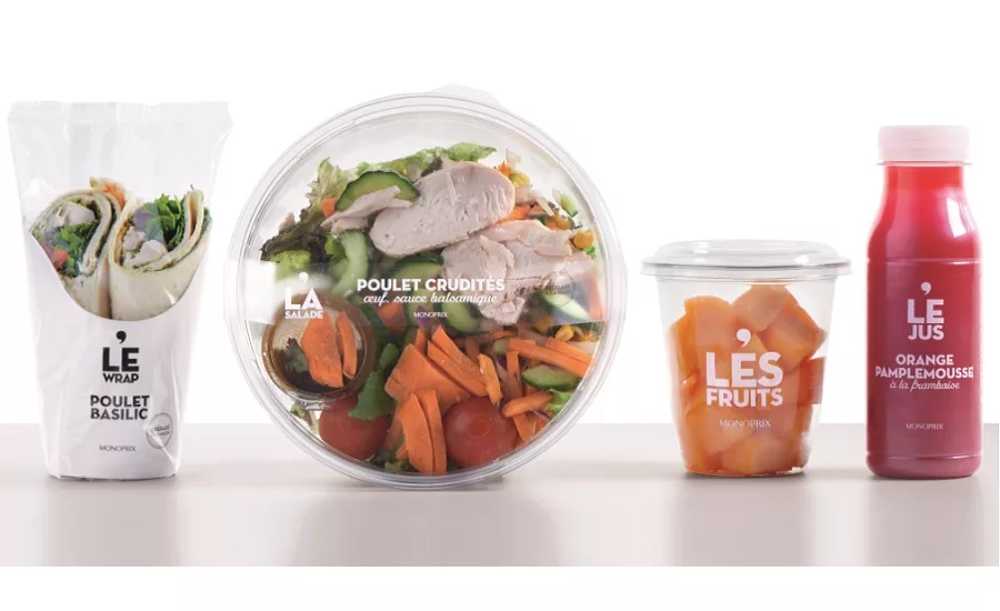
Brandimage created a graphic design that highlights appealing and ultra-fresh products. The line gets real through transparent packaging that focuses on the product selection, quality ingredients and simple recipes.
High-quality labels promote Monoprix’s commitments:
- “Prepared by hand” on all sandwiches and salads
- “Fruits picked at their peak” on all fruit salads
The graphic identity is a trilogy of sorts, comprised of font styles that reflect a modern elegance, the brand’s iconic apostrophe placed at the center to introduce the selected products, and a simple and effective color code in black and white. Monoprix’s identity comes through effectively yet simply in a chic and trendy way.
Sleek and trendy packaging to showcase quality and freshness.
A single tone runs through the entire ultra-minimalist, simple, direct and affordable line that includes fresh sandwiches, salads, fresh-squeezed juices, desserts and entrées to go.
Small words can make a big impression, and Monoprix is taking advantage of that fact to set itself apart in the world of urban convenience stores.
The articles “LE”, “LA” and “LES” (“the” in French) in “LE CLUB,” “LA SALADE,” “LES FRUITS” or “LES DESSERTS” tells consumers both boldly and clearly what they’re getting. This small word becomes the common denominator among a variety of unique products and recipe selected and prepared by Monoprix.
Looking for a reprint of this article?
From high-res PDFs to custom plaques, order your copy today!


