A New 2D and 3D Design Shakes Up Antibacterial Hand Gel Range
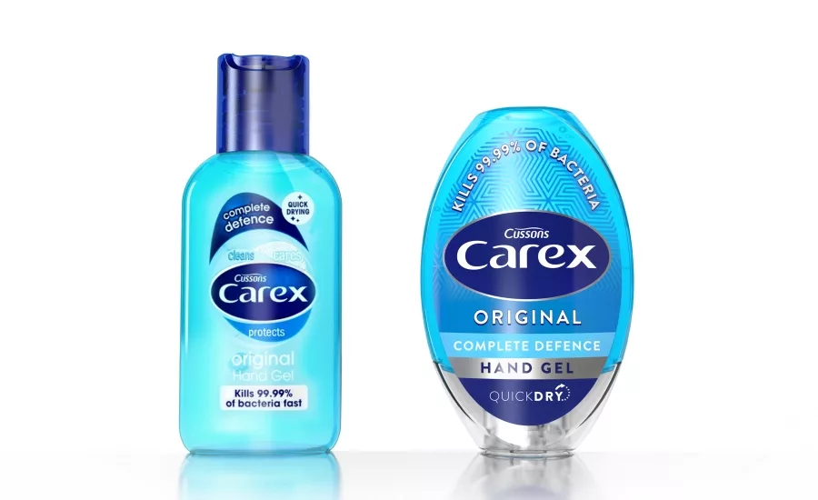
The U.K.’s original hand-gel line, Carex, is relaunching with a holistic 2D and 3D redesign by brand and packaging design agency PB Creative.
Carex felt it was time to shake up what had become a very functional category and ensure the brand remained center stage. The brand approached PB Creative with the challenge to develop a new 2D and 3D design that would communicate its caring, trusted brand ethos, boost branding, on-shelf stand-out and range navigation,along with better functionality and portability.
The agency made the strategic decision to take a brandmark-inspired approach to the design. An integrated closure means that the new elliptical package seamlessly embodies the curves of the logo and creates a much bigger canvas on which to express the key brand qualities of product efficacy and care.
The new structure fits perfectly in the hand, with a top-down orientation that makes it easier to dispense from the bottle in one swift maneuver. Ultimately, it achieves stand-out in a sea of generic bottles.
While the pack volume has remained the same, thanks to the innovative label area, which extends over the cap, branding has increased by almost 50% and is positioned at the heart of the pack, delivering prominent consistency across the whole range.
Each SKU in the core range has been given its own unique design. And the personality of the Fun Editions bottles, Love Hearts, Bubble Gum and Strawberry Laces, has been dialed up using playful imagery and typography – making hygiene fun for sticky little fingers.
Looking for a reprint of this article?
From high-res PDFs to custom plaques, order your copy today!


