Bottom Line
 In 2004, friends Andrew Quinlan and Neil McDonald began making their own ciders and fruit juices from their homes in Somerset, England. However, after eight years, what started as a hobby expanded into a million dollar company. Therefore, in an effort to bring the artisan cider into the mainstream, Orchard Pig underwent a redesign.
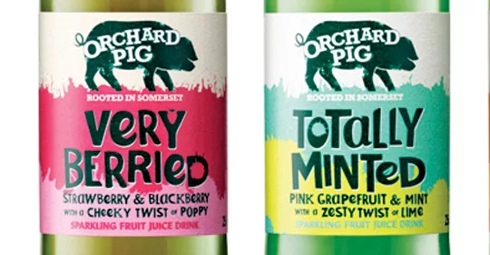
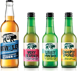
The updated labels feature playful copy, bold colors, and the infamous brand character, the Orchard Pig. To provide clearer differentiation between the brand’s juices and cider, the varieties are also color-coded and have their own unique names (e.g., Reveller for the ciders).
THE BOTTOM LINE: Orchard Pig introduced its redesigned bottles in March. Since the launch, annual revenue has grown five-fold. Additionally, for the 2012-2013 year, sales are 10 percent ahead of target. The brand attributes this growth to on-trade sales and wholesalers who are helping the brand scale up and distribute. According to Andrew Quinlan, managing director of Orchard Pig, “What the rebrand has done is really dial up the taste of the soft drinks, whilst giving the products standout and character … We have character, fun names, great shelf standout and are not seeking to conform with the industry norm — we cannot — as we have to get noticed through our packaging.”
Package Design
Blue Marlin, www.bluemarlinbd.com
Looking for a reprint of this article?
From high-res PDFs to custom plaques, order your copy today!


