Spices Dash to Store Shelves in New Package Design
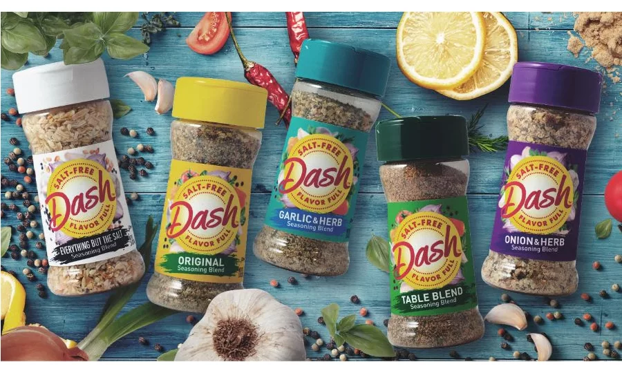
America's best-known salt-free flavoring brand revamped with a modernized name and look, transforming Mrs. DashÔ into a lively Dash. To strengthen appeal with millennials, while protecting the brand's relationship with older loyalists, The Biondo Group created a visual image depicting a "healthy lifestyle."
The new packaging rolled out to stores and online retail just as nation's shoppers prepared for stay-at-home orders, stocking-up pantries with staple items. With health foremost in mind, consumer's shift toward "better-for-you" foods is now accelerating. Shoppers actively seek healthy ways to recreate the taste experience and convenience of in-restaurant dining at home.
The evolved Dash name includes a logo with strong central focus, with historical equities in red and yellow used in a new way. Ingredient photography surrounds the brand stamp, reinforcing the brand's all-natural, wholesome attributes. Color-coding on labels and caps differentiate flavor and are easily recognizable. The new design is on 26 SKU's, including 12 base-brand flavors and 2 grilling blend varieties.
Looking for a reprint of this article?
From high-res PDFs to custom plaques, order your copy today!


