Brand Packaging: Branding
What Does Your Brand Convey Through Its Packaging?
Done the right way, packaging can showcase a brand’s personality
Product packaging is, and always has been, important for a range of reasons. The main and most common reasons being to protect the contents of the packaging, hygiene reasons, and for practicality and ease of use. These days, packaging is becoming more than just a standard must-have or something to transport the product, brands are making the most of it and using it as a marketing tool.
A recent survey by contract packing company, WePack, asked members of the U.K. public: “Do you think product packaging can showcase a brand's personality?” Over 30% of respondents said they believe that packaging does showcase personality.
The majority of respondents (41.3%) said packaging can showcase a brand's personality if done well. There is a range of design aspects to consider that can ensure the packaging design is done well.
The Overall Design
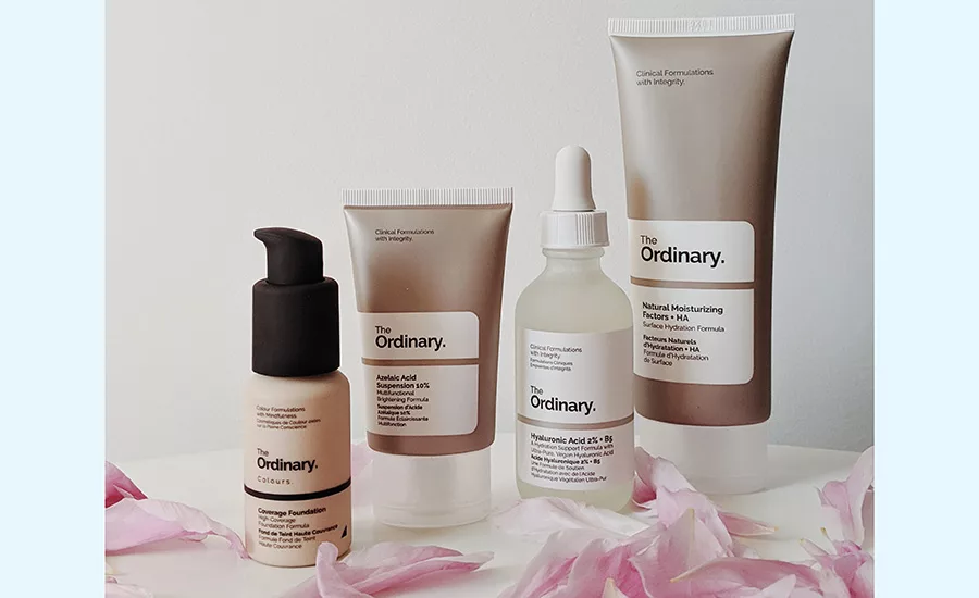
Packaging design can achieve a range of objectives — it can reflect how luxurious a brand is, who their target audience is, and also showcase any key messages and missions (e.g. whether the brand is environmentally friendly). All of these can be made apparent by the colors, imagery, typography and material used.
Apple is a great example of a brand whose packaging design reflects its high-end, luxurious reputation. When you buy an iPhone, it comes in an all-white box made from high quality, sturdy material and the outer and inner packaging all fits together perfectly.
Designing packaging so that it appeals to your target audience is worthwhile and important. This can be done by using the correct colors, typography and imagery in particular. For example, Estee Lauder has a target audience aged 35 to 55, therefore its packaging is very sleek and simple featuring a navy blue box with gold writing in a clear, simple font.
On the other hand, beauty brand Too Faced has a target audience aged 18 to 35, therefore, the packaging tends to be a lot more colorful with multiple "fun" fonts used and some products are packaged in unique shapes such as hearts.
Lush is a great example of a brand that showcases its values and ideologies via packaging. This brand is known for being environmentally friendly, so much so that some products are "naked," meaning they have no packaging at all. When packaging is unavoidable, they use recycled materials wherever possible — 90% of the brand’s packaging material is recyclable.
Using Color
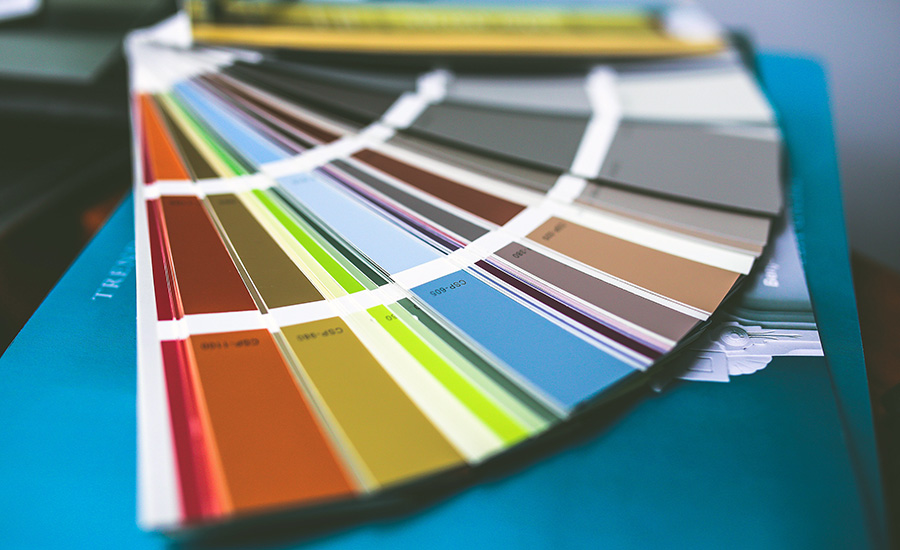
Using color within packaging design is extremely powerful. Color alone can make a brand instantly recognizable and, as mentioned above, makes it clear who the target audience is.
The research found that 93% of buyers focus on visual appearance, and almost 85% claimed color is a primary factor when making a purchase. This shows that color is an essential tool when designing packaging.
The Right Font
As well as color, typography can also showcase a brand's personality and target audience — making it instantly recognizable. Different styles of font represent different moods and have different effects. Some brands choose to have a much sleeker and simpler font (for example, Apple, MAC, Netflix) which could be to appeal to a wider target audience. Even though these fonts may be simple, they’re still easy to recognize for customers (especially when combined with brand colors and logos).
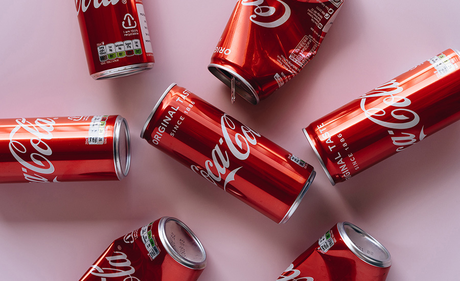
Other brands may choose to have a more "fun" and interesting font. This could be to showcase a personality as being "fun" and out there, simply to attract the target audience or to ensure the typography is so unique it’s instantly recognizable, even without the logo and brand colors (e.g. Coca-Cola, Disney, Subway).
Logos Dictate Design
Typography and color are essential for brand recognition, but adding logos into the mix will almost certainly ensure a brand is instantly familiar by consumers, as well as showcasing other aspects such as who the target audience is. Logos often dictate other elements of packaging design such as color and font.
Logos are a must for any brand — companies often spend a lot of money creating the perfect logo. For example, British Petroleum (BP) spent over $200,000 on its logo, and a huge amount of thought was put into it — green was used as the primary color to show a dedication to "being greener."
Importance of Materials
Over the years, the materials that brands use in their products and packaging have become increasingly important to consumers. Many brands are altering their packaging to make it more environmentally friendly. However, making packaging completely environmentally friendly can be difficult due to a range of logistical issues. Research is still ongoing to find a worthy replacement for materials such as plastic.
Ensuring Product Protection
While showcasing a brand's personality via packaging is important, it is also essential to ensure product packaging is still performing its primary job of protecting the product. A brand could have the most beautiful-looking packaging in the world, but if the product was faulty or broken due to poor packaging, the brand reputation would suffer.
Some considerations must be taken when packaging certain materials. For example, gas flushing may be required for bottles containing solvents such as nail polish remover or home cleaning solvents. This involves repeatedly injecting inert gases (carbon dioxide or nitrogen) into the packaging, which is then flushed out to remove all the oxygen. The procedure helps prolong the liquid’s shelf life and protect it from damage. It also prevents strong scents from escaping, and it strengthens the bottle’s internal walls.
Using the right color, typography and logo within packaging design can showcase a brand's personality — whether the overall aim is to share ideologies, be instantly recognizable or aim to the right audience, all design elements can achieve this. However, it’s important for a brand to also remember the practicalities of packaging.
Looking for a reprint of this article?
From high-res PDFs to custom plaques, order your copy today!


