Global Design Agency Turner Duckworth Creates New Visual Identity for Icelandic Provisions
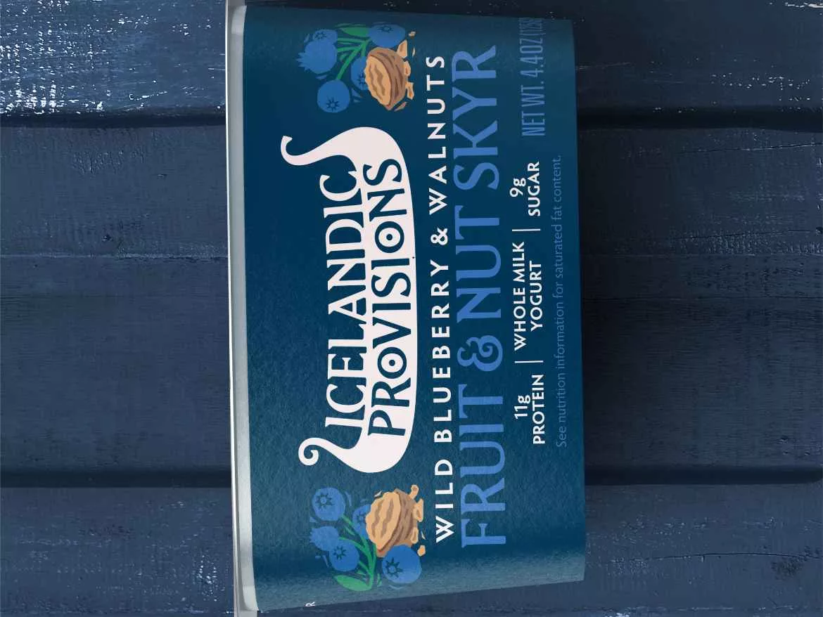
Image courtesy of Turner Duckworth
“This rebrand is an opportunity for us to create an iconic expression for our brand; tell the story of Iceland, its values, its provisions, its foods,” said Dan Hickle, Icelandic Provisions’ Chief Marketing Officer. “We want people to really feel the heritage and connect with it in a powerful way. Our Skyr is made with heirloom cultures that stretch back to the age of the Vikings.”
Inspired by this, Turner Duckworth created a new icon for the brand in the form of a Viking longship. "It's one of those great right-brained marks, that works at lots of levels,” explains Turner Duckworth Design Director Matt Lurcock, "It's a symbol of strength, and journeys, fitting the brand. The word ‘provisions’ sits neatly in the hull, where provisions would be stored – the O’s in provisions even gave us two shields to hang from the sides, Viking-style! But the mark also has this smooth, creamy quality, evocative of the Skyr. It's full of great discoveries, which in itself is a very Viking thing.”
Turner Duckworth also created a bespoke typeface, “Edda”, inspired by runes – traditional Icelandic letterforms. The distinctive trailing serifs of these letters echo the forward movement of a ship. The hand-carved style carries through to illustrations of native fruits, berries and nuts.
Lurcock adds, “Icelandic Provisions has a fantastic story, grounded in tradition, but with a strong sense of optimism and progress; and all centered on the food, the Skyr. With the longship icon, the new typeface, and the way we depict ingredients, all the chapters of this story are now there, in design.”
Looking for a reprint of this article?
From high-res PDFs to custom plaques, order your copy today!


