Sensodyne Expands Product Range with ‘Nourish’ Range, Designed By Marks
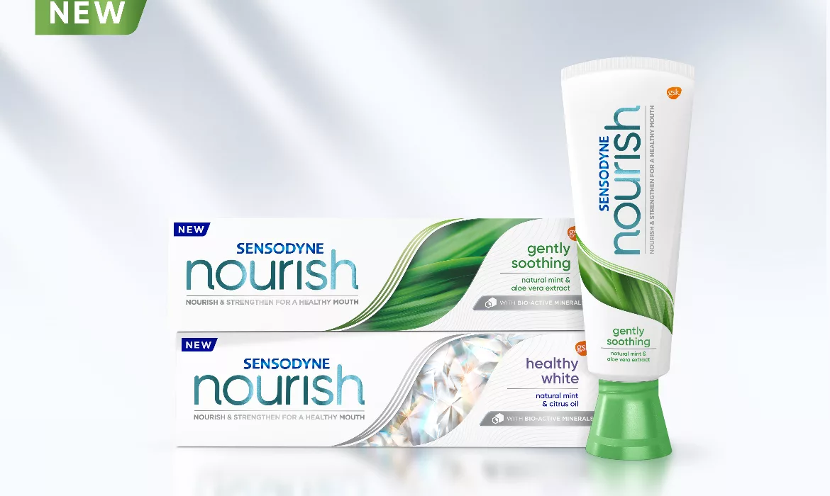
Image courtesy of Marks
GSK power brand Sensodyne is launching Sensodyne Nourish, the first in a new range of products designed to resonate with a younger audience. Driven by Sensodyne’s ambitious growth plans, Sensodyne Nourish remains true to its parent brand’s DNA focusing on tooth sensitivity but aims to broaden its relevance and appeal to recruit a younger generation of Sensodyne users.
Created by global brand design and experience agency Marks, the concept and visual identity of Nourish connects more effectively with millennials previously unengaged with the brand. It conveys natural beauty and sensorial efficacy to appeal to those consumers that might be less aware of tooth sensitivity but increasingly concerned with overall wellbeing, health, happiness and the planet.
“New Sensodyne Nourish balances science and nature and comes with fully recyclable packaging. Its distinctive experience brand language will broaden appeal to attract and emotionally connect with the younger conscious consumer and help fuel Sensodyne’s ambitious growth engine. The beauty of Sensodyne’s experience brand language is its creative capacity to expand and flex to tell meaningful, memorable and distinctive product and efficacy stories. The design celebrates the products’ natural combinations that enhance the health and wellbeing of your mouth – nourishing and strengthening,” says James Houghton, global experience design director, GSK.
Kashif Amin, Associate Creative Director at Marks, says: “As all aspects of the new sub-brand needed to resonate with the target millennial consumer, this project required a very different approach from the one aimed at the traditional Sensodyne consumer. The strategy and design process included extensive exploration, trying to push the brand in ways that it never had been pushed before, architecturally, visually and in tone of voice.”
To support the brand’s ambitions, the visual approach for Sensodyne Nourish represents a distinct shift from the parent brand, while retaining the trust and recognition that its established visual markers provide.
Sensodyne Nourish’s flexible assets bring to life the product’s stories using codes and cues that resonate more closely with the holistic lifestyle of its target audience. It amplifies natural semiotics, while dialing down the traditional science visualization, but still communicates efficacy.
For example, the imagery veers towards the natural, aspirational and sensorial. Using bespoke photography commissioned by Marks, Sensodyne Nourish’s packaging reflects the sense of wellbeing its formulation conveys. The visual execution reinforces the feelings of replenishment and nourishment that the product is designed to evoke.
The name ‘Nourish’ itself implies care and replenishment, helping to underscore the wider wellness story. While it maintains a sense of natural efficacy, the tone of voice reflects Sensodyne’s new positioning of enabling all sensitivity sufferers to enjoy life’s small pleasures. It will also allow the brand to live and breathe off-pack, augmenting its story via in-store and digital experiences.
Other distinctive brand assets include the ‘amplifying S’ that acts as a linking motif to the Sensodyne brandmark; an ‘S crop device’ that acts as a window into nature and expresses the three variants (‘naturally fresh’, ‘gently soothing’ and ‘healthy white’) with bespoke photography; and a contoured texture that offers further cues of nourishment.
Looking for a reprint of this article?
From high-res PDFs to custom plaques, order your copy today!


