Hydroxycut, America’s Number 1 Selling Weight Loss Supplement, Gets its Own Before/After Makeover
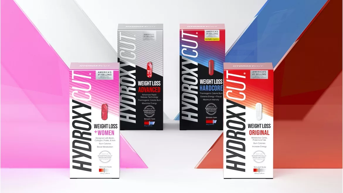
Image courtesy of Chase Design Group
With over 100-million bottles sold and more than 2 decades of proven results, changing consumer perceptions about the weight loss category, prompted Hydroxycut to rebrand and redesign for greater consistency, relevancy and impact on shelf. Driven by new entrants and weekly fads, the weight loss category continues to expand and get more crowded by the day. That’s why Iovate, the company behind Hydroxycut, called on creative agency, Chase Design Group, to align with evolving consumer preferences and cut through the clutter.
Amplifying the distinctive benefits (simple to use, safe, and trusted) and efficacy of Hydroxycut was the focus for the creative team. “We achieved this by creating a bold design architecture that breaks through at shelf and heroes the Hydroxycut brandmark, giving it a renewed sense of confidence,” says Steve Dunphy, Executive Creative Director, Chase Design Group. “We also maintained the recognizable sub-brand colors, informative product visuals, and a telegraphic claims system,” he adds.
“Central to the brand is the essence of simplicity, proven results, and straight talk. The design was guided by the concept of ‘cut through.’ This platform – a powerful combination of brand authority and easy-to-decode information system – was most resonant with consumers and ultimately provided the greatest degree of brand distinction,” says Justin Molina, Account Director, Chase Design Group.
Two different weights of typography for the brandmark and a dynamic cut-through graphic bisects the package to emphasize efficacy of the Hydryoxycut pill and allude to its ‘before and after’ product effectiveness. All of this was communicated through a modernized package design and architecture that clearly lays out exactly what the product is and its benefits.
“In this category, consumers must quickly understand which product is for them. The combination of tier color and straightforward nomenclature guides consumers to the product best fit for their weight loss journey,” says Jaymie Bachiu, Head of Creative, Iovate. Name changes for the products helped clarify these. Base (Lose Weight), Max and Black were changed to Original, +Women, and Advanced, respectively.
The package architecture is identical across the full portfolio, creating a unified brand look. With red most strongly associated with the brand, the Original, or entry-level products, all incorporate the same red gradient. As a consumer moves through the shelf, color further distinguishes offerings: pink for the +Women SKU, and black, with more complex gradients and silver for Advanced, the most intense segment of the portfolio.
The refreshed packaging for all 7 SKUs, including Original, Non-Stimulant, +Women, Hardcore, Advanced, Gummies, and Drink Mix, is currently rolling out across the U.S.
Looking for a reprint of this article?
From high-res PDFs to custom plaques, order your copy today!


