A Healthy Dose of Packaging Impact
SOURCE GGB
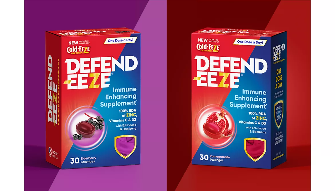
GGB crafted Defend-EEZE, the newest member of the Cold-EEZE family, to stand out as a new offering among the brand's sea of red, white and blue.
The Project: Defend-EEZE
In a post-pandemic world, no other category is bursting at the seams quite like the immunity shelves. As a new offering among so many fierce competitors, Defend-EEZE needed to cut through the noise to prove its place on the shelf and highlight its unique points of difference: Delicious flavors, a trusted parent brand, and the simplicity of a single daily dose. GGB used its Shelf Sight Sequence™, and was able to craft a design that communicates a new promise of daily defense while maintaining an essential connection to the Cold-EEZE brand.
How?
Uncovering existing brand equities was a key aspect of the project. Via a honed color crayon research exercise, perceived brand equities were revealed, informing which visual vocabulary to depart from and what was necessary to keep the integrity of the parent brand.
The result?
Colors remained within the memorable Cold-EEZE spectrum. New shapes were carved out to violate and add vibration on shelf. Symbols were built into the brand to convey its unique point of difference in seconds, and the copy was included in a flag to reinforce its unique and powerful daily dosage.
Looking for a reprint of this article?
From high-res PDFs to custom plaques, order your copy today!


