Sabra Unveils New Logo & Label Design
Sabra Dipping Company brings a fresh look to the table. Sabra is known for plant-based dips including dozens of varieties of hummus, guacamole and Greek yogurt-based tzatzikis. The brand unveiled a fresh logo and packaging redesign for its complete product line. The rebranding includes an updated logo, restyled label design and original on-pack photography.
"We are thrilled to introduce a fresh look for Sabra at an exciting time in the food world," said Eugenio Perrier, chief marketing officer for Sabra Dipping Company. "Cultivating a natural evolution for this unique brand, we sought to enrich the way we communicate visually with consumers on shelf and on pack. From the Sabra sun which is recast as a chickpea evoking the warmth at the heart of the Mediterranean, to fresh ingredients shot in sunshine on a kitchen cutting board, the new designs enhance flavor expectation and beautifully convey Sabra's brand personality and promise."
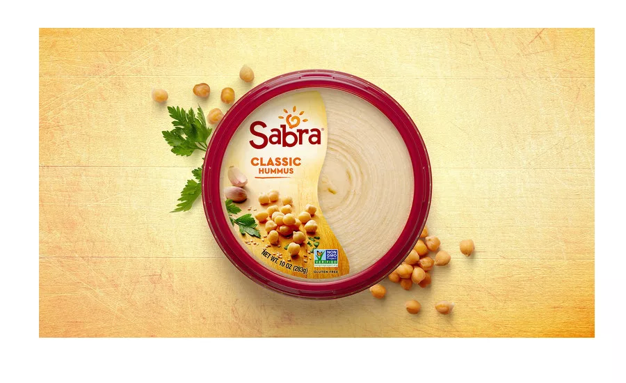
For the new logo design, the new Sabra word mark is customized to keep the playful "musicality" of the previous version while prompting a bolder impression. The reimagined sun is now illustrated as a chickpea heart surrounded by five sesame seed rays; chickpeas and tahini (sesame paste) are the two primary ingredients in hummus, Sabra's signature dip. The five rays of the sun represent Sabra's five core values: Openness, Trust, Passion, Caring, and Daring.
With its iconic red rim unchanged, Sabra's packaging label has received a complete refresh, beginning with the reorientation of the top label from horizontal to vertical. Vertical labels guide the eye naturally to the new logo, then flavor, ingredients and finally to the transparent view of the product. The cleaner side label with bold fonts and brighter colors incorporates color-coded flavor differentiation, improving shop-ability
The new photo style shows Mediterranean inspiration with sunlit ingredients atop a wooden cutting board, boosting freshness and real food appeal.
Looking for a reprint of this article?
From high-res PDFs to custom plaques, order your copy today!


