Outdoor Paint Gets Animalistic in Design
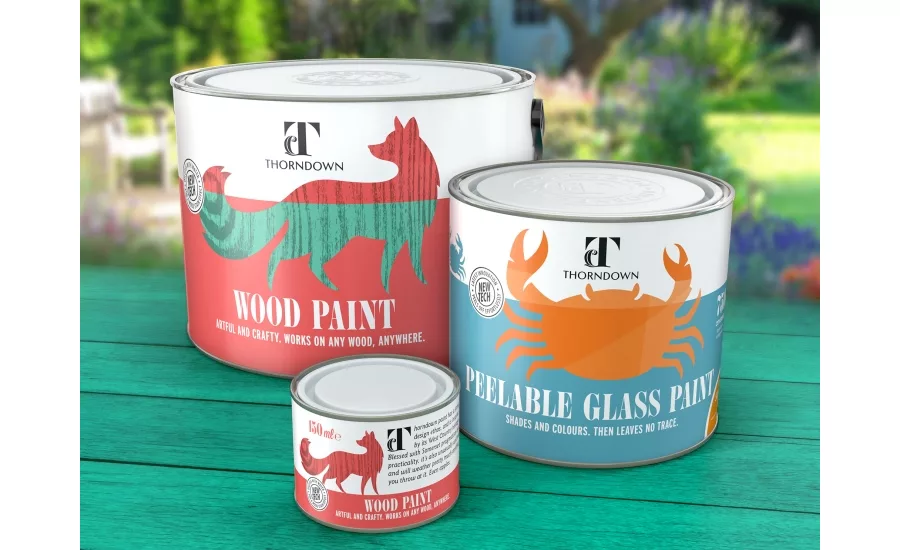
Thorndown paints approached Brown&co (B&co, brownandco.co) to create a new brand from scratch that would stand out in this crowded and bland marketplace. The job included a radical tin size overhaul, new messaging, graphics and colors.
The goal was to achieve on-shelf standout in an overcrowded and ‘safe’ category. The outdoor paint market is saturated and addresses only product functionality. At point of sale, range navigation and messaging tends to be confusing and cluttered, with uninspired brands struggling to differentiate themselves.
The paint company and agency worked together to identify a clear gap for a more design-oriented and aesthetically-considered brand that could elevate the entire category. B&co brought perceptions of exterior wood care out of being purely industrial and functional and into the realm of design. The objective was to help house-proud homeowners think about the exteriors of their home with the same attention as their interiors, and provide the products and solutions to help make these ideas a reality.
An entire graphic language was created for the brand including iconography, color palettes and typography. The brand was named Thorndown. The family behind the paint are the Thornborough husband and wife team. Thorns are hardy, practical, plant structures. Down is soft and delicate. The name 'Thorndown' captures this combination of science and art and this ethos was transposed to the logo.
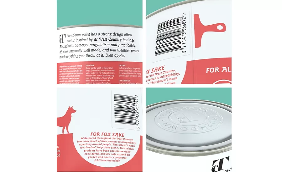
A color palette that drew on the orchards found in The West Country of England—the origins of the paint manufacturer—in broadening the spectrum. Animals and icons associated with The West Country were chosen, which represented the objectives of the paint with a story being told on the labels.
Thorndown will be sold in a different tin dimension than the rest of the market. A shorter, fatter pot is now being produced which boasts benefits including a wider opening for paintbrushes. The unconventional design will also create a distinctive and eye-catching shape on shelf. All modifications to the standard paint tin specifications were created with zero extra cost in the manufacturing process.
B&co had labels printed on special paper and wrapped round the pots to highlight the craft element of the paints. This is another departure from conventional tin design, where the label is printed directly onto the metal.
Looking for a reprint of this article?
From high-res PDFs to custom plaques, order your copy today!


