Vodka Packaging Design Gets More Teeth for Halloween
The goal of the packaging was to help SVEDKA stand out from the crowd during the popular Halloween sales window and disrupt an oversaturated category. BRIGADE (wearebrigade.com) took on the challenge, having created previous successful limited edition designs for the brand.
“Too often we see brands returning to the same worn themes: pumpkins, skeletons, candy corn,” said Robert Parker, creative strategy director at BRIGADE. “We wanted to make sure that SVEDKA’s 2018 Halloween creative belonged to the season without blending into the space.”
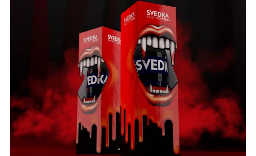
The final strategic concept for SVEDKA is a gaping mouth that includes vampire fangs and dripping blood. It’s graphic and bold, colorful and eye-catching. “It’s a little bit Dracula, a little bit Rocky Horror Picture Show,” Parker added.
A sharp die-cut in the box forms the mouth’s opening creates the illusion of dripping fangs overlaying the bottle. A high-gloss printing technique makes the blood and mouth appear raised on the box. In contrast, matte white teeth and debossed logos provide prominent placement for SVEDKA branding on the packaging.
BRIGADE made the SVEDKA Halloween packaging cohesive by designing additional pieces of collateral for consumers to engage with. All assets were designed to translate to multiple channels, including digital, social and point of purchase.
Looking for a reprint of this article?
From high-res PDFs to custom plaques, order your copy today!


