Caution: Fresh Paint
After falling out of the public eye, Glidden underwent a redesign to recreate, rebuild and reestablish itself as a national brand.
The story: Tens of thousands of years ago primitive people made cave paintings. Five hundred years ago Leonardo da Vinci painted the Mona Lisa. Today, anyone can be an artist-and in their own home. For decades, Glidden has been providing a palette of paint colors, enabling consumers to transform the interior or exterior of their homes. Primarily sold in Home Depot stores, the brand had established itself as a quality American product.
 The challenge: Because it hadn’t undergone significant branding changes in years, the Glidden brand had painted itself into a corner, so to speak. It was experiencing loss of share, consumer recognition and sales volume. With painting season just around the corner (April through October), it was important that Glidden find a way to bring its products back into the eyes of consumers.
The goal: With just two weeks to spare, Glidden turned to Interbrand to reinvigorate the brand’s packaging. The design team faced two goals. First, make the packaging work for sales associates so they could better use and reference Glidden’s product range in-store. Second, create an emotional connection between the product and the consumer.
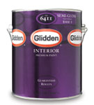
 The solution: “The only thing that didn’t change [in the packaging] was the logo,” says Ted Monnin, Interbrand associate creative director. And although the logo stayed the same, it now appears three times on the packaging, enabling a salesperson or consumer to view the logo from any angle.
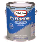
To create an emotional connection with consumers, the packaging features photos of real Glidden customers with quotes explaining their experiences with the brand. It also uses abstract designs to remind consumers of the feeling of finishing a painting project. For instance, bright colors and circular elements on a metallic-finish foil stock label are meant to give the package a premium, fresh look.
The team also brought forth the element of color by simplifying the package. Information on the can is now clean and clear, better displaying the bold colors representing each paint variety.
While the product’s packaging is important in helping sales associates and consumers better understand the product, the design team learned it would not always be the first thing people connect with the brand. Consumers may first find a color swatch they like, or request a certain brand from the salesperson, Monnin says. Because of these factors, the design team realized that a lot of brand interaction would come through the sales associate. To make the brand stand out further, Glidden put the trays that hold its paint cans to work by carrying the same design elements from the can over to the trays. The colorful trays help make the brand more eye-catching while creating a shelf block.
The results: The redesigned Glidden brand began appearing in stores in late April and continued to roll out in 400 locations through June. Within the first couple of months-before any advertising hit-stores that were reset with the new packaging were reporting a sales boost over stores that hadn’t been reset, said Mark Hembree, Glidden senior brand manager.
Though the painting season isn’t over just yet, Jenny Kroeger, Interbrand’s client development leader, says the new Glidden packaging has already been well received. BP
Stephanie Hildebrandt is the associate editor of BRANDPACKAGING. Contact her at hildebrandts@bnpmedia.com.
The story: Tens of thousands of years ago primitive people made cave paintings. Five hundred years ago Leonardo da Vinci painted the Mona Lisa. Today, anyone can be an artist-and in their own home. For decades, Glidden has been providing a palette of paint colors, enabling consumers to transform the interior or exterior of their homes. Primarily sold in Home Depot stores, the brand had established itself as a quality American product.
BEFORE
The goal: With just two weeks to spare, Glidden turned to Interbrand to reinvigorate the brand’s packaging. The design team faced two goals. First, make the packaging work for sales associates so they could better use and reference Glidden’s product range in-store. Second, create an emotional connection between the product and the consumer.
AFTER
To create an emotional connection with consumers, the packaging features photos of real Glidden customers with quotes explaining their experiences with the brand. It also uses abstract designs to remind consumers of the feeling of finishing a painting project. For instance, bright colors and circular elements on a metallic-finish foil stock label are meant to give the package a premium, fresh look.
The team also brought forth the element of color by simplifying the package. Information on the can is now clean and clear, better displaying the bold colors representing each paint variety.
While the product’s packaging is important in helping sales associates and consumers better understand the product, the design team learned it would not always be the first thing people connect with the brand. Consumers may first find a color swatch they like, or request a certain brand from the salesperson, Monnin says. Because of these factors, the design team realized that a lot of brand interaction would come through the sales associate. To make the brand stand out further, Glidden put the trays that hold its paint cans to work by carrying the same design elements from the can over to the trays. The colorful trays help make the brand more eye-catching while creating a shelf block.
The results: The redesigned Glidden brand began appearing in stores in late April and continued to roll out in 400 locations through June. Within the first couple of months-before any advertising hit-stores that were reset with the new packaging were reporting a sales boost over stores that hadn’t been reset, said Mark Hembree, Glidden senior brand manager.
Though the painting season isn’t over just yet, Jenny Kroeger, Interbrand’s client development leader, says the new Glidden packaging has already been well received. BP
Stephanie Hildebrandt is the associate editor of BRANDPACKAGING. Contact her at hildebrandts@bnpmedia.com.
Looking for a reprint of this article?
From high-res PDFs to custom plaques, order your copy today!


